Joey Watson Ceramics
Joey Watson Ceramics
Joey Watson Ceramics
Kansas City ceramicist Joey Watson approached Special Edition Co. to design his portfolio website. He wanted the site to provide a fun and engaging experience for users, much like the one they would have interacting with his artwork.
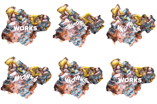
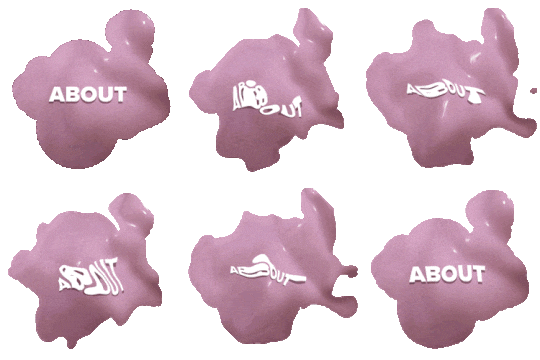
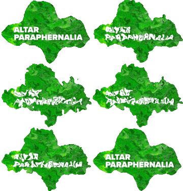
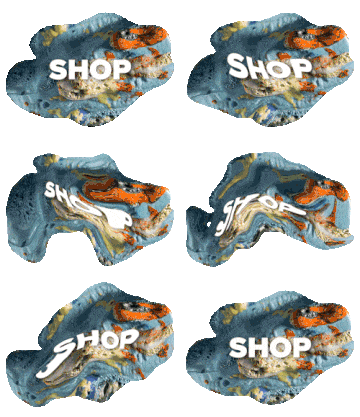
We created an organic and loopy aesthetic for the site. Page textures and hover state graphics are sampled directly from high-resolution photographs of Joey's work. We experimented with HTML & CSS customization to create unique audio and motion interactions. The site offers a complete archive of Joey's work, an artist bio, and a link to his webshop.
Kansas City ceramicist Joey Watson approached Special Edition Co. to design his portfolio website. He wanted the site to provide a fun and engaging experience for users, much like the one they would have interacting with his artwork.
We created an organic and loopy aesthetic for the site. Page textures and hover state graphics are sampled directly from high-resolution photographs of Joey's work. We experimented with HTML & CSS customization to create unique audio and motion interactions. The site offers a complete archive of Joey's work, an artist bio and a link to his webshop.
Kansas City ceramicist Joey Watson approached Special Edition Co. to design his portfolio website. He wanted the site to provide a fun and engaging experience for users, much like the one they would have interacting with his artwork.
We created an organic and loopy aesthetic for the site. Page textures and hover state graphics are sampled directly from high-resolution photographs of Joey's work. We experimented with HTML & CSS customization to create unique audio and motion interactions. The site offers a complete archive of Joey's work, an artist bio, and a link to his webshop.
My Role
Web Design
Development
Journey Mapping
Information Architecture
Wireframing
Motion Graphics
Animation
Client
Joey Watson
Collaborators
Trent Roach
Special Edition Co.
Completed
2017
Completed
2017
Completed
2017

Process
We brainstormed with Joey on the look and feel for his portfolio site. He wanted the user experience to be very immersive and interactive with fun moments of discovery.
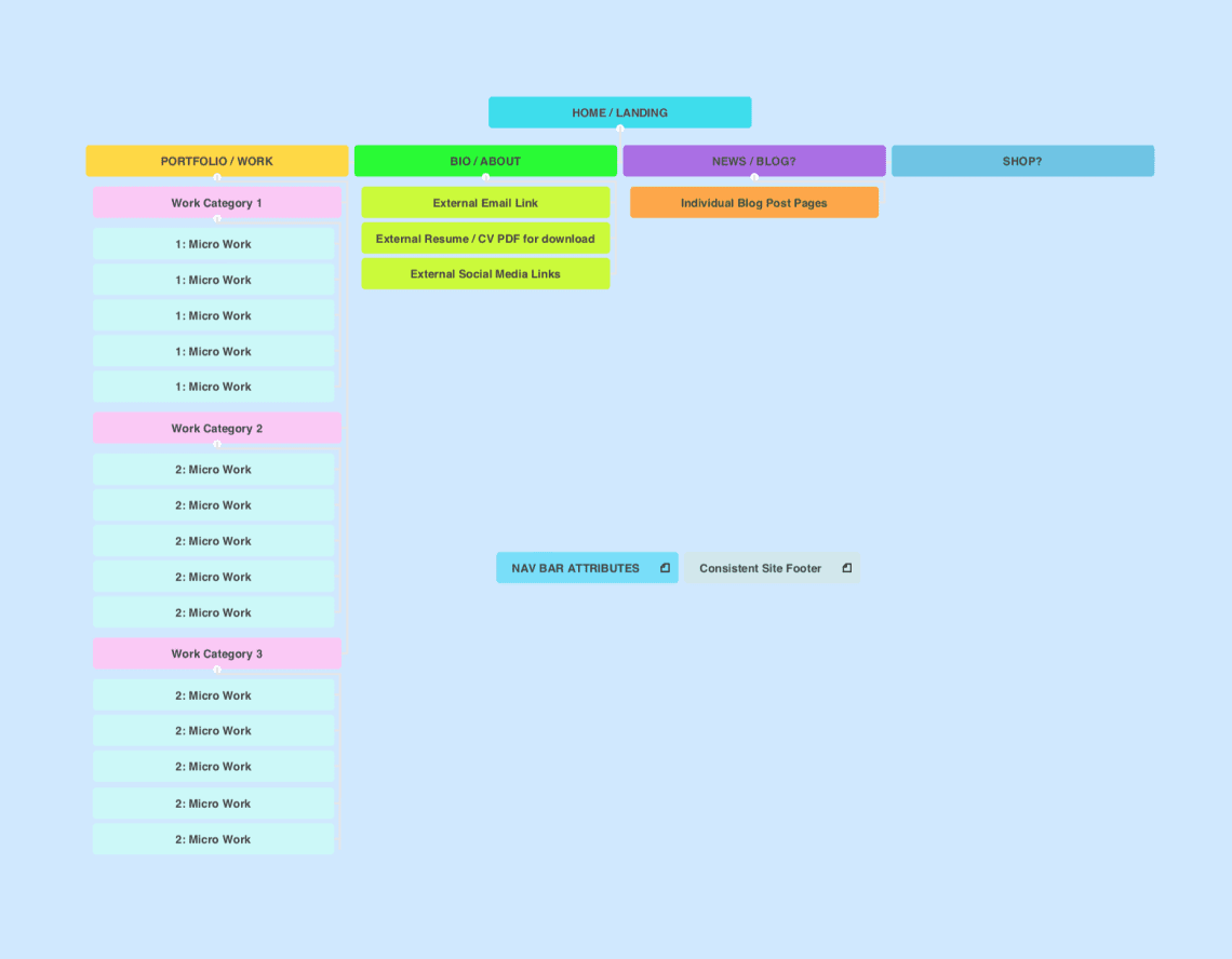
We learned about Joey's creative process, developed visual mood boards, and researched unique interactive web approaches. We mapped out the architecture of the site and began with lots of analog sketching.
We brainstormed with Joey on the look and feel for his portfolio site. He wanted the user experience to be very immersive and interactive with fun moments of discovery.
We learned about Joey's creative process, developed visual mood boards and researched unique interactive web approaches. We mapped out the architecture of the site and began with lots of analog sketching.
We brainstormed with Joey on the look and feel for his portfolio site. He wanted the user experience to be very immersive and interactive with fun moments of discovery.
We learned about Joey's creative process, developed visual mood boards, and researched unique interactive web approaches. We mapped out the architecture of the site and began with lots of analog sketching.
Low Fidelity Wireframes
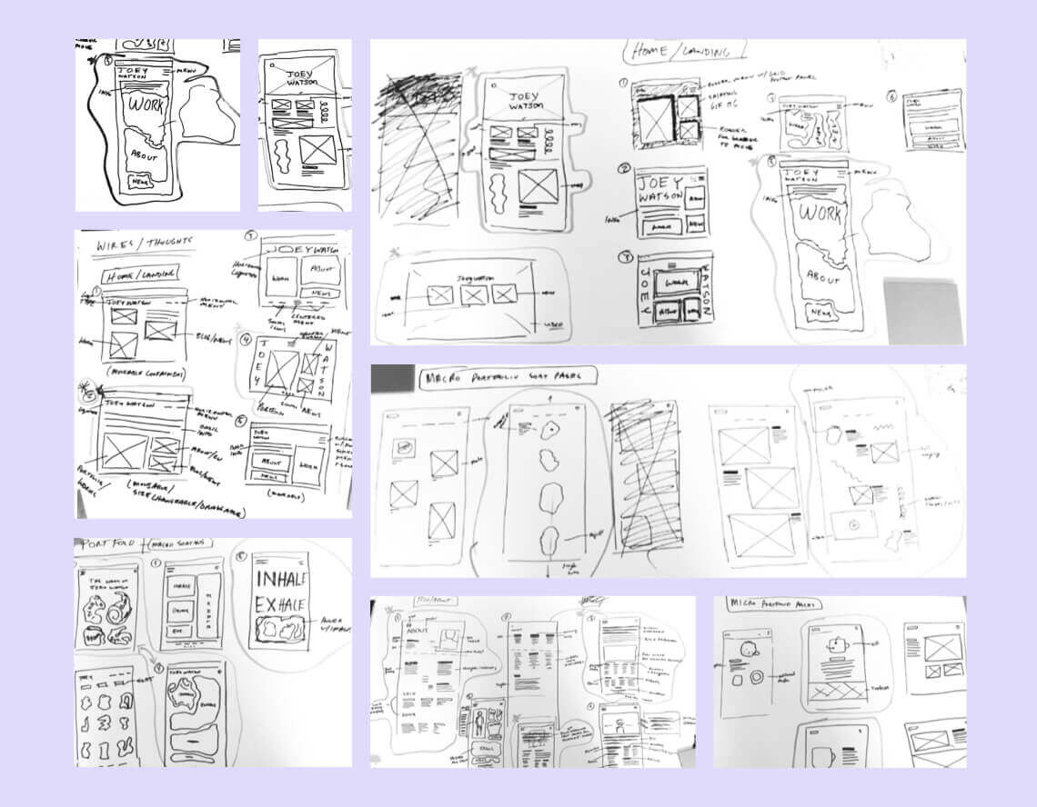
We digitized sketches and created low fidelity wireframes to work out the information architecture of each page.
We digitized sketches and created low fidelity wireframes to work out the information architecture of each page.
We digitized sketches and created low fidelity wireframes to work out the information architecture of each page.
High Fidelity Wireframes
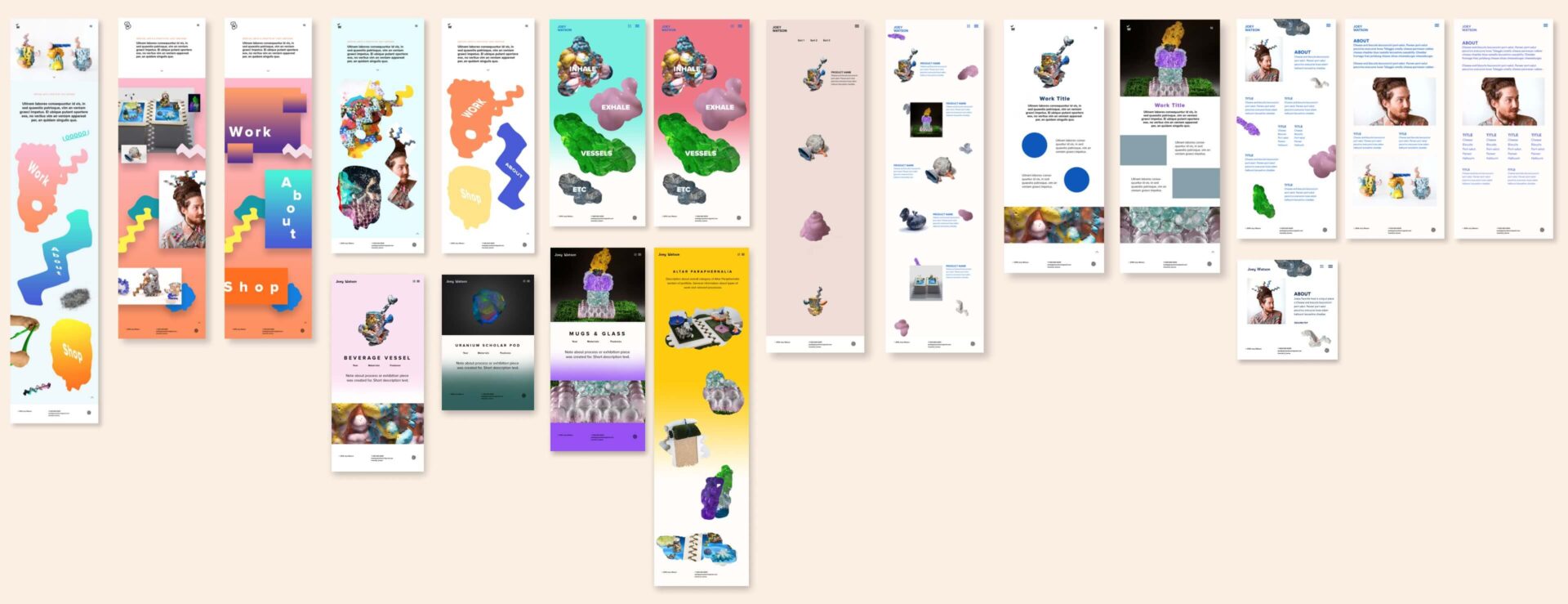
We added fidelity to wireframes with imagery and colors/textures sampled from Joey's work. Throughout the process, we collaborated with Joey to review concepts, and continued to iterate until pages felt right.
We added fidelity to wireframes with imagery and colors/textures sampled from Joey's work. Throughout the process, we collaborated with Joey to review concepts, and continued to iterate until pages felt right.
We added fidelity to wireframes with imagery and colors/textures sampled from Joey's work. Throughout the process, we collaborated with Joey to review concepts, and continued to iterate until pages felt right.
Motion Exploration
Motion Exploration
Motion Exploration
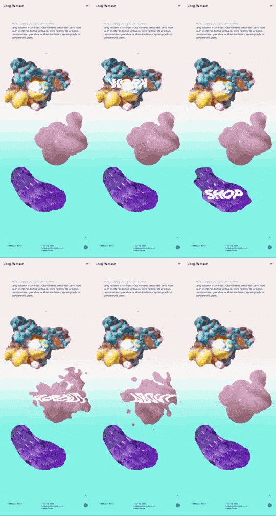
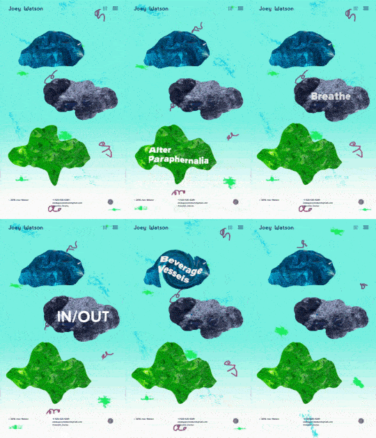
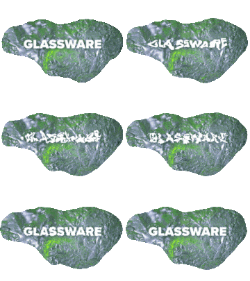
Joey wanted unique hover interactions and background animations. We explored different shapes, masking techniques, textures, and motion pacing to strike the right balance.
Joey wanted unique hover interactions and background animations. We explored different shapes, masking techniques, textures, and motion pacing to strike the right balance.


The Outcome
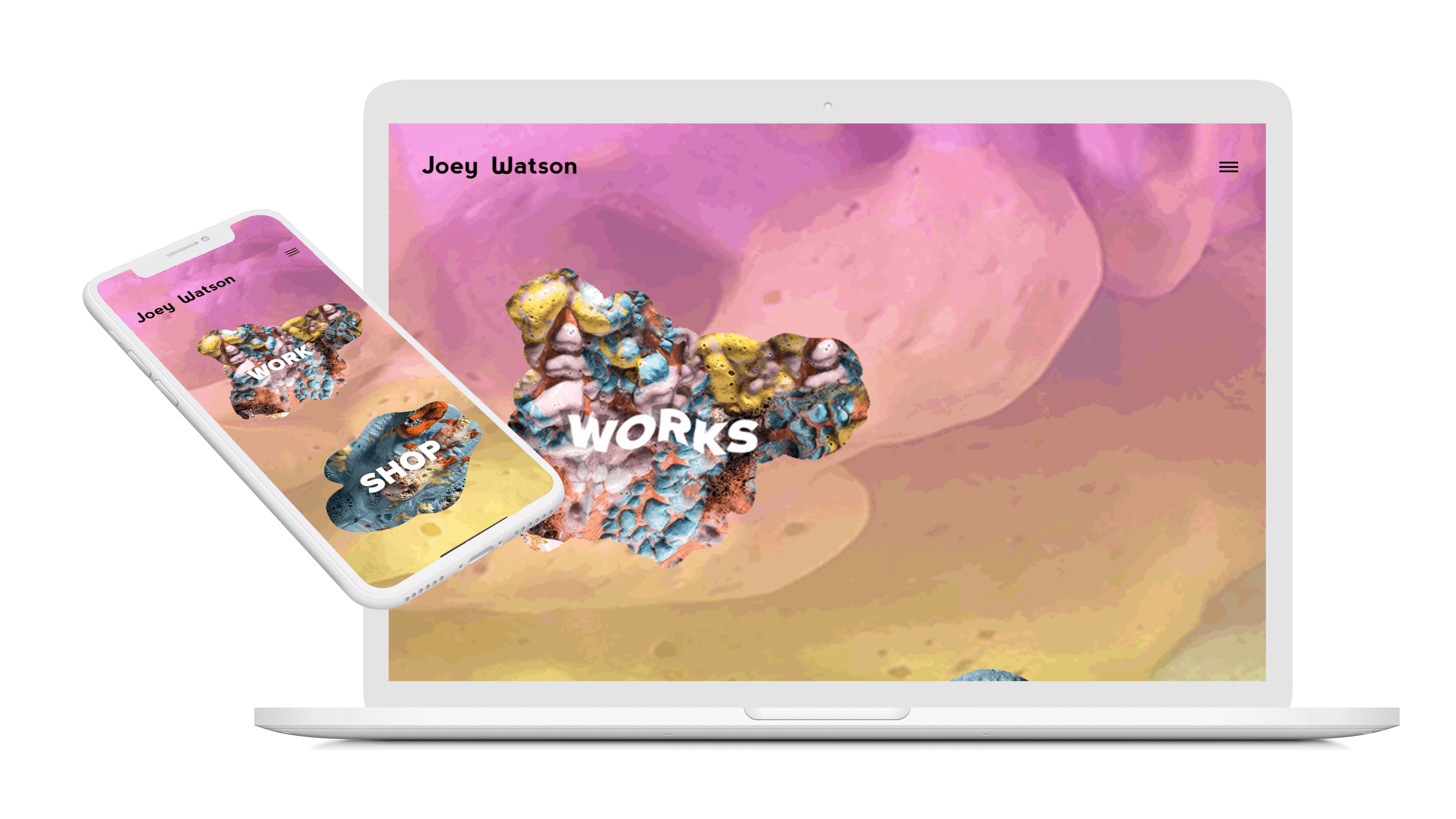
The final website reflects the playful nature of Joey's work while also providing a clear path for the user to navigate through his portfolio. It includes various looping gifs, audio clips, interactive easter egg moments, wonky animations, and textures from Joey's ceramic work. The portfolio experience is also fully responsive.
The final website reflects the playful nature of Joey's work, while also providing a clear path for the user to navigate through his portfolio. It includes various looping gifs, audio clips, interactive easter egg moments, wonky animations and textures from Joey's ceramic work. The portfolio experience is also fully responsive.
The final website reflects the playful nature of Joey's work, while also providing a clear path for the user to navigate through his portfolio. It includes various looping gifs, audio clips, interactive easter egg moments, wonky animations and textures from Joey's ceramic work. The portfolio experience is also fully responsive.
Home Page
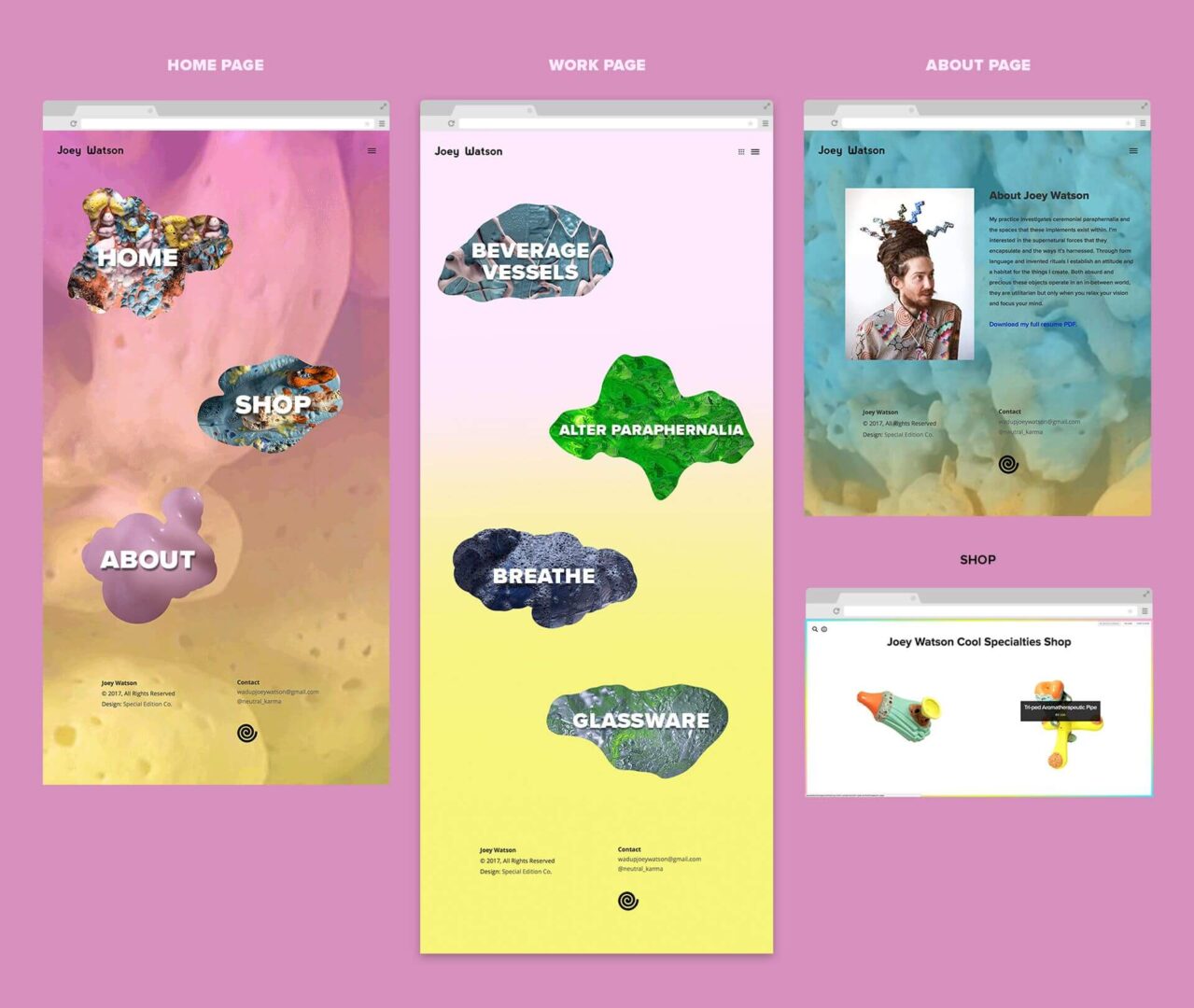
The home page features a pulsating gradient background with textures sampled from Joey's work. Page links also feature sampled textures and animated hover states with audio clips created by Joey.
Work Overview Page
The work overview page features sampled textures and animated hover states with audio clips representing each category of work. This page allows the user to select which type of work they would like to view.
The work overview page features sampled textures and animated hover states with audio clips representing each category of work. This page allows the user to select which type of work they would like to view.
The work overview page features sampled textures and animated hover states with audio clips representing each category of work. This page allows the user to select which type of work they would like to view.
Work Category Page
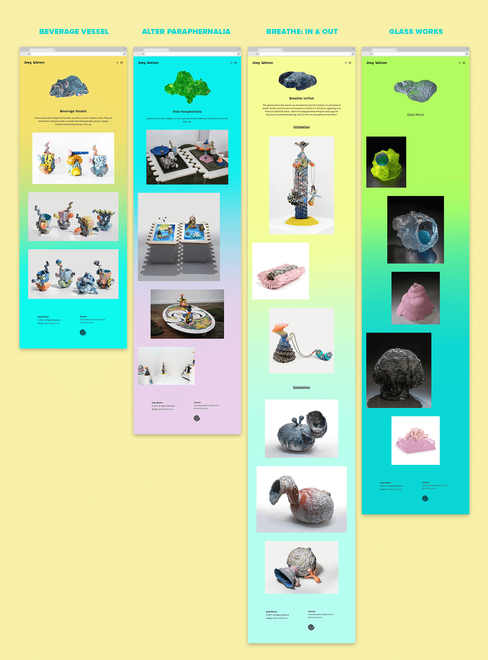
Each work category page provides a brief description of the type of work and links to each piece to learn more about the creative process and view imagery.
Each work category page provides a brief description about the type of the work and links to each piece to learn more about the creative process and view imagery.
Each work category page provides a brief description of the type of work and links to each piece to learn more about the creative process and view imagery.
About Page
The about page features Joey's photo, artist statement, and a downloadable resume. The gradient background features more sampled textures and a custom audio clip created by Joey using one of his ceramic instruments plays in the background. Playful interactions like hovering over Joey's image to change colors and the ability to move elements around the page offer moments of discovery for the user.
The about page features Joey's photo, artist statement, and a downloadable resume. The gradient background features more sampled textures and a custom audio clip created by Joey using one of his ceramic instruments plays in the background. Playful interactions like hovering over Joey's image to change colors and the ability to move elements around the page offer moments of discovery for the user.
The about page features Joey's photo, artist statement, and a downloadable resume. The gradient background features more sampled textures and a custom audio clip created by Joey using one of his ceramic instruments plays in the background. Playful interactions like hovering over Joey's image to change colors and the ability to move elements around the page offer moments of discovery for the user.
Portfolio Grid View
We established a simple high-level view of categorized projects which expands from the grid icon. This enables users to easily browse Joey's whole body of work without having to jump back to category pages.
We established a simple high-level view of categorized projects which expands from the grid icon. This enables users to easily browse Joey's whole body of work without having to jump back to category pages.
We established a simple high-level view of categorized projects which expands from the grid icon. This enables users to easily browse Joey's whole body of work without having to jump back to category pages.
Primary Pages
Primary Pages
Primary Pages
Work Category Pages
Work Category Pages
Work Category Pages
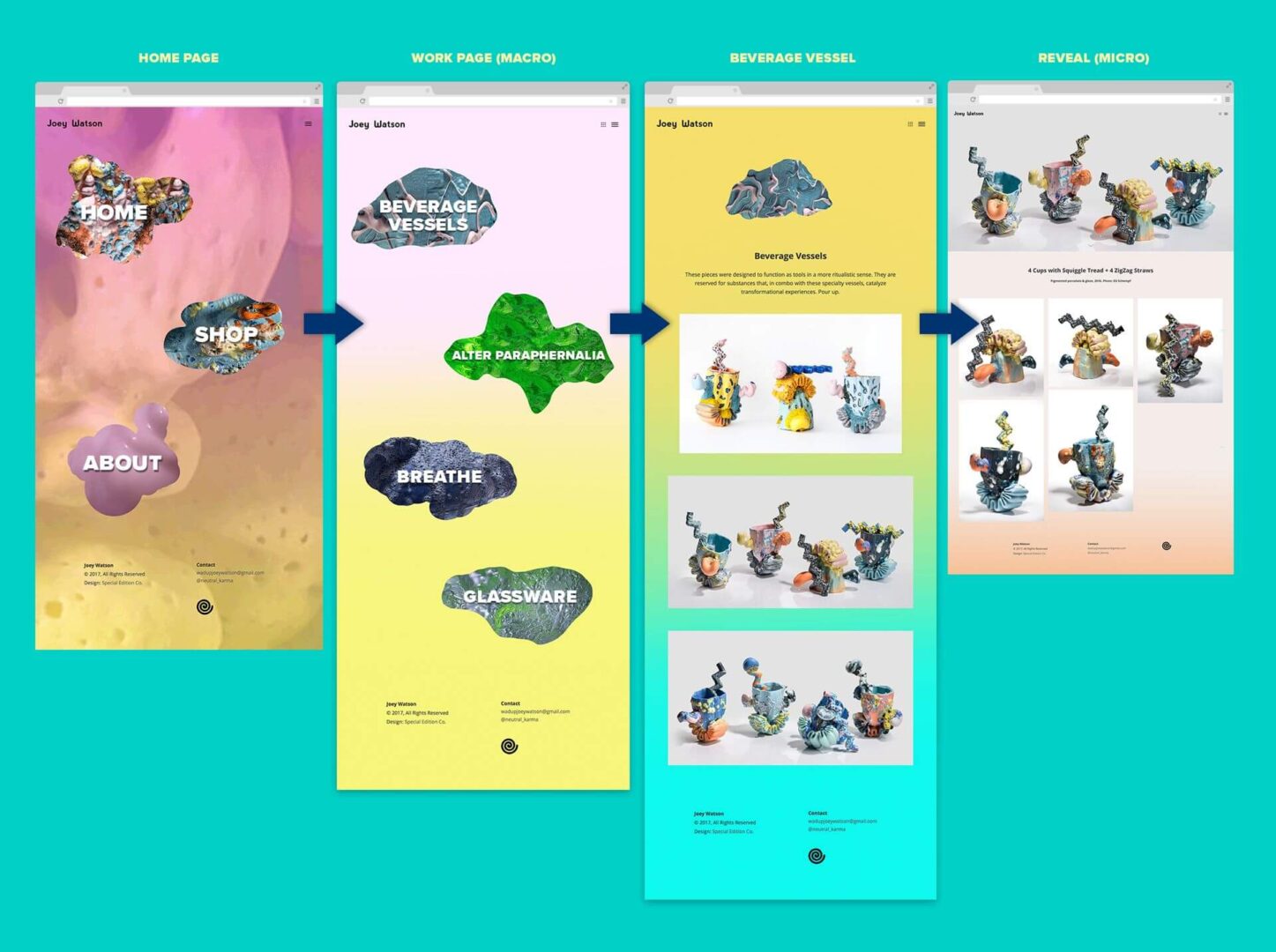
Page Flow
Page Flow
Page Flow

Sam Small Design
© 2024
Contact
Connect

