Welcome to the Archives
More work from the archives including collaborations, case studies, killed concepts, and more.
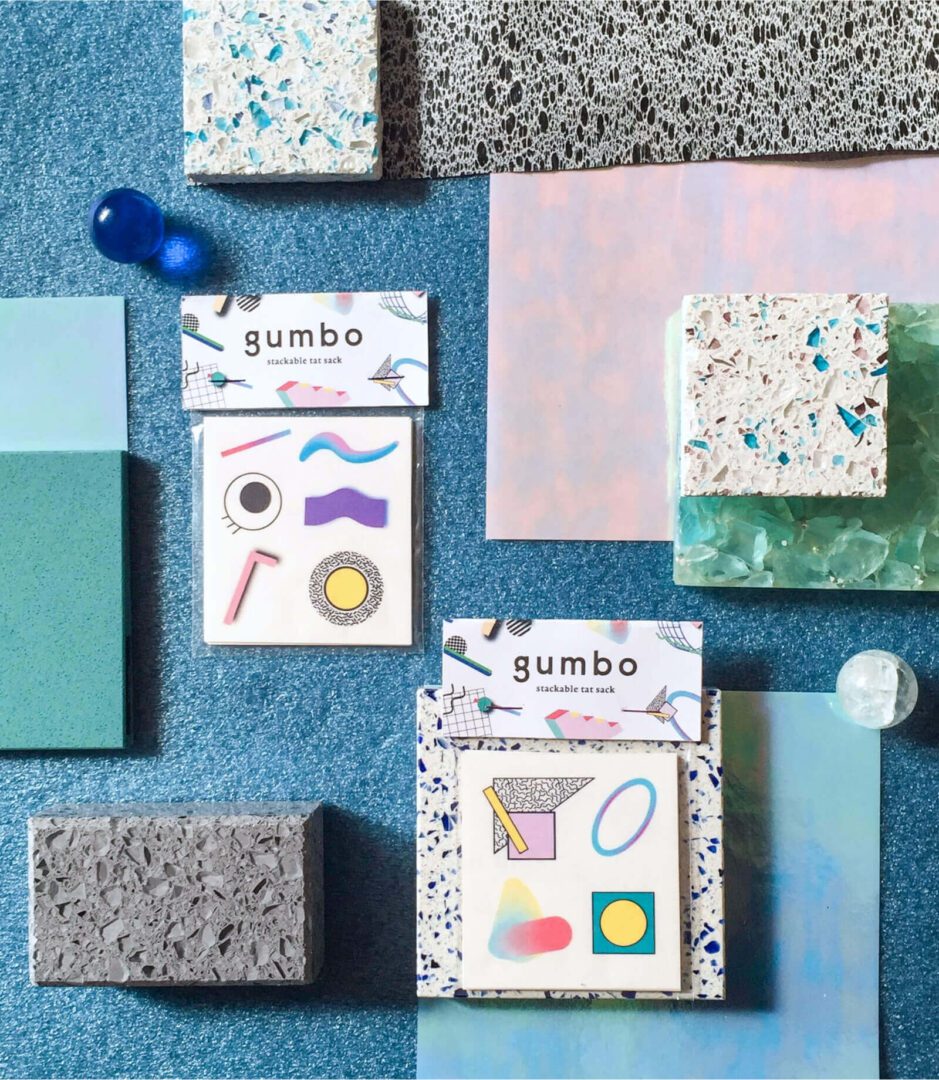
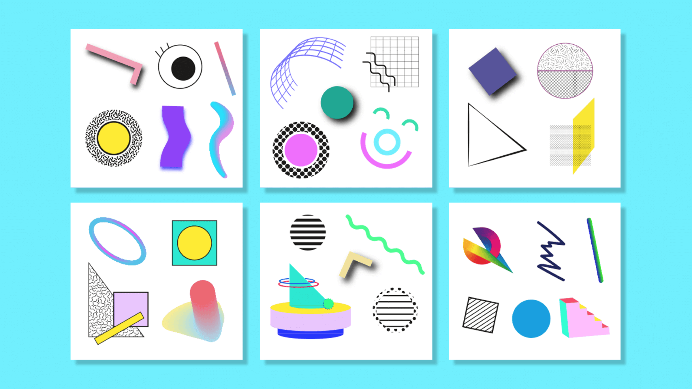
Gumbo Stackable Temporary Tats
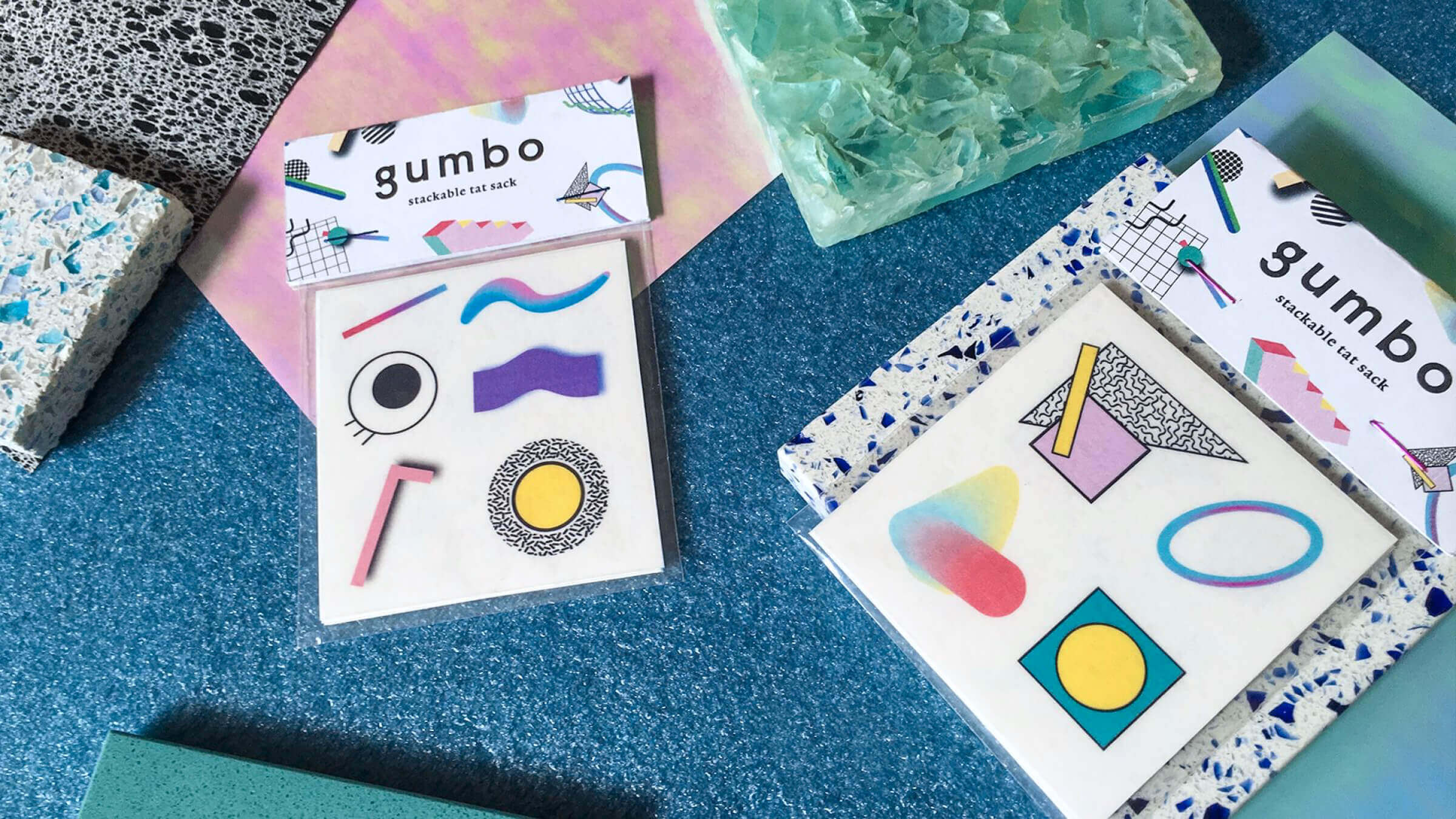
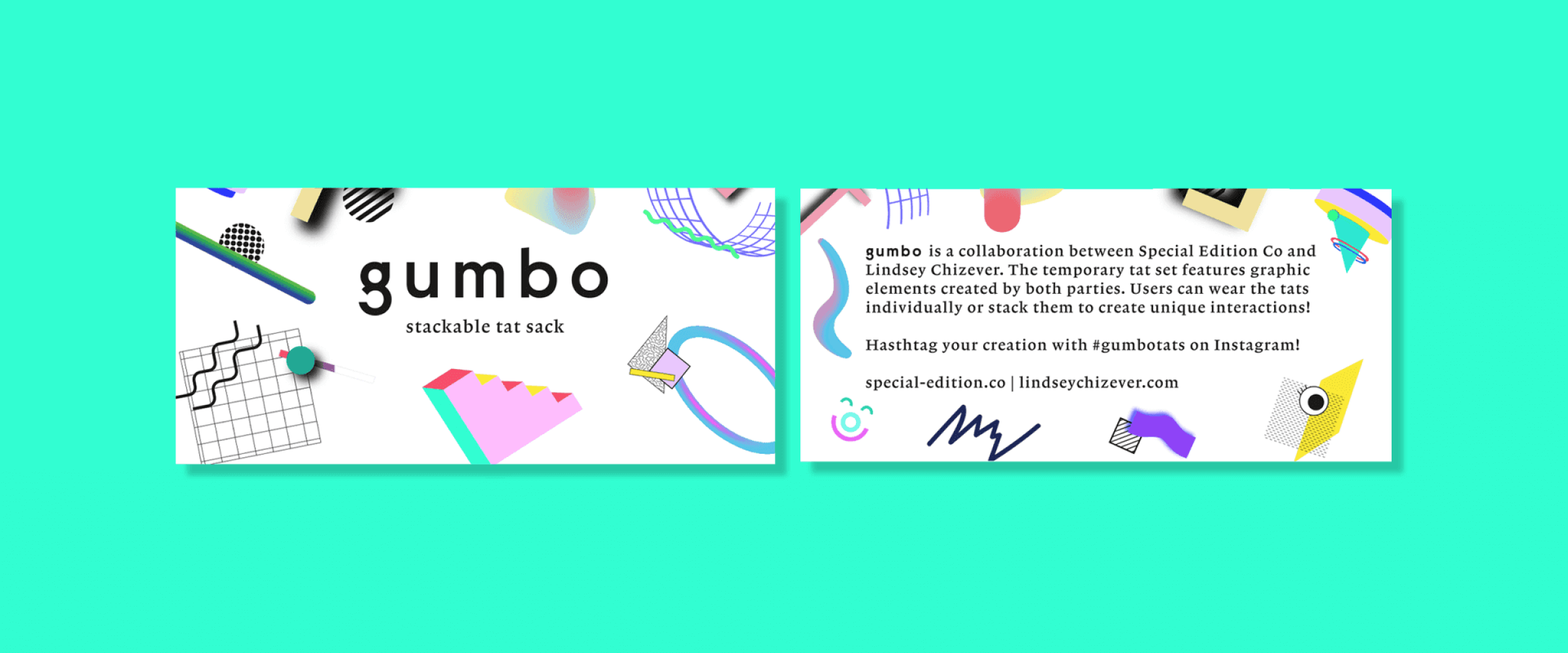
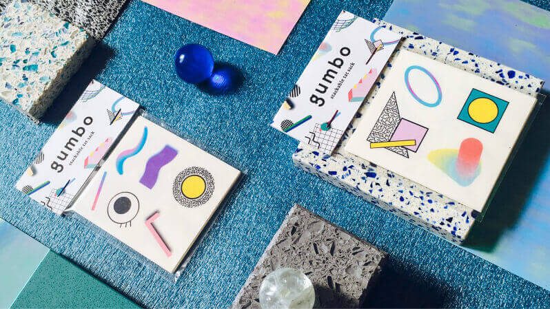
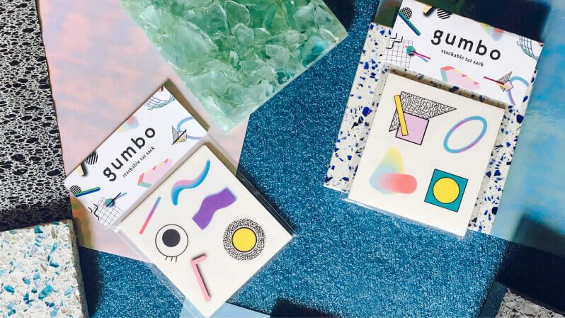
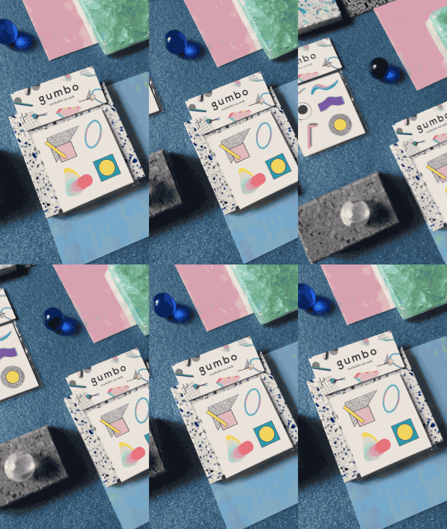
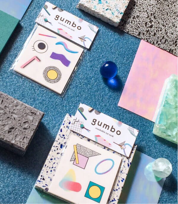
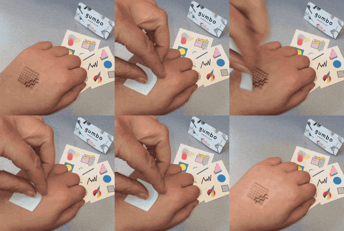
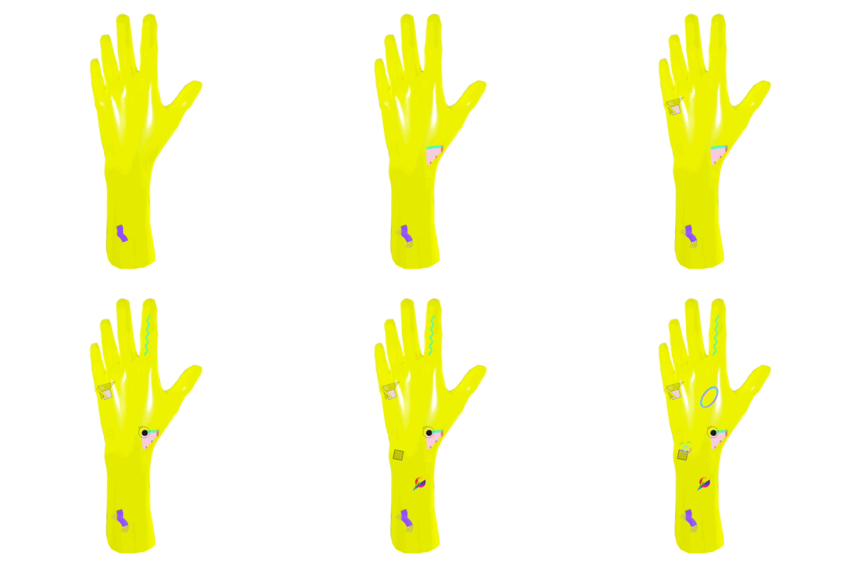
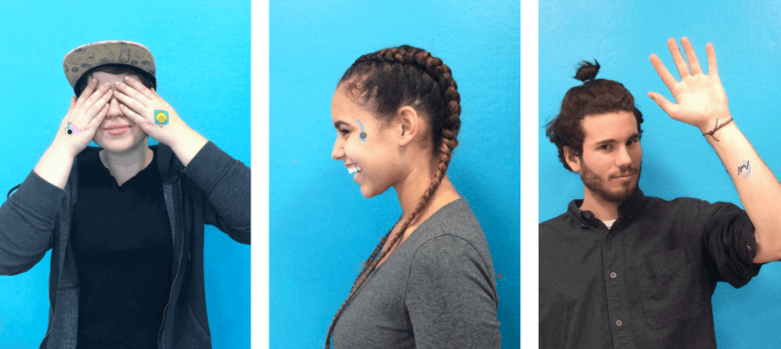
Gumbo was a fun collaboration between Special Edition Co. and designer Lindsey Chizever. We wanted to create something unique and tactile. We decided on temporary tattoos because users can wear them individually or stack several to create their own custom interactions. The set features graphic elements created by both parties. We packaged them up and sold out online!
Collaborators
Lindsey Chizever
Trent Roach
Special Edition Co.
Completed
2016
My Role
Print Design
OBJET Cool Workshop & Block Party
OBJET Cool Workshop & Block Party
OBJET Cool Workshop & Block Party
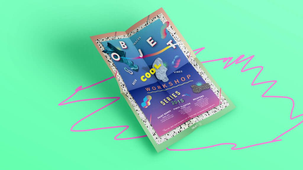
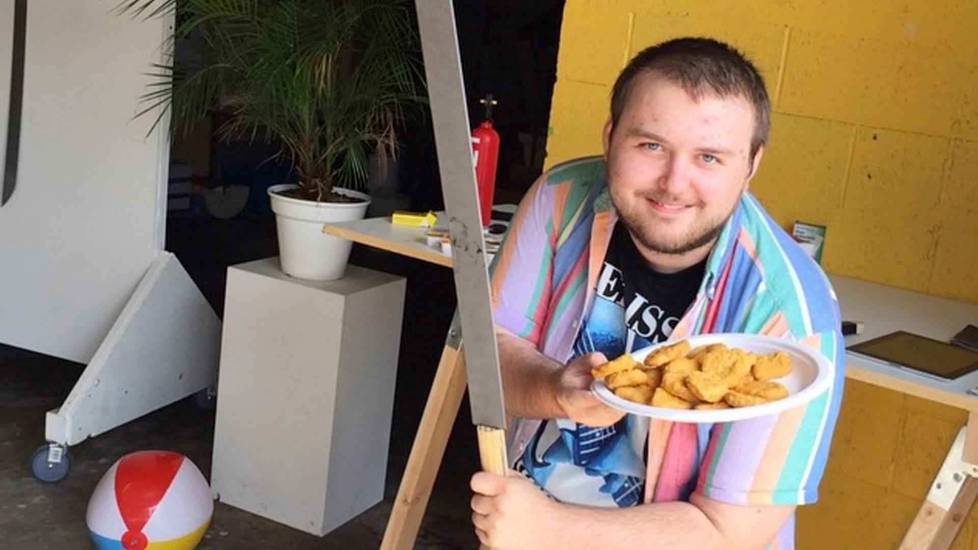
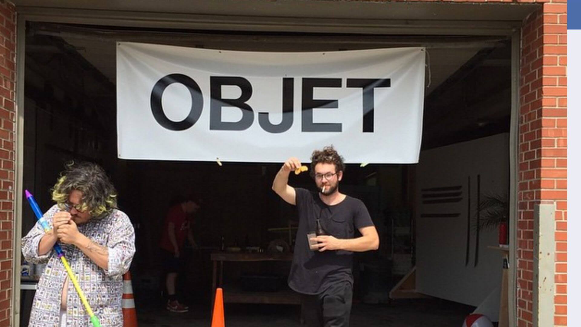
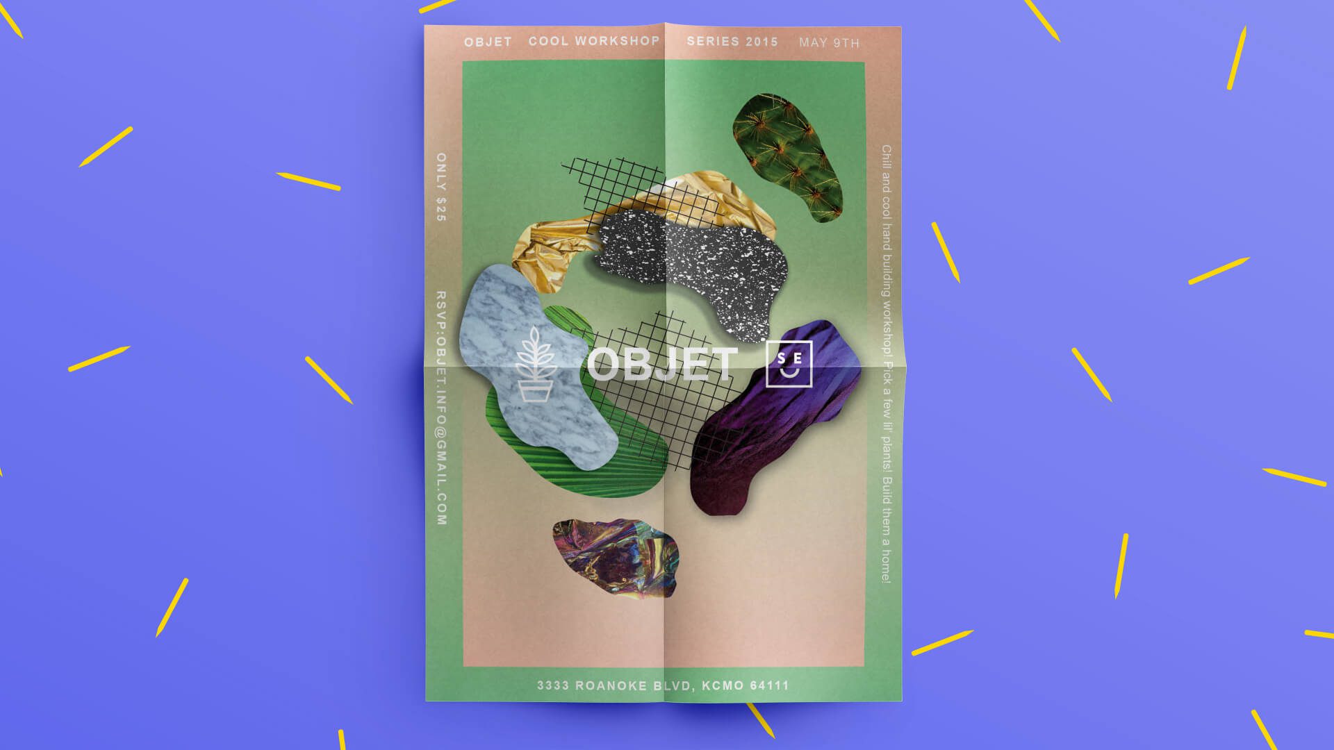
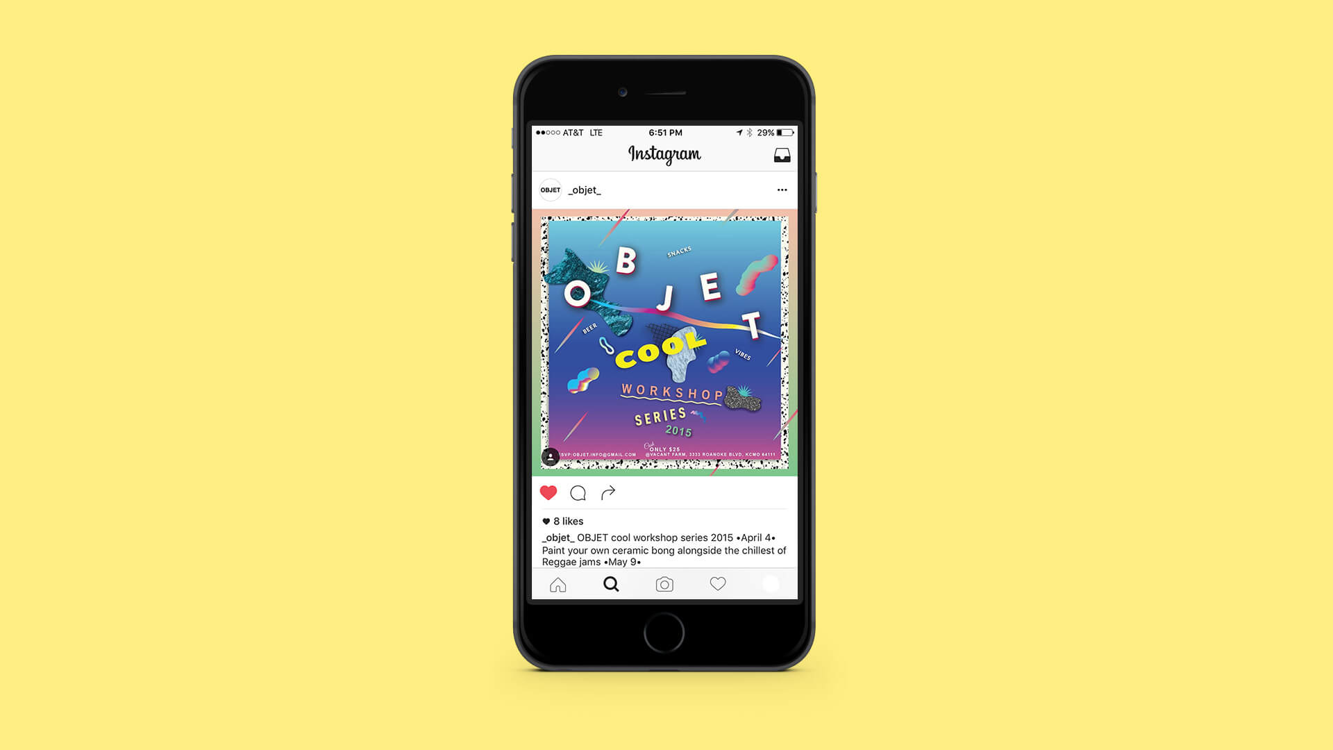
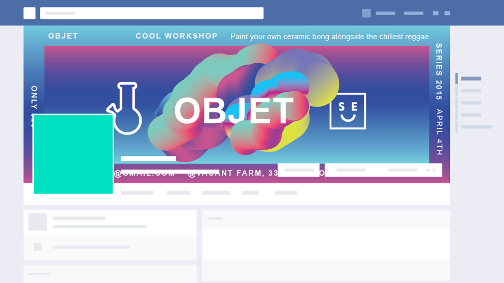
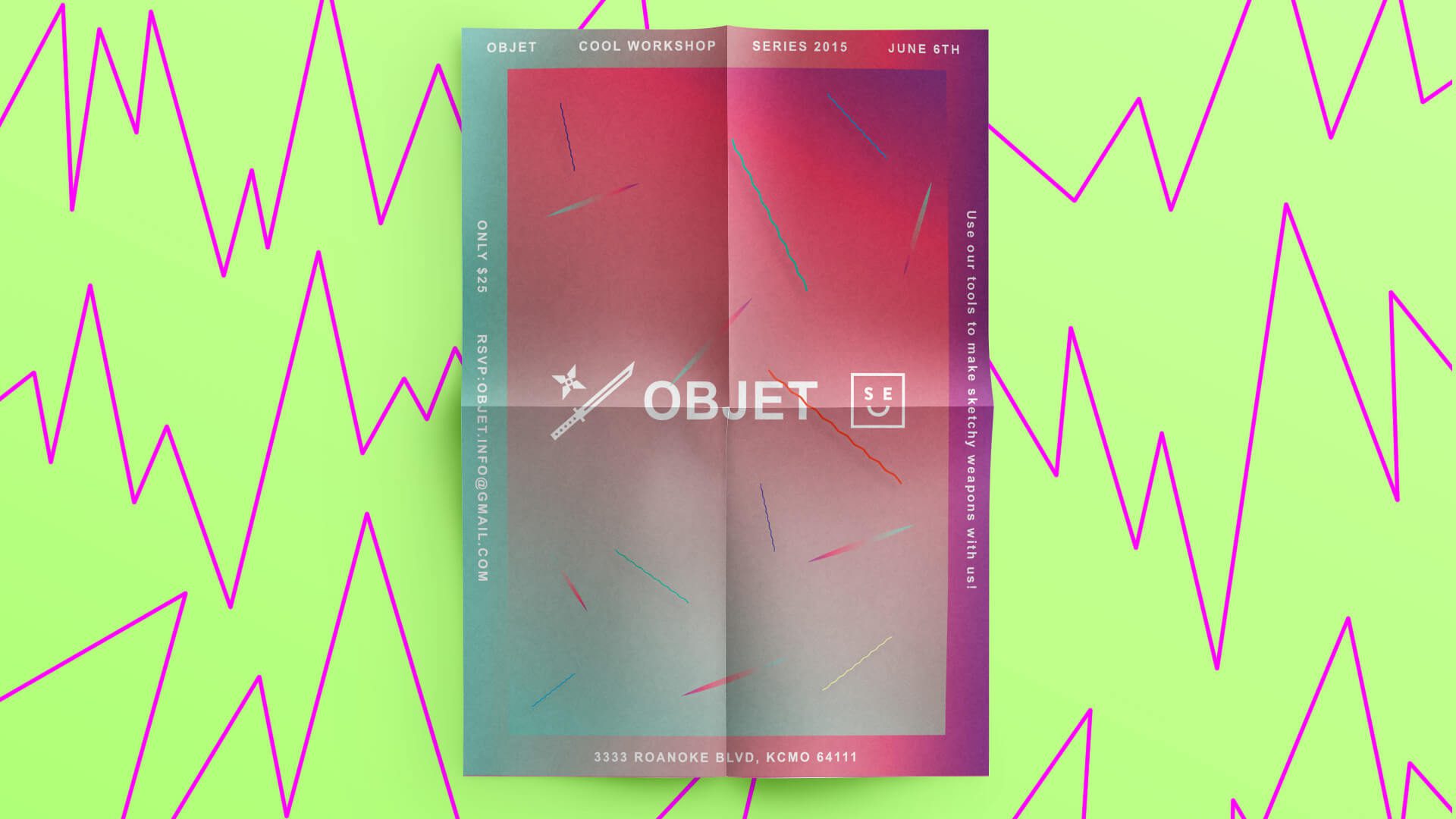
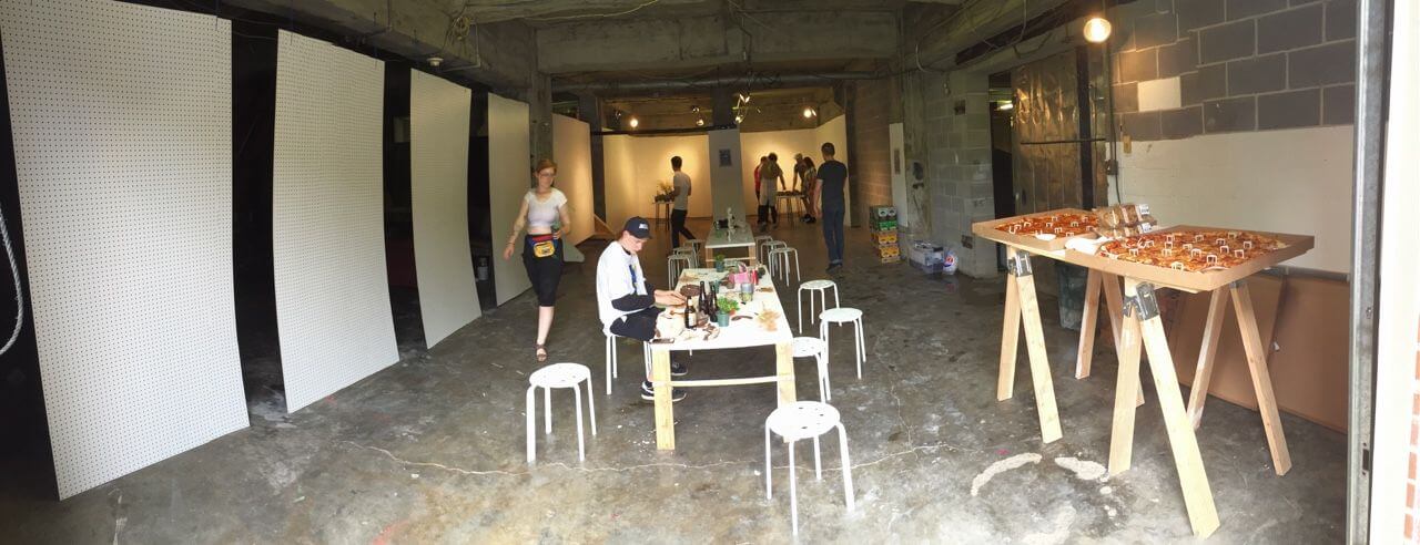
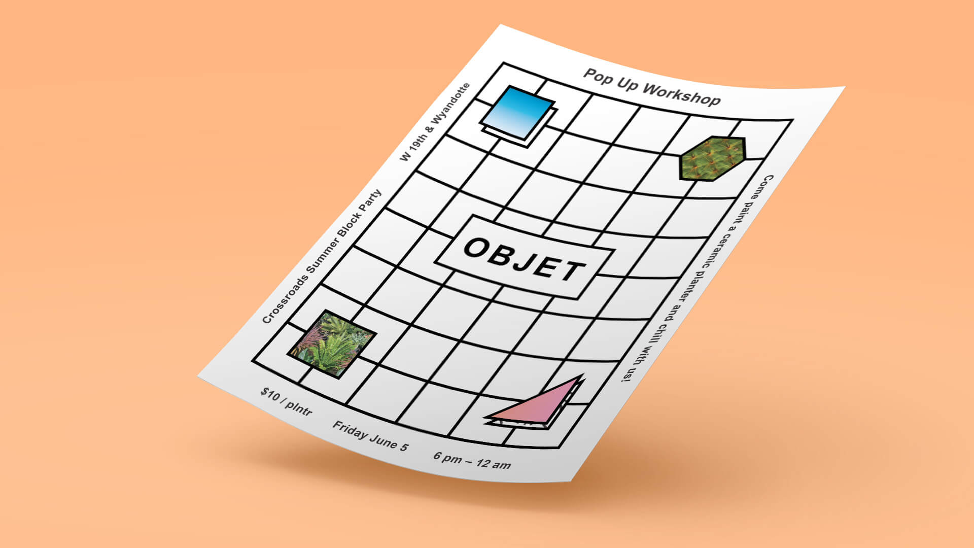
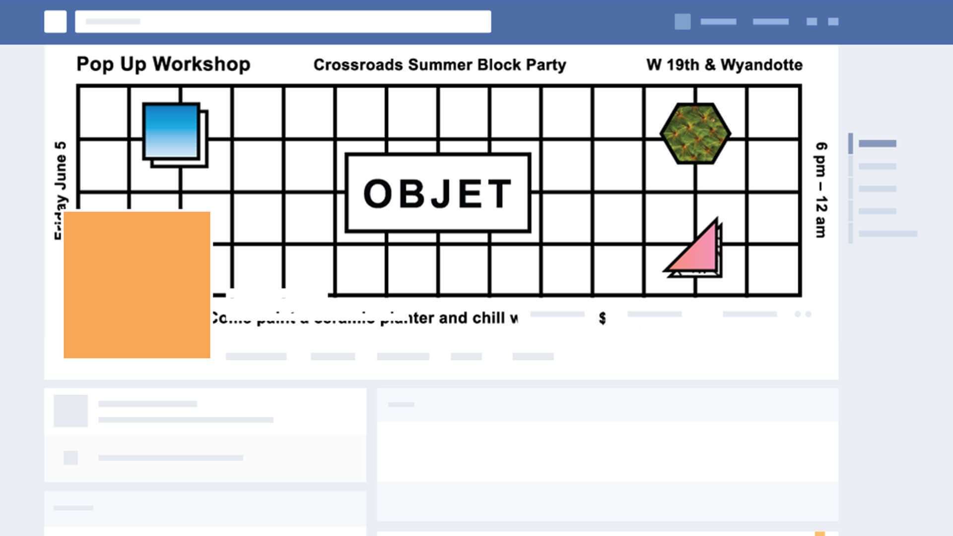
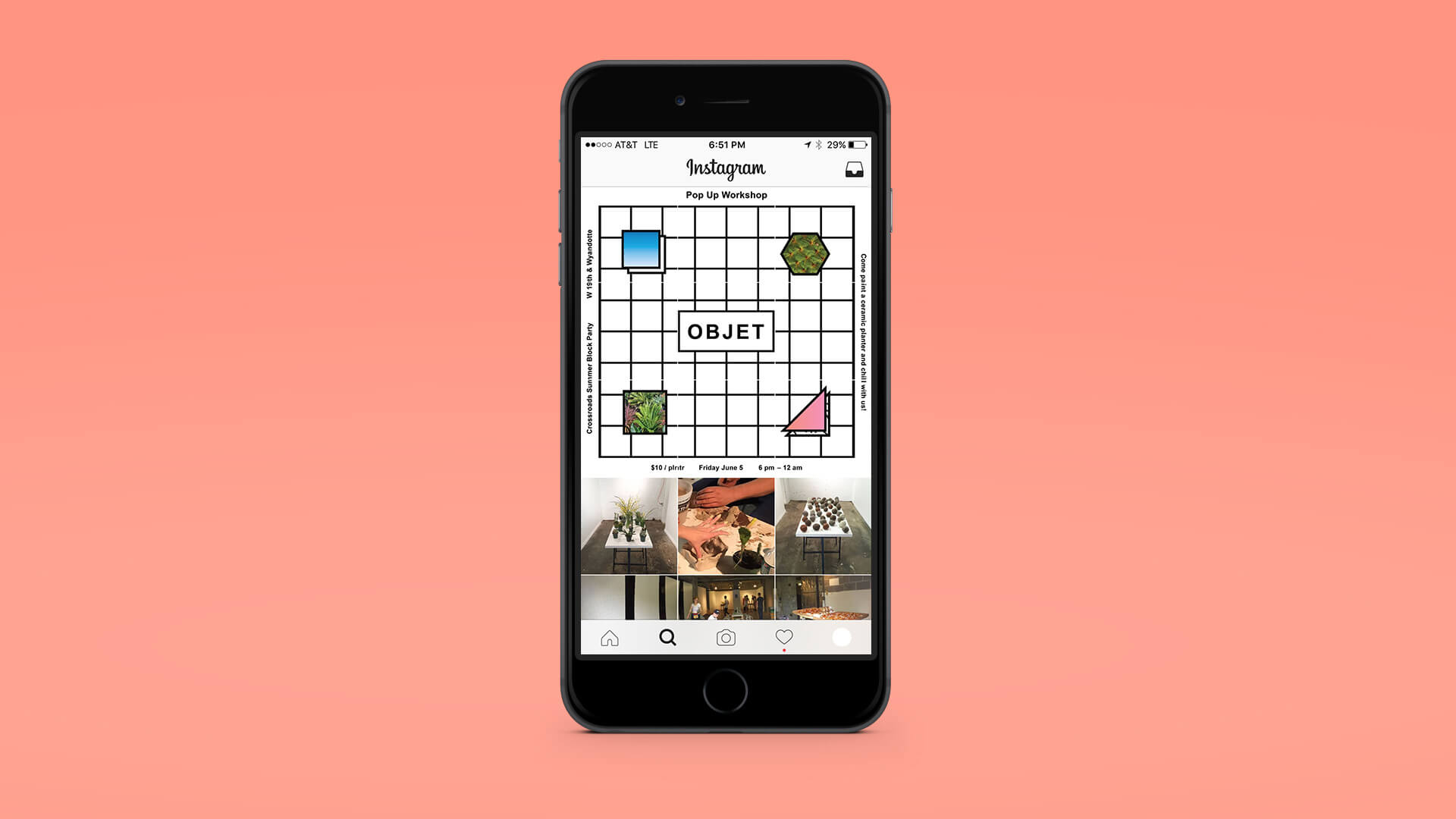
Objet hosted a series of workshops focused on creating and customizing ceramics and weapons. The workshops took place at Vacant Farm in Kansas City. Objet reached out to Special Edition Co. to create a visual campaign for the workshops. We designed posters and handbills focused on the nature of the workshops. We also created social media promos for the workshops. Shortly after the workshops, we also created an additional poster for an Objet pop up shop.
Objet hosted a series of workshops focused on creating and customizing ceramics and weapons. The workshops took place at Vacant Farm in Kansas City. Objet reached out to Special Edition Co. to create a visual campaign for the workshops. We designed posters and handbills focused on the nature of the workshops. We also created social media promos for the workshops. Shortly after the workshops, we also created an additional poster for an Objet pop up shop.
Objet hosted a series of workshops focused on creating and customizing ceramics and weapons. The workshops took place at Vacant Farm in Kansas City. Objet reached out to Special Edition Co. to create a visual campaign for the workshops. We designed posters and handbills focused on the nature of the workshops. We also created social media promos for the workshops. Shortly after the workshops, we also created an additional poster for an Objet pop up shop.
My Role
Event Campaign Design
Promotional Design
Collaborators
Trent Roach
Special Edition Co.
Completed
2015
RVSVR (Reality vs. Virtual Reality) Zine
RVSVR (Reality vs Virtual Reality) Zine
RVSVR (Reality vs. Virtual Reality) Zine
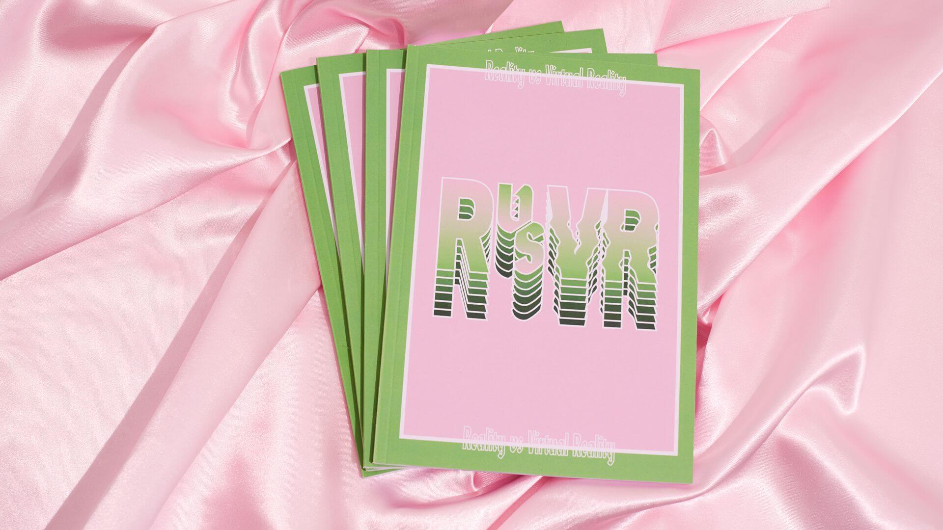
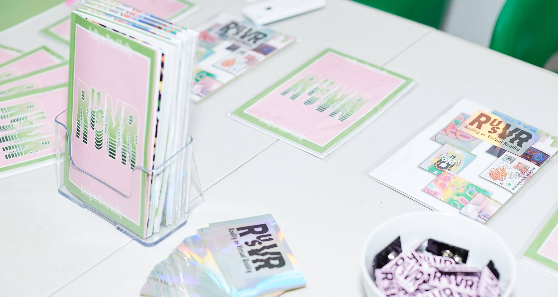
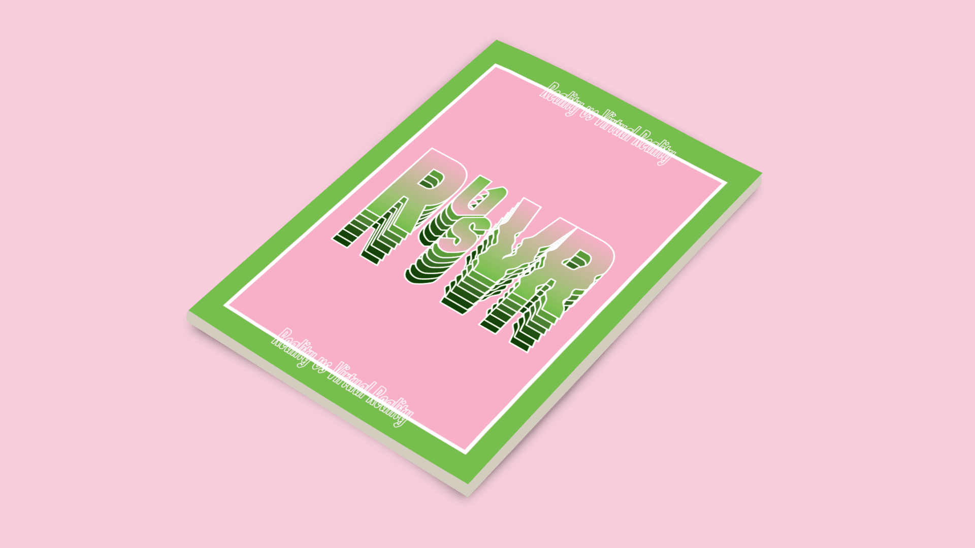
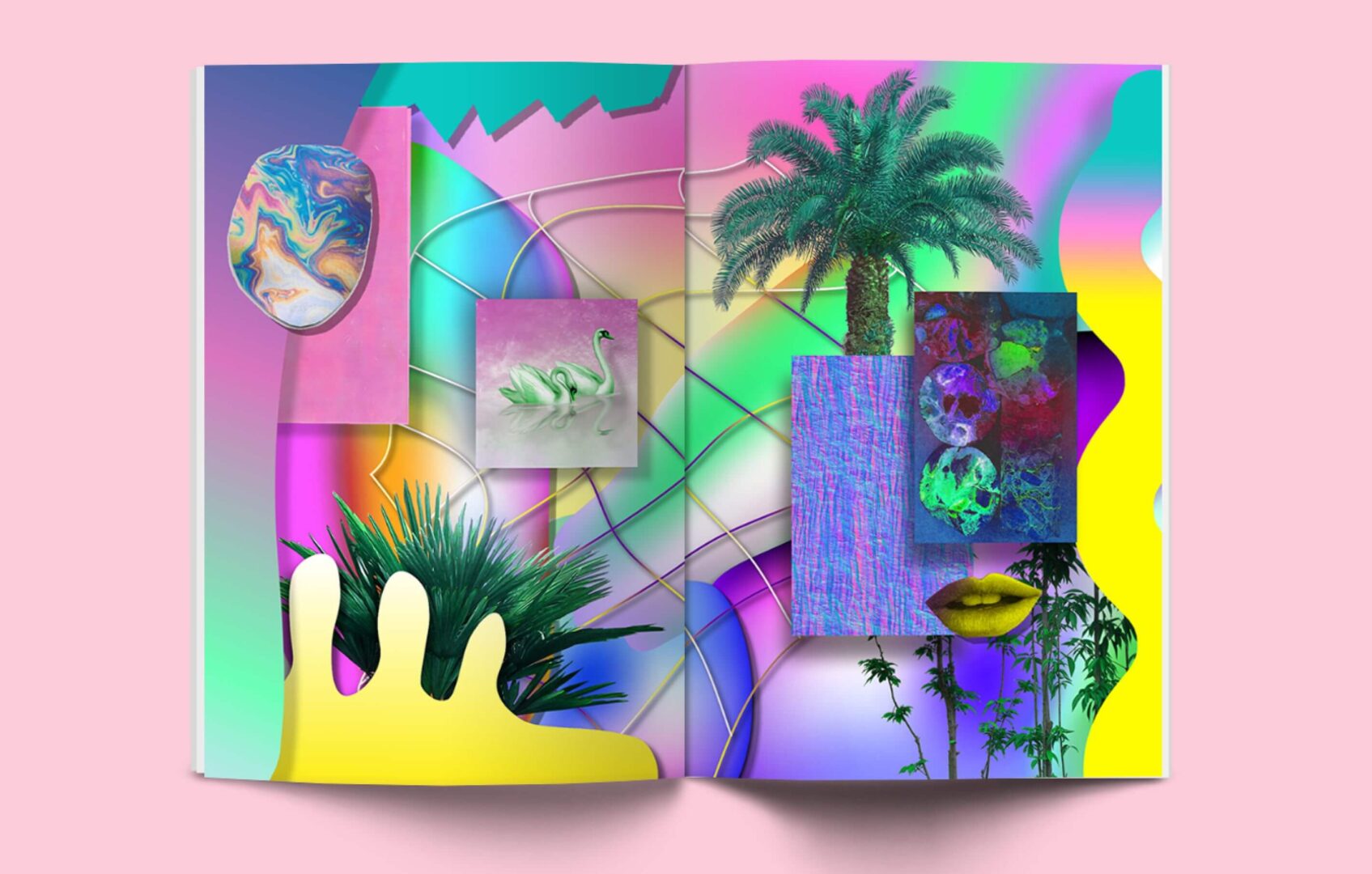
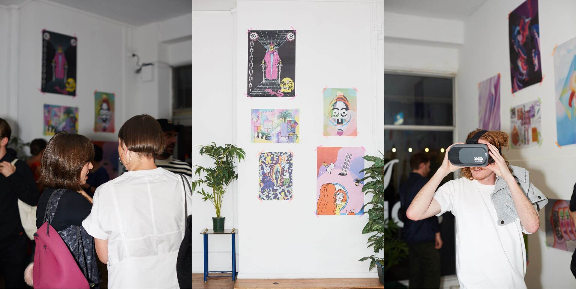
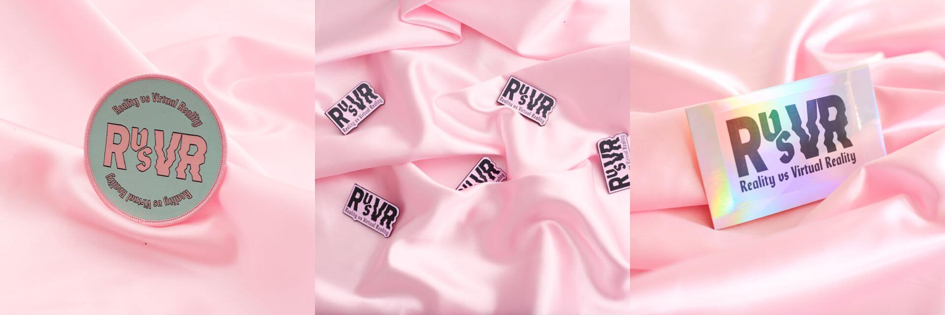
RVSVR (Reality vs. Virtual Reality) is a zine created by designers Christie Morgan and Chrissie Abbott. Special Edition Co. was asked to contribute work alongside 24 other artists across Australia, the UK, and the US. The concept behind this project was to showcase in physical form, the idea of reality and virtual reality shown visually through a series of digital art.
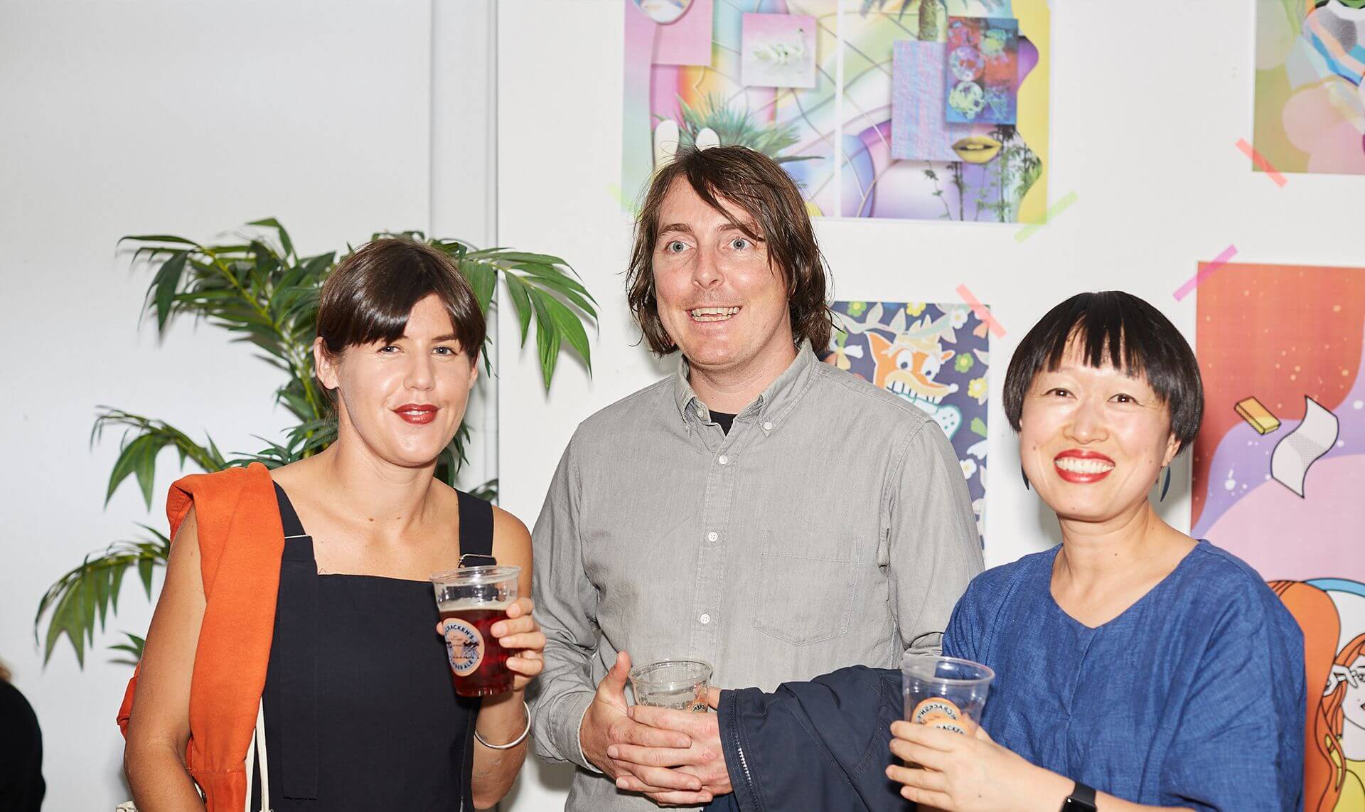
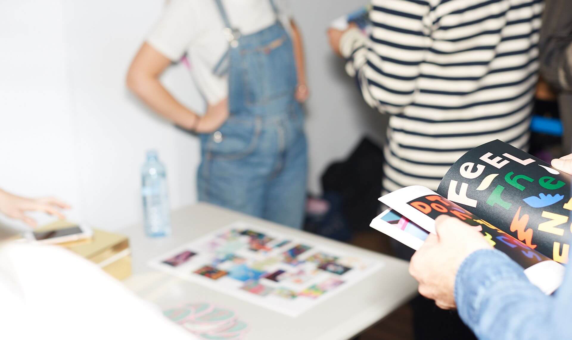
The works were also exhibited in Melbourne as part of the zine launch party at Magic Johnston in 2017. Another launch party was also held in Los Angeles at the Ace Hotel.
RVSVR (Reality vs Virtual Reality) is a zine created by designers Christie Morgan and Chrissie Abbott. Special Edition Co. was asked to contribute work alongside 24 other artists across Australia, the UK, and the US. The concept behind this project was to showcase in physical form, the idea of reality and virtual reality shown visually through a series of digital art.
The works were also exhibited in Melbourne as part of the zine launch party at Magic Johnston in 2017. Another launch party was also held in Los Angeles at the Ace Hotel.
RVSVR (Reality vs. Virtual Reality) is a zine created by designers Christie Morgan and Chrissie Abbott. Special Edition Co. was asked to contribute work alongside 24 other artists across Australia, the UK, and the US. The concept behind this project was to showcase in physical form, the idea of reality and virtual reality shown visually through a series of digital art.
The works were also exhibited in Melbourne as part of the zine launch party at Magic Johnston in 2017. Another launch party was also held in Los Angeles at the Ace Hotel.
My Role
Digital Design
Print Design
Completed
2017
Special Edition Co's Zine Spread
Special Edition Co's Zine Spread
Special Edition Co's Zine Spread
Graphic Platters
Graphic Platters
Graphic Platters
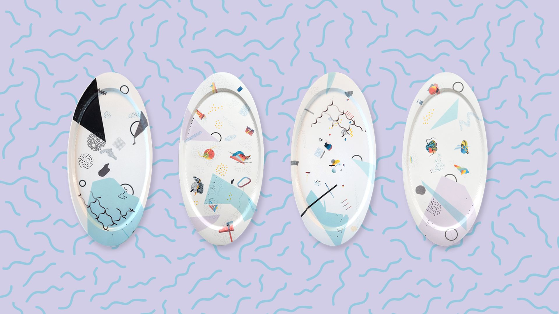
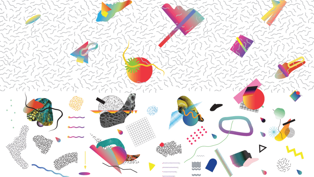
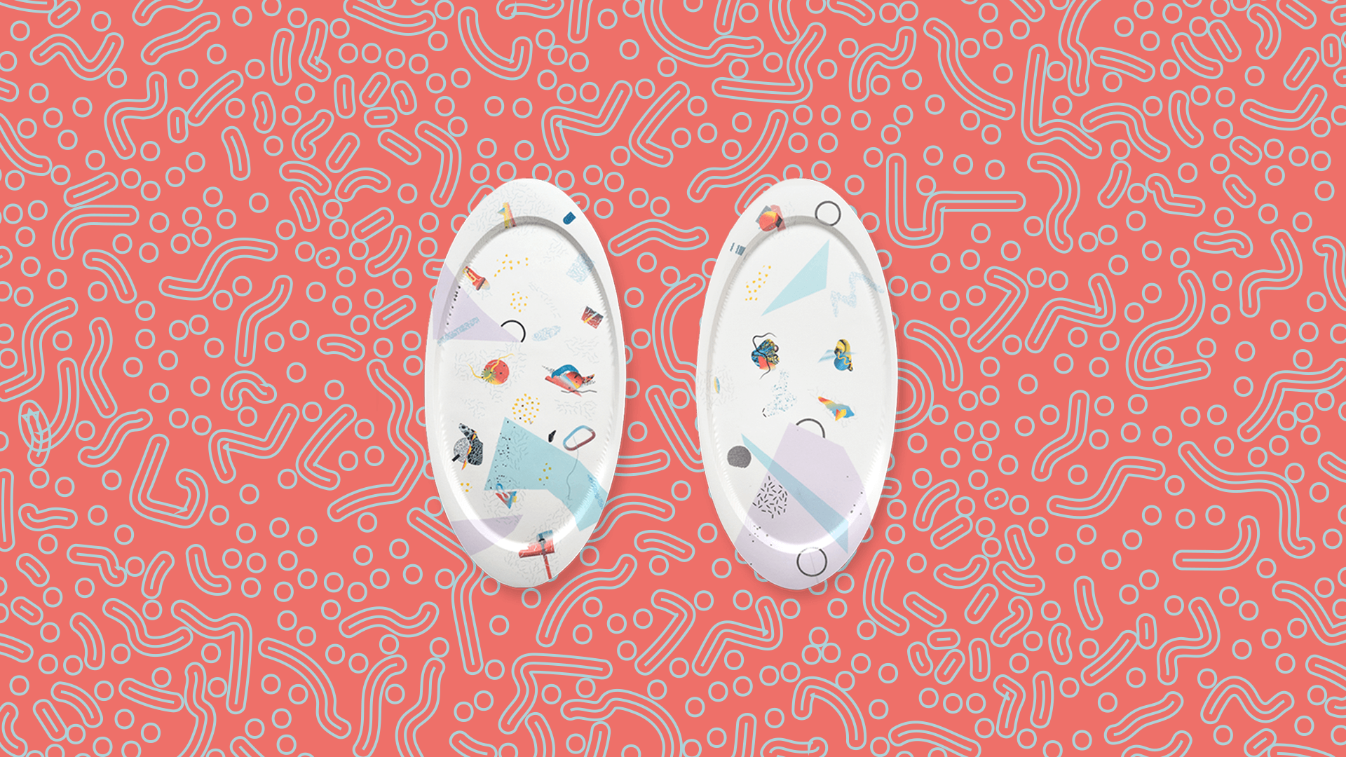
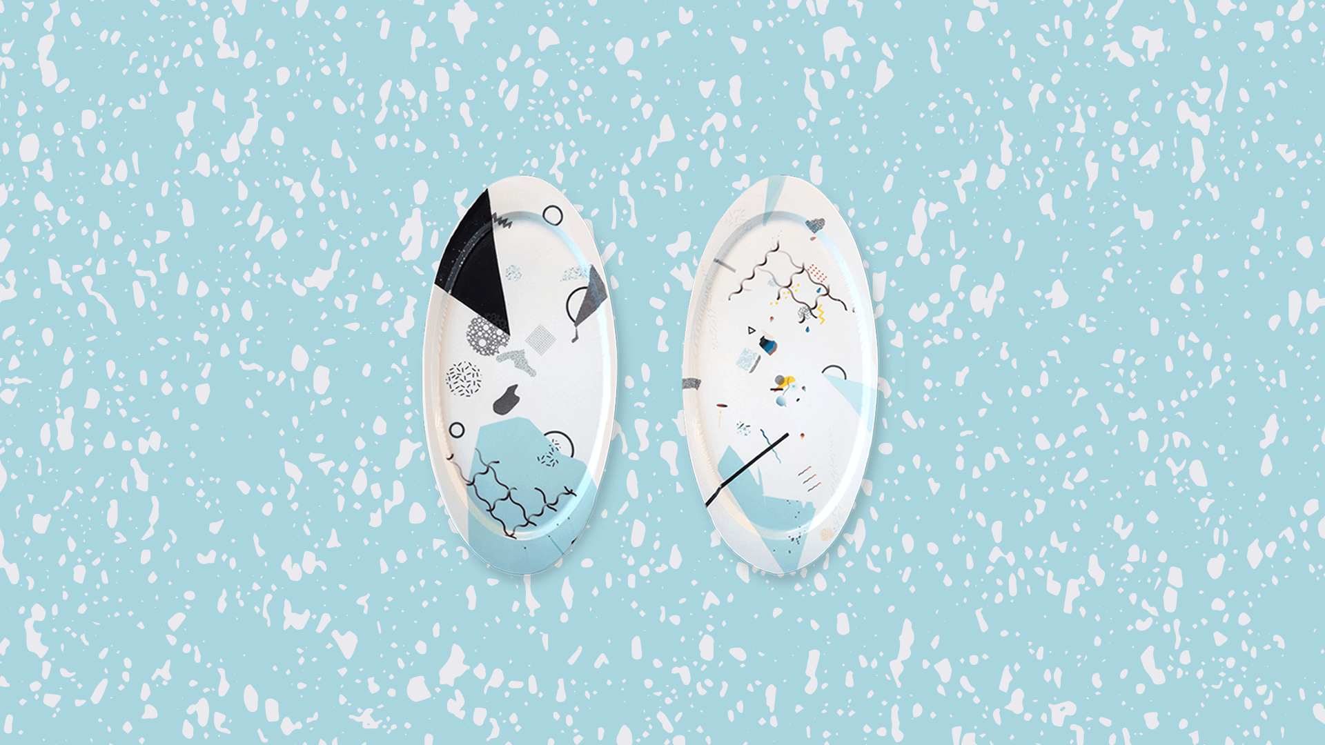
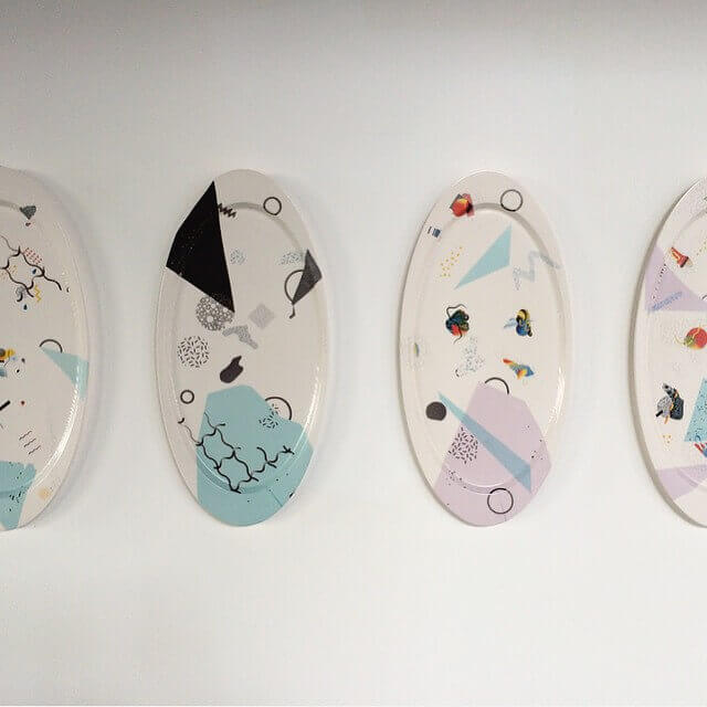
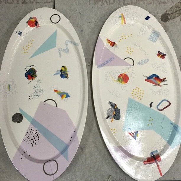
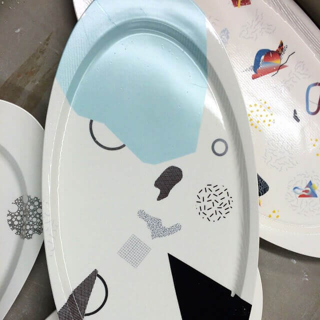
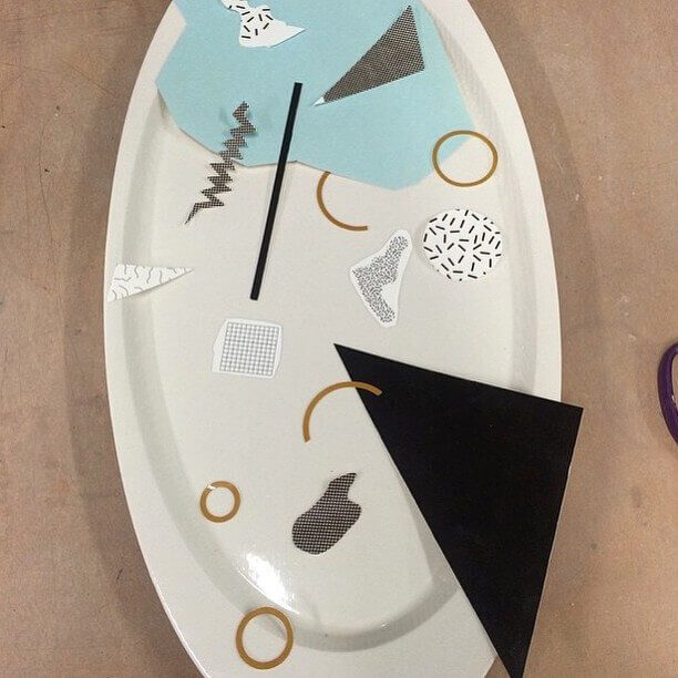
Special Edition Co. collaborated with ceramicist Lea McCormick Griggs on these graphic ceramic platters. Lea uses ceramic decals regularly in his work, offering opportunities for graphic and photographic applications directly to ceramic pieces. We designed the graphics, printed them on ceramic decal paper, and collaboratively placed the elements on each of the four platters.
Each platter measures 11" x 22" x 2".
Special Edition Co. collaborated with ceramicist Lea McCormick Griggs on these graphic ceramic platters. Lea uses ceramic decals regularly in his work, offering opportunities for graphic and photographic application directly to ceramic pieces. We designed the graphics, printed them on ceramic decal paper and collaboratively placed the elements on each of the four platters.
Each platter measures 11" x 22" x 2".
Special Edition Co. collaborated with ceramicist Lea McCormick Griggs on these graphic ceramic platters. Lea uses ceramic decals regularly in his work, offering opportunities for graphic and photographic applications directly to ceramic pieces. We designed the graphics, printed them on ceramic decal paper, and collaboratively placed the elements on each of the four platters.
Each platter measures 11" x 22" x 2".
My Role
Graphic Decal Design
Collaborators
Trent Roach
Lea McCormick Griggs
Recognition
Featured in Red Star Studios Artist
in Residence Annual Exhibition
Recognition
Featured in Red Star Studios Artist
in Residence Annual Exhibition
Recognition
Featured in Red Star Studios Artist
in Residence Annual Exhibition
Completed
2015
Guts + Glory Website
Guts + Glory Website
Guts + Glory Website
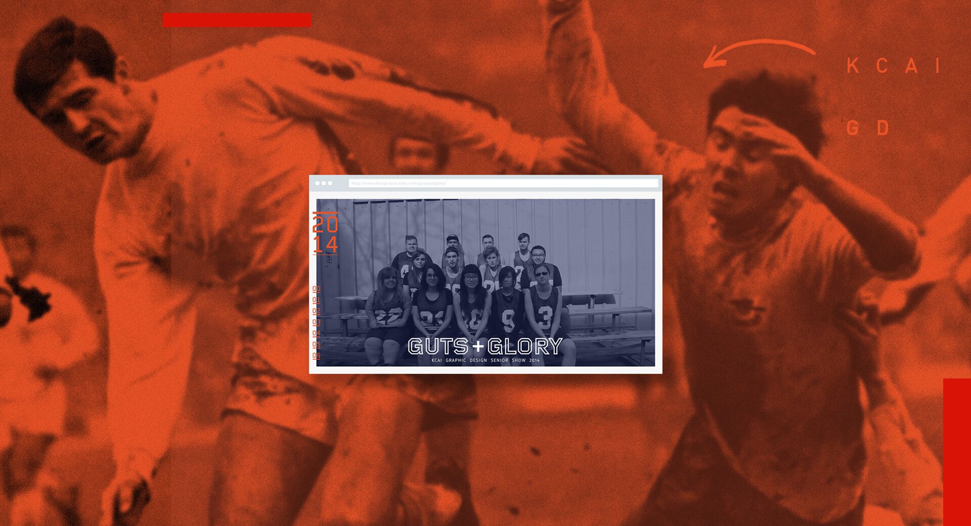
I collaborated with designer/developer Edwing Mendez on the design for the long scroll, one-page website promoting the 2014 Kansas City Art Institute Graphic Design Senior Show. The sports concept for the show focused on our successes and failures as a class or "team." This concept is conveyed in the copy, gifs, photography, and graphic elements on the website. Highlights of the design include the navigation featuring numerical treatment reminiscent of jersey numbers and unique hover states throughout.
I collaborated with designer and developer Edwing Mendez on the design for the long scroll, one-page website promoting the 2014 Kansas City Art Institute Graphic Design Senior Show. The sports concept for the show focused on our successes and failures as a class, or "team". This concept is conveyed in the copy, gifs, photography and graphic elements on the website. Highlights of the design include the navigation featuring numerical treatment reminiscent of jersey numbers and unique hover states throughout.
I collaborated with designer/developer Edwing Mendez on the design for the long scroll, one-page website promoting the 2014 Kansas City Art Institute Graphic Design Senior Show. The sports concept for the show focused on our successes and failures as a class or "team." This concept is conveyed in the copy, gifs, photography, and graphic elements on the website. Highlights of the design include the navigation featuring numerical treatment reminiscent of jersey numbers and unique hover states throughout.
My Role
Web Design
Collaborators
Edwing Mendez
Features
One Page Love
zxcvbnmnbvcxz
Completed
2014
00 | G+G: Landing page with team photo
01 | About: Description of the concept
02 | Team: Team section with linked portfolios
03 | Coaches: Coaches (teachers) section
04 | Gamedays: Show opening dates
05 | Location
06 | Connect: Integrated social media
00 | G+G: Landing page with team photo
01 | About: Description of the concept
02 | Team: Team section with linked portfolios
03 | Coaches: Coaches (teachers) section
04 | Gamedays: Show opening dates
05 | Location
06 | Connect: Integrated social media
00 | G+G: Landing page with team photo
01 | About: Description of the concept
02 | Team: Team section with linked portfolios
03 | Coaches: Coaches (teachers) section
04 | Gamedays: Show opening dates
05 | Location
06 | Connect: Integrated social media
Chroma Magazine: The Red Issue
Chroma Magazine: The Red Issue
Chroma Magazine:
The Red Issue
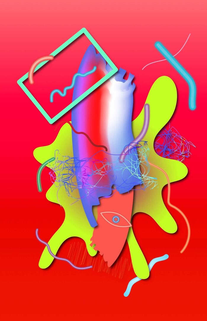
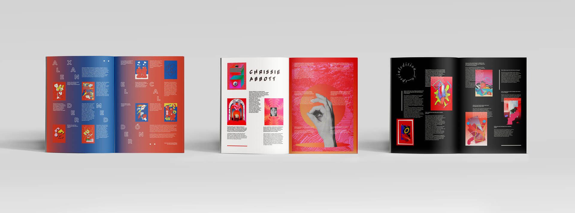
Special Edition Co. created work for Chroma Magazine's first issue, The Red Issue. We were asked, along with other visual artists and designers, to interpret our connotations of the color red visually. We created the compositions and collaborated with Matthew Varker for the layout design of our spreads.
Special Edition Co. created work for Chroma Magazine's first issue, The Red Issue. We were asked, along with other visual artists and designers, to interpret our connotations of the color red visually. We created the compositions and collaborated with Matthew Varker for the layout design of our spreads.
Special Edition Co. created work for Chroma Magazine's first issue, The Red Issue. We were asked, along with other visual artists and designers, to interpret our connotations of the color red visually. We created the compositions and collaborated with Matthew Varker for the layout design of our spreads.
My Role
Digital Design
Print Design
My Role
Digital Design
Print Design
My Role
Digital Design
Print Design
Collaborators
Matthew Varker (UK)
Trent Roach
Special Edition Co.
Completed
2016
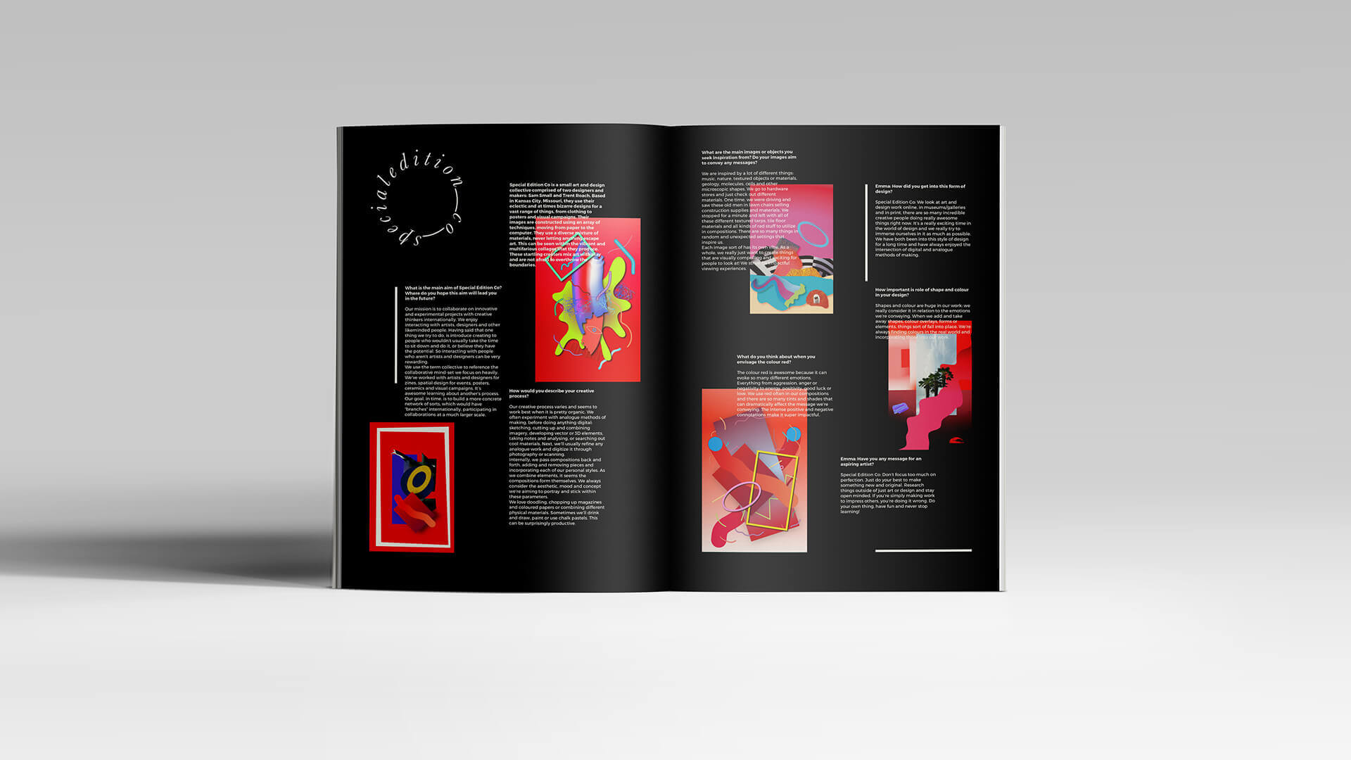
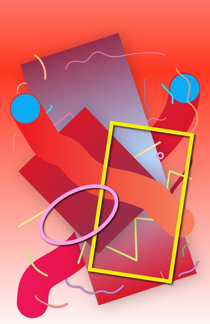
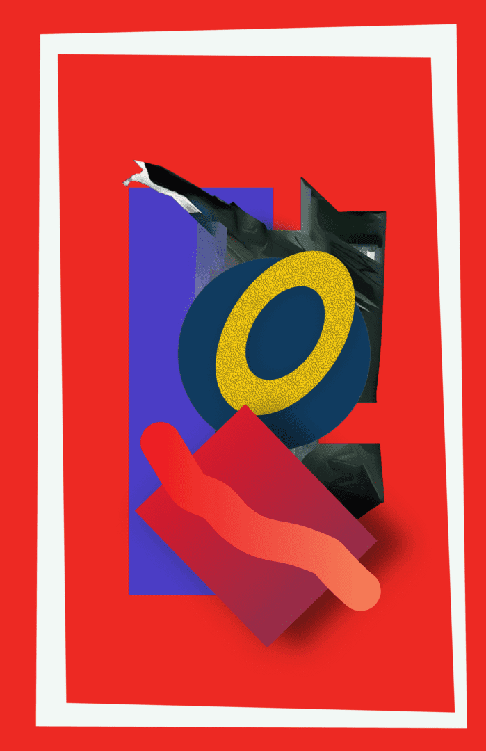
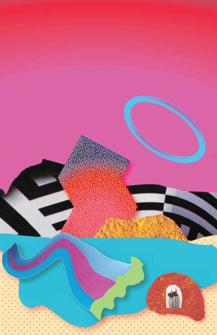
Pattern Soup Wallpapers
Pattern Soup Wallpapers
Pattern Soup Wallpapers
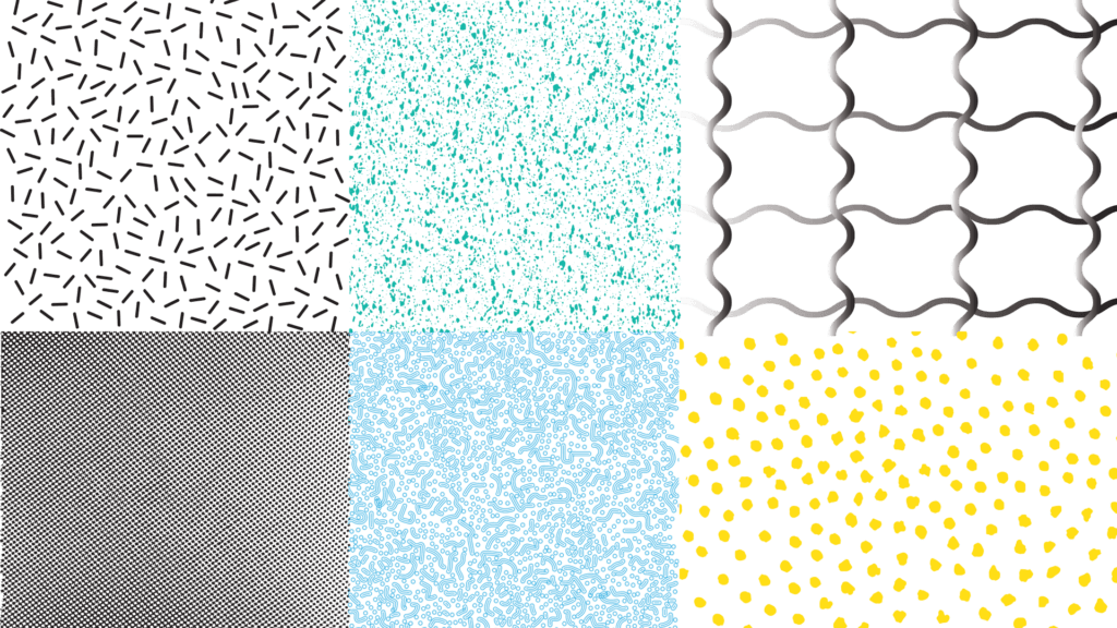
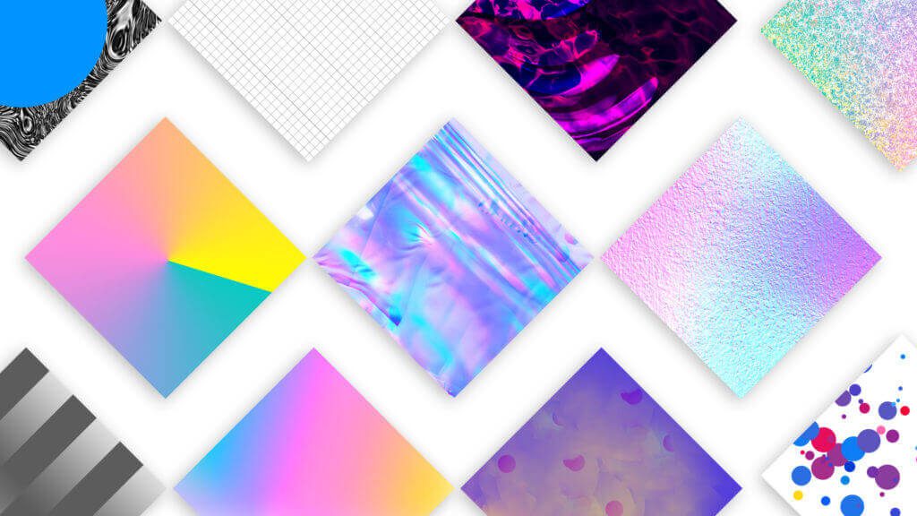
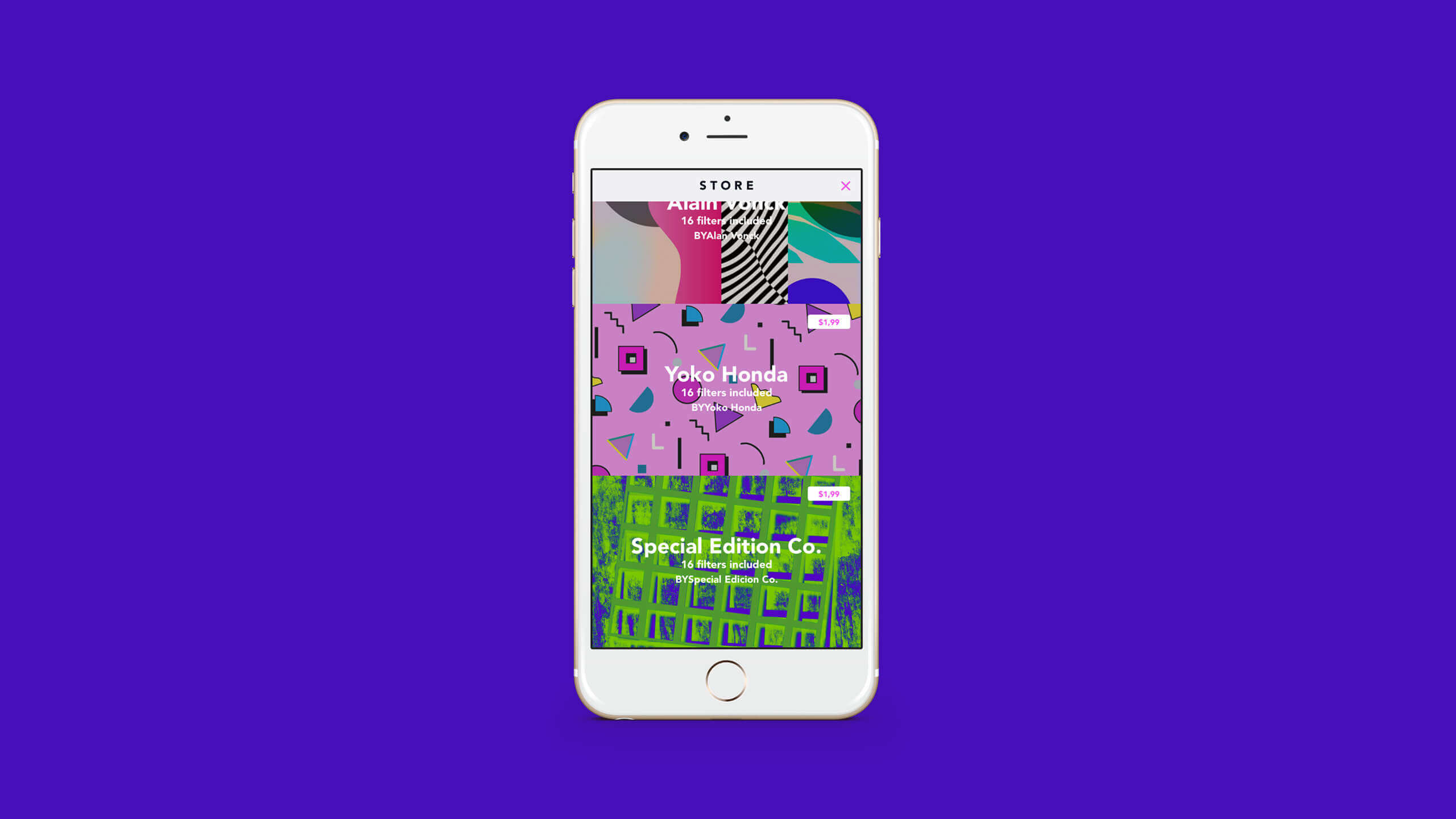
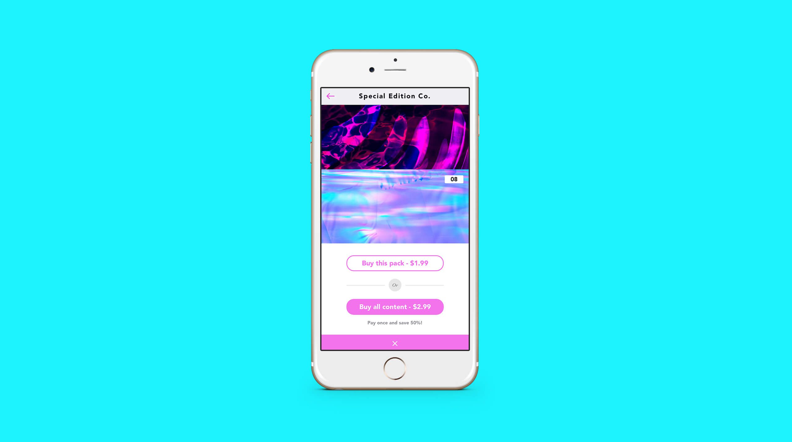
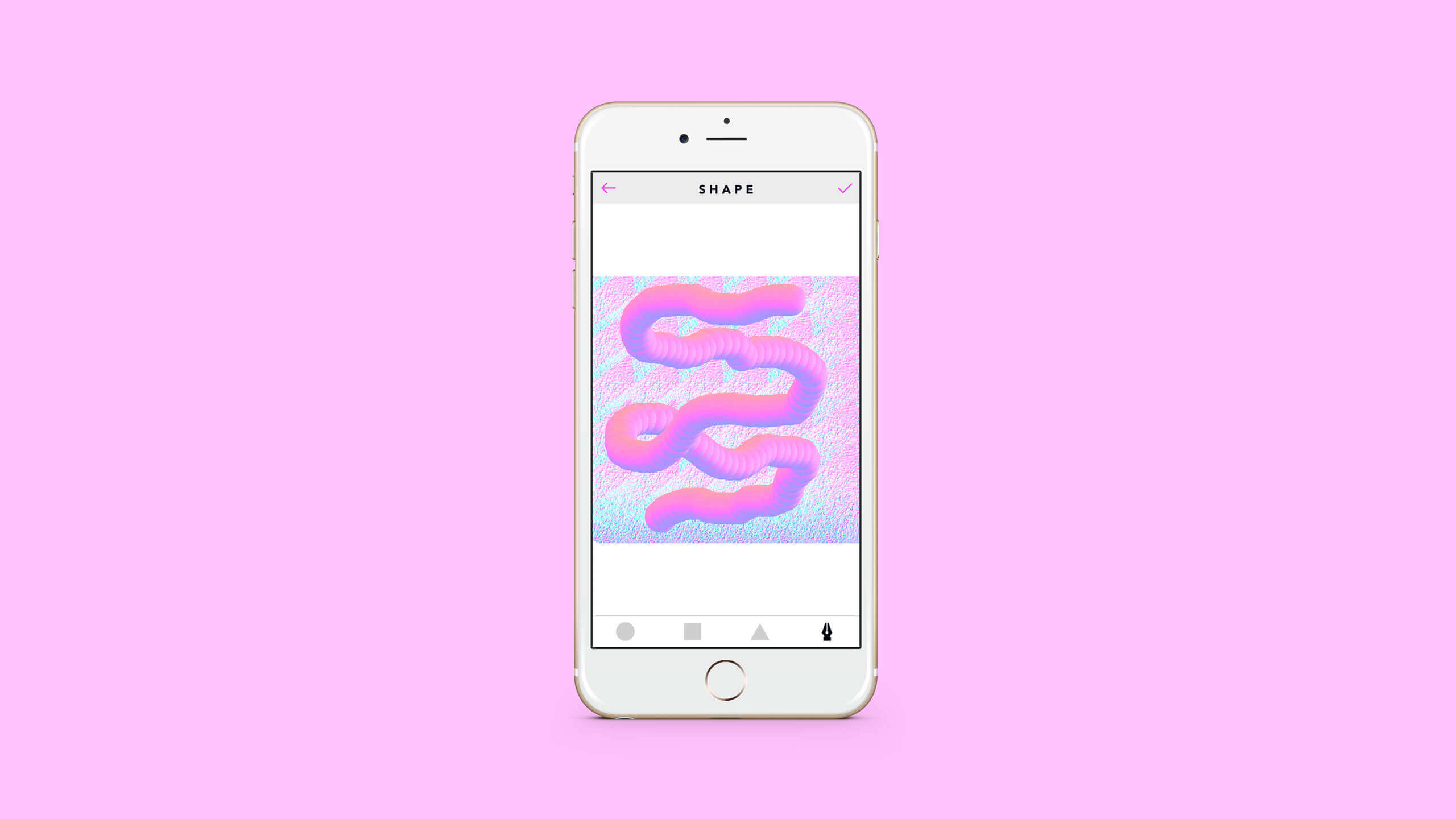
Ultralab Apps asked Special Edition Co. and several other artists to create sixteen patterns and original wallpapers to feature in their new Pattern Soup mobile app. The app allows users to create unique decorative designs and collages from photo cutouts and background patterns. Our wallpapers were part of a package that users could purchase to utilize when kicking off their image collages.
Ultralab Apps asked Special Edition Co. and several other artists to create sixteen patterns and original wallpapers to feature in their new Pattern Soup mobile app. The app allows users to create unique decorative designs and collages from photo cutouts and background patterns. Our wallpapers were part of a package that users could purchase to utilize when kicking off their image collages.
Ultralab Apps asked Special Edition Co. and several other artists to create sixteen patterns and original wallpapers to feature in their new Pattern Soup mobile app. The app allows users to create unique decorative designs and collages from photo cutouts and background patterns. Our wallpapers were part of a package that users could purchase to utilize when kicking off their image collages.
My Role
Composition Design
Collaborators
Trent Roach
Special Edition Co.
Completed
2016
Rivets & Hems Microsite
Rivets & Hems Microsite
Rivets & Hems Microsite
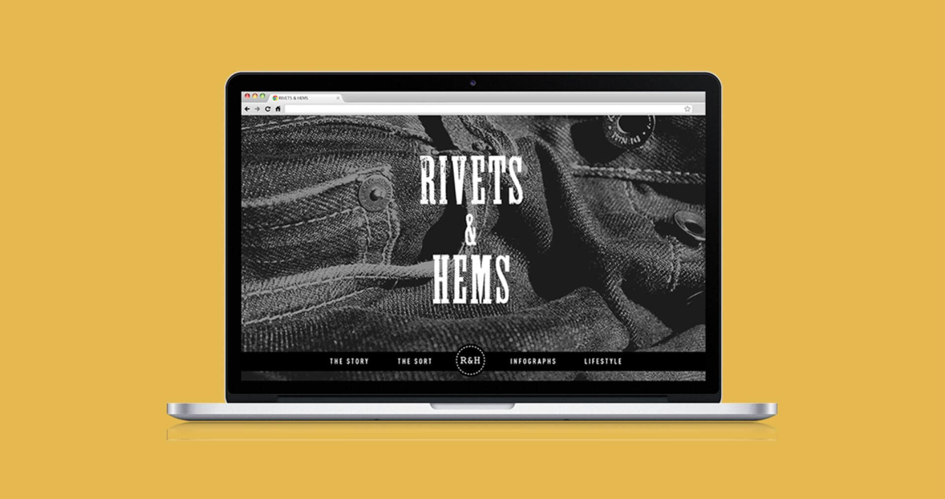
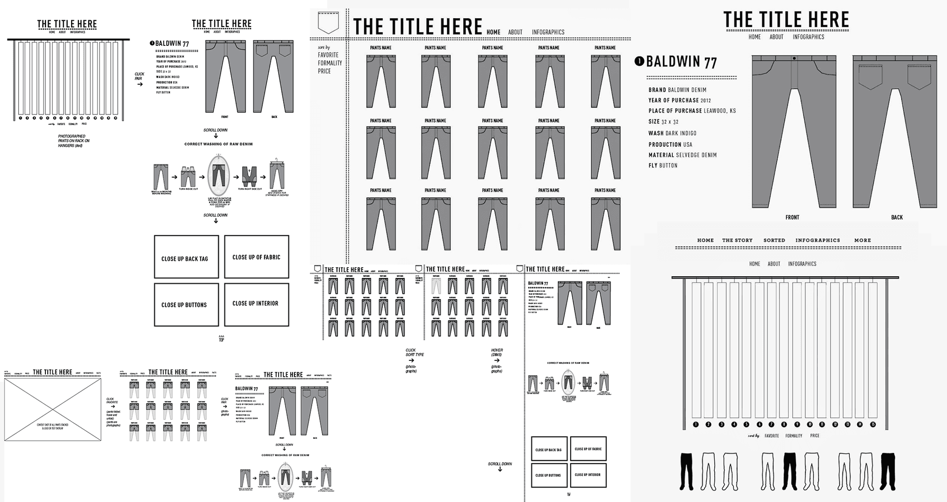
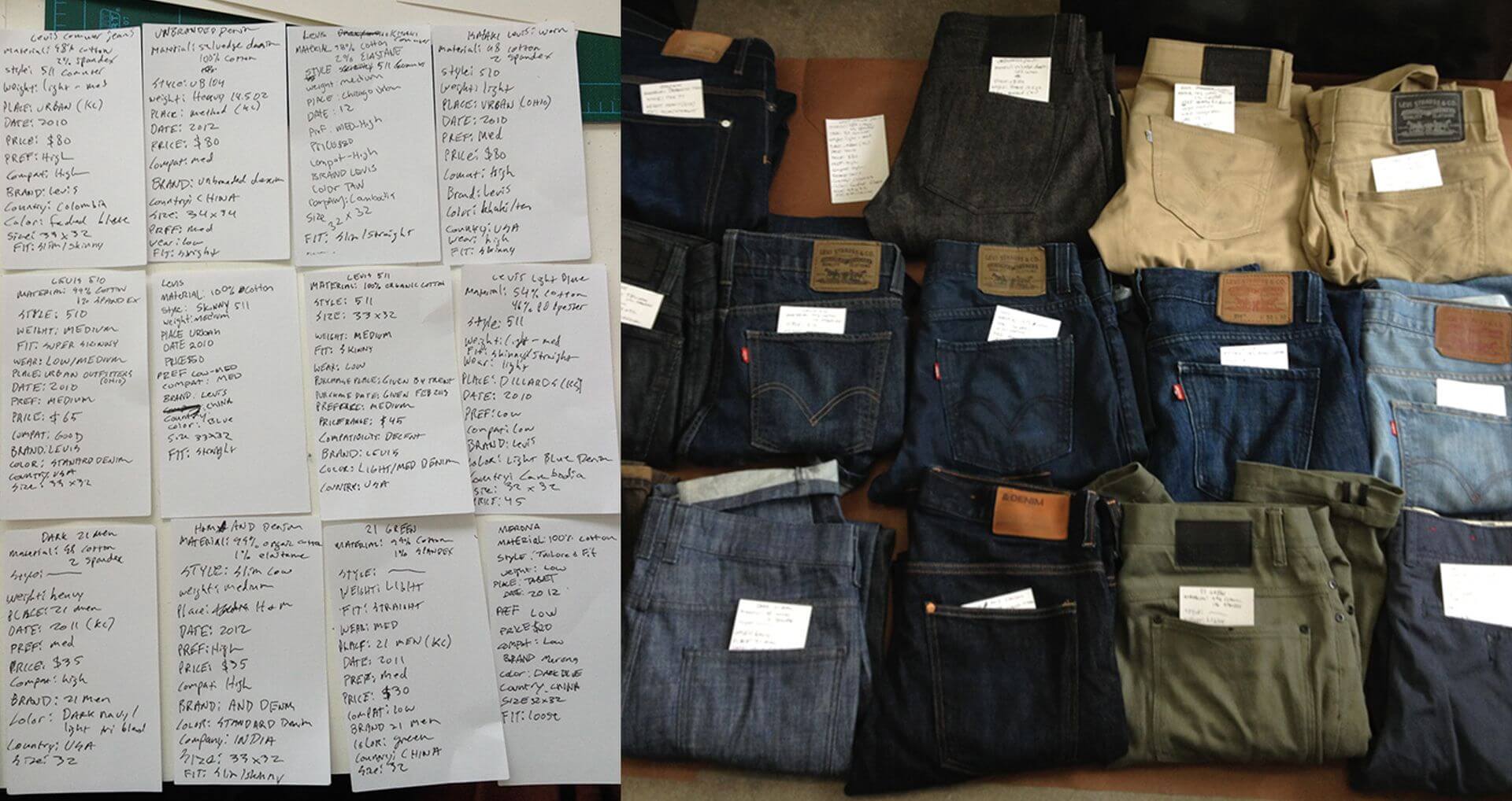
A case study website focused on my collection of pants. Ranging from high-end denim to thrift store finds, the site offers interactive sorting methods based on price, formality, and favorites. Each pair of pants has a focused page with descriptive information, relevant infographics, and detail imagery. An infographic page offers visual facts about pants and the denim industry, and a lifestyle page shows select pairs in use.
A case study website focused on my collection of pants. Ranging from high-end denim to thrift store finds, the site offers interactive sorting methods based on price, formality, and favorites. Each pair of pants has a focused page with descriptive information, relevant infographics, and detail imagery. An infographic page offers visual facts about pants and the denim industry and a lifestyle page shows select pairs in use.
A case study website focused on my collection of pants. Ranging from high-end denim to thrift store finds, the site offers interactive sorting methods based on price, formality, and favorites. Each pair of pants has a focused page with descriptive information, relevant infographics, and detail imagery. An infographic page offers visual facts about pants and the denim industry, and a lifestyle page shows select pairs in use.
My Role
Web Design
Information Architecture
Completed
2013
Awards
Adobe Muse Site of the Day & Year
2013 Adobe Above the Fold Award

Process
Website Walkthrough
Minutia Display Typeface
Minutia Display Typeface
Minutia Display Typeface
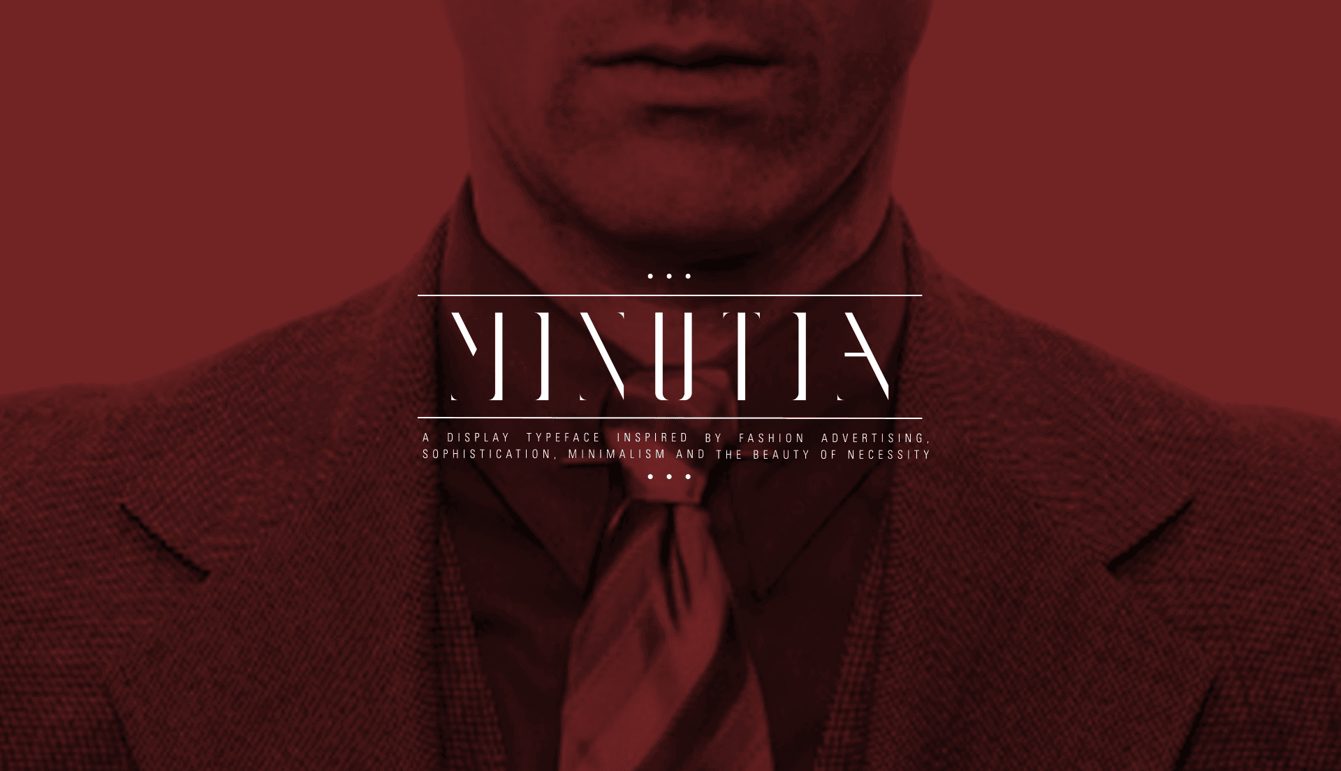
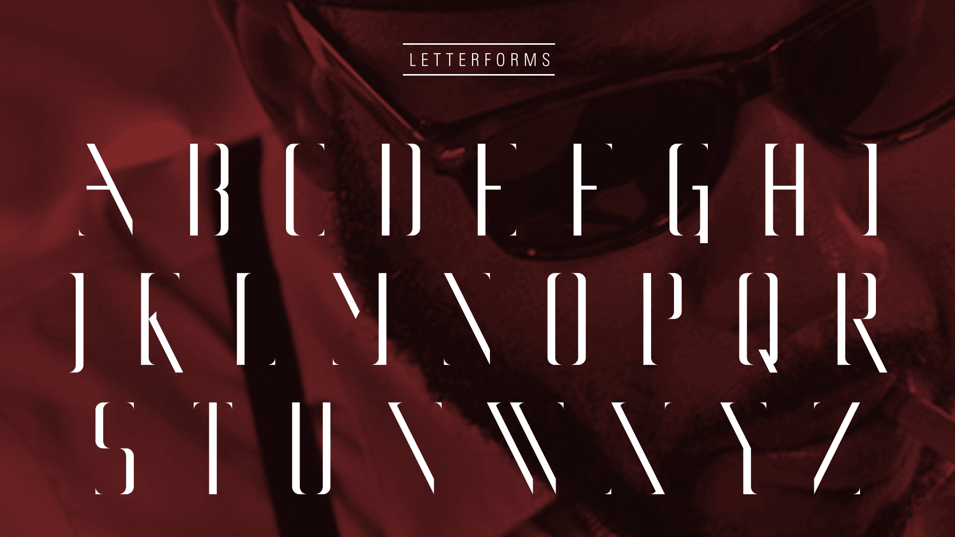
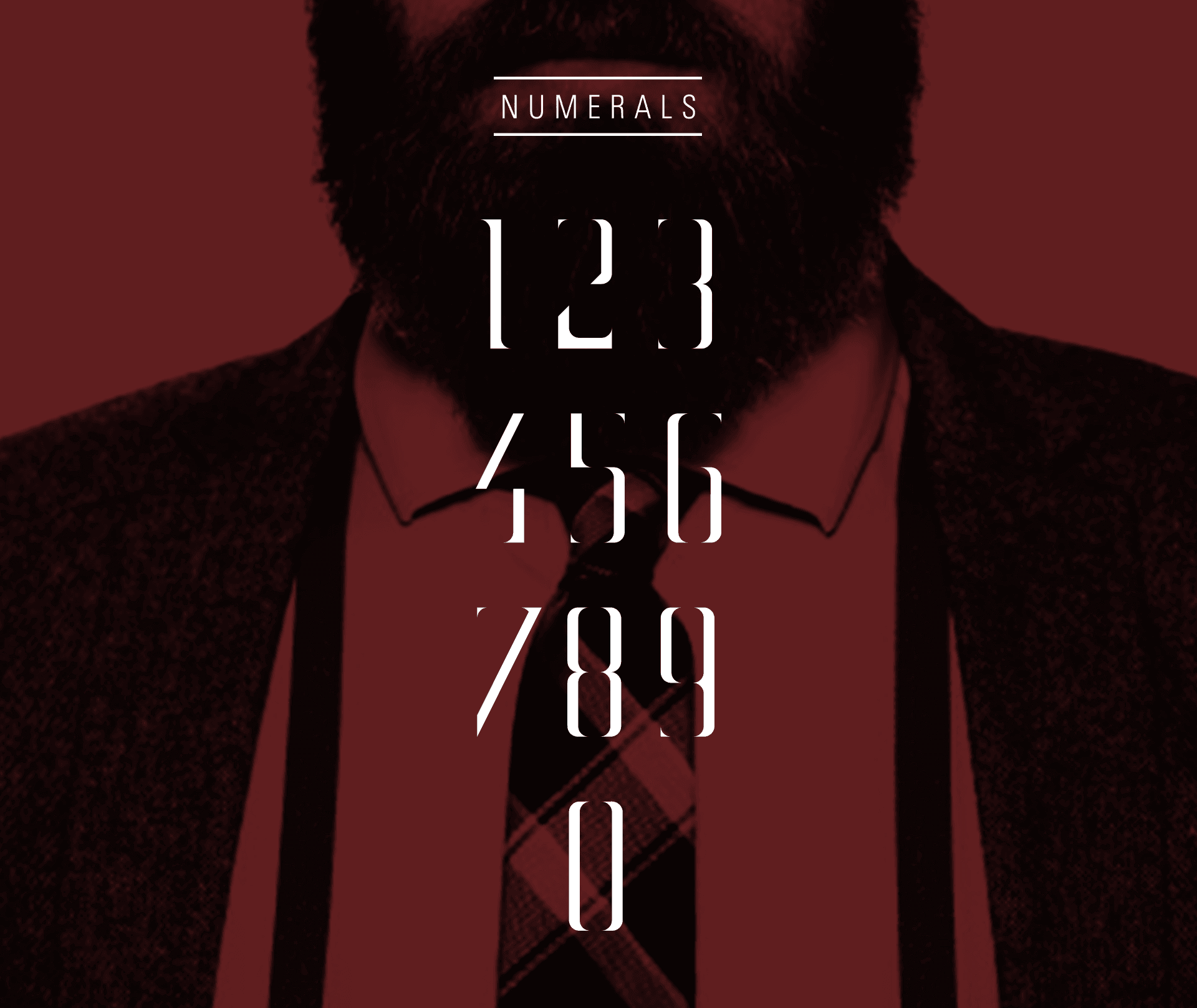
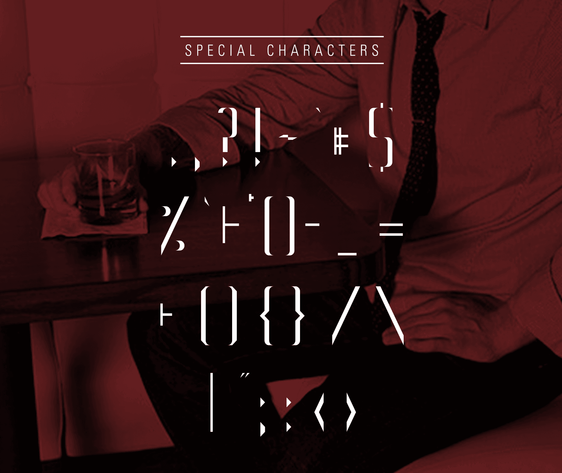
Minutia is a display typeface with sharp, dynamic angles and serifs. Focused on sophistication, class, and elegance, Minutia emphasizes the beauty of high contrast and minimalism. Intended to be combined in display settings with generous spacing, each letterform and character is designed with only the typographic elements necessary for legibility.
Minutia is a display typeface with sharp, dynamic angles and serifs. Focused on sophistication, class, and elegance, Minutia emphasizes the beauty of high contrast and minimalism. Intended to be combined in display settings with generous spacing, each letterform and character is designed with only the typographic elements necessary for legibility.
Minutia is a display typeface with sharp, dynamic angles and serifs. Focused on sophistication, class, and elegance, Minutia emphasizes the beauty of high contrast and minimalism. Intended to be combined in display settings with generous spacing, each letterform and character is designed with only the typographic elements necessary for legibility.
My Role
Type Design
Completed
2012
Awards
AIGA KC: A9 Award
Computer Arts Magazine
The Designers Foundry
Awards
AIGA KC: A9 Award
Computer Arts Magazine
The Designers Foundry
Awards
AIGA KC: A9 Award
Computer Arts Magazine
The Designers Foundry
Forrester
Forrester
Forrester
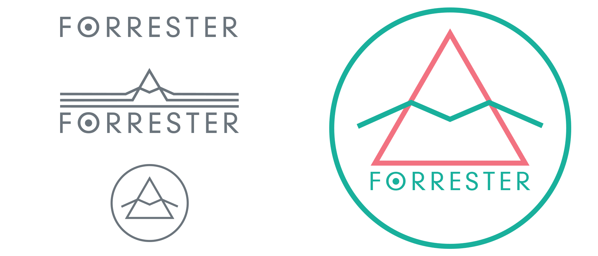
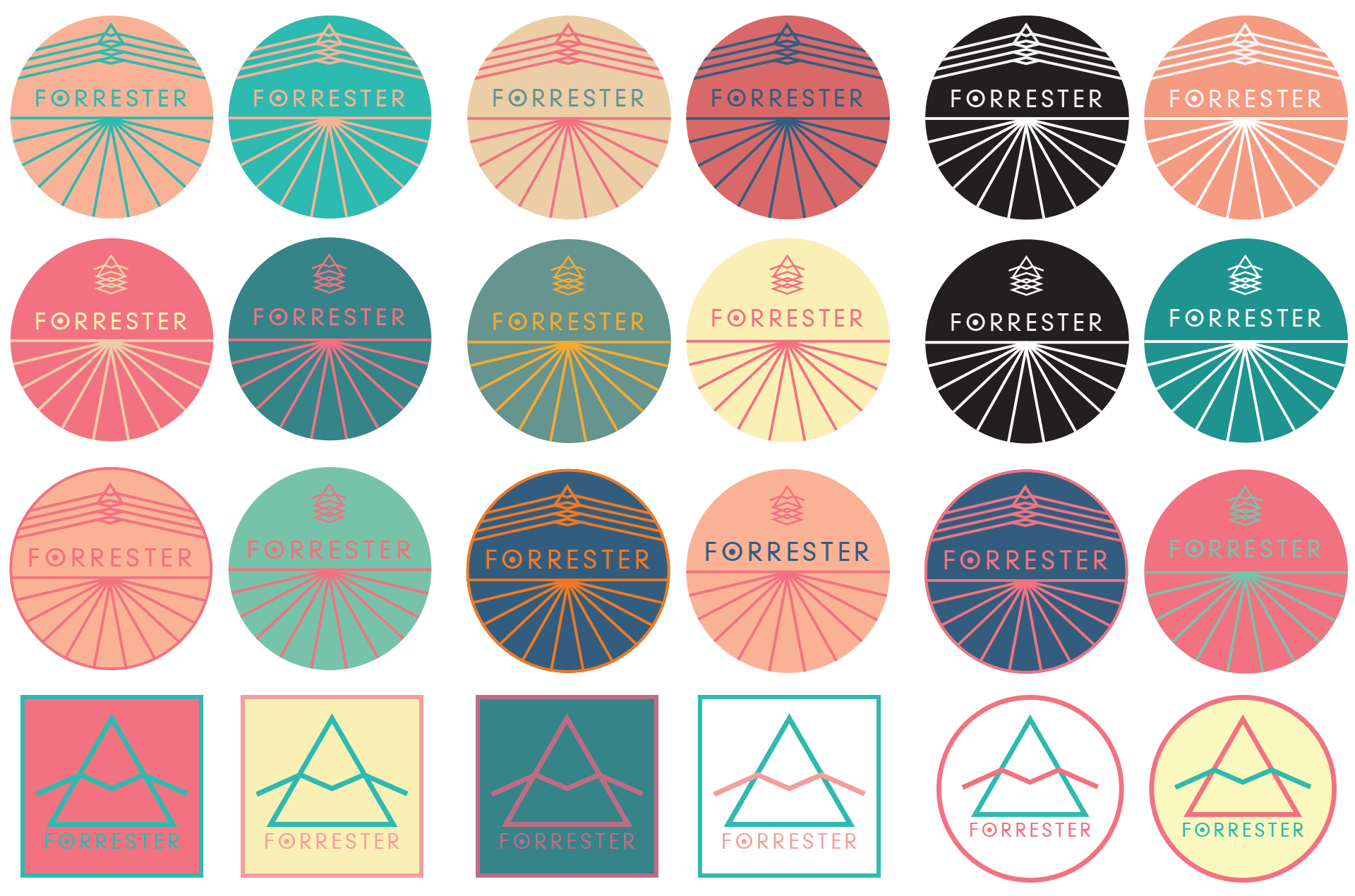
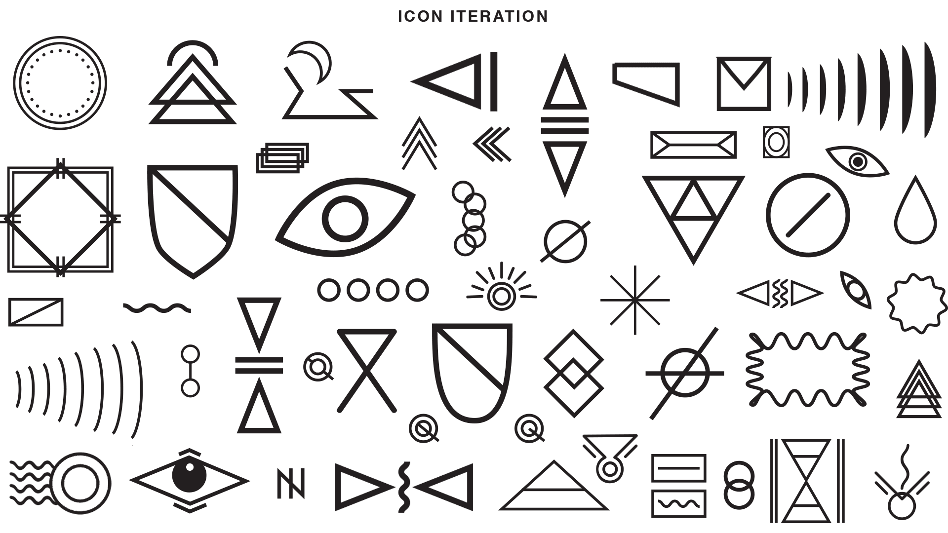
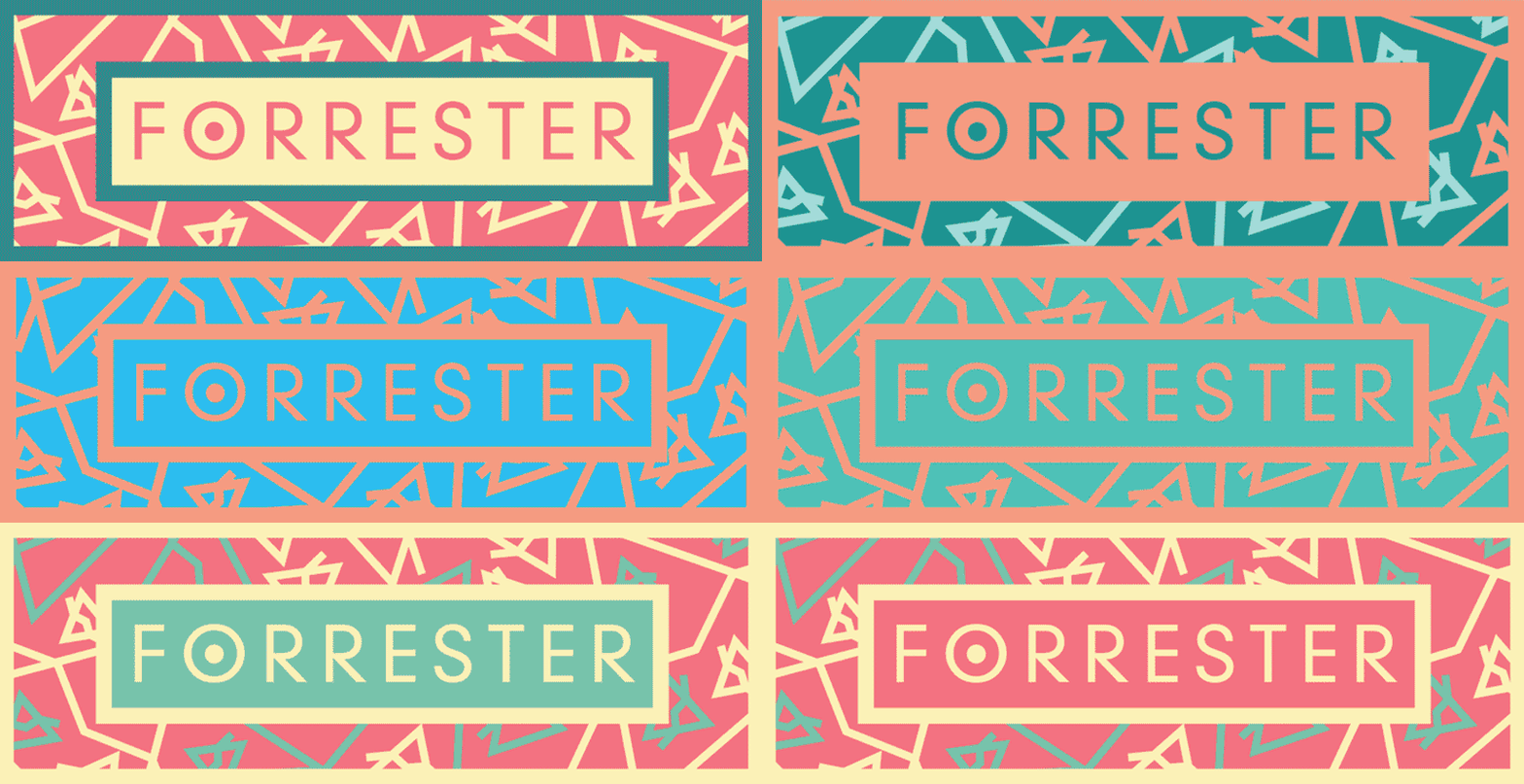
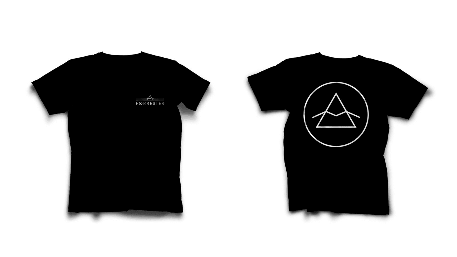
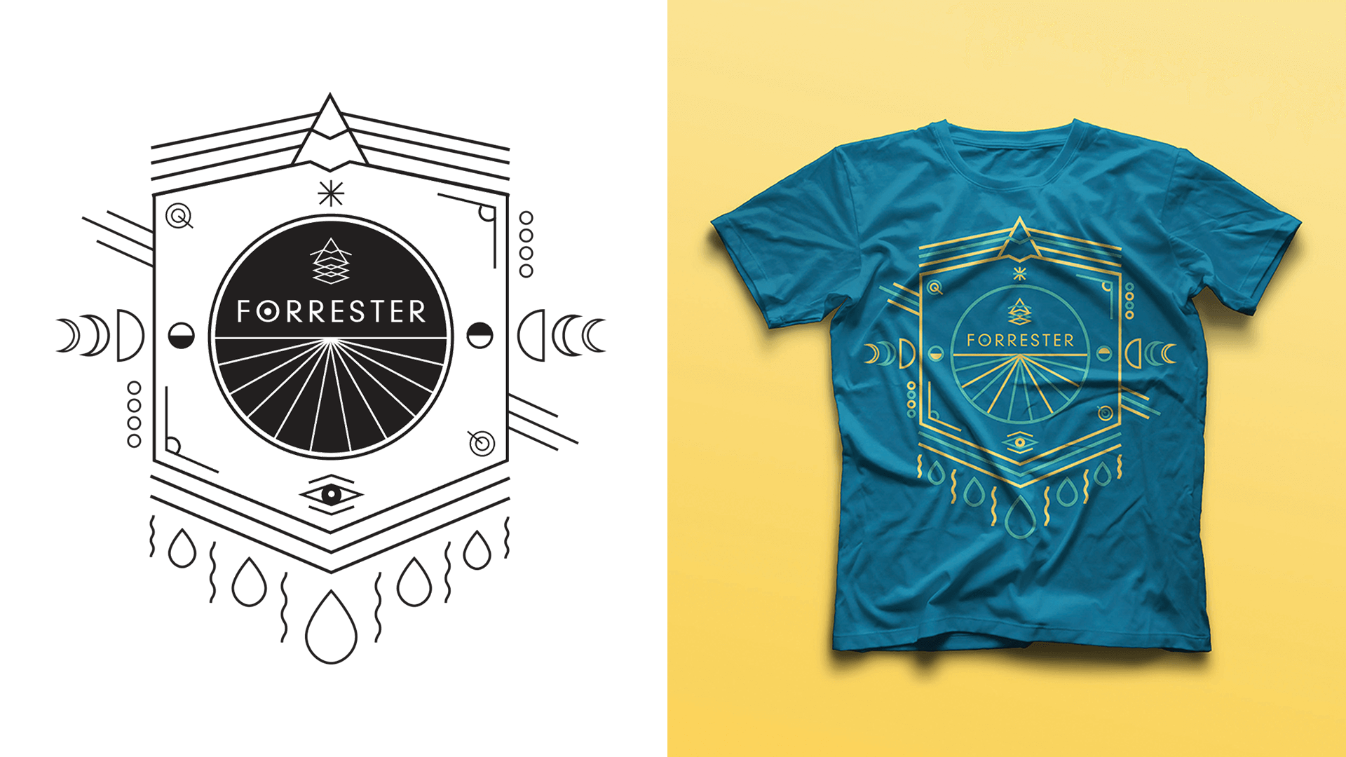
I designed the visual identity for Lawrence, Kansas, band Forrester. Their sound is spontaneous and ranges from ambient to hip hop to trance rock. I wanted to represent this sound with a vibrant, impactful mark with opportunities for variation in use. I also designed several shirts and stickers for the band.
I designed the visual identity for Lawrence, Kansas, band Forrester. Their sound is spontaneous and ranges from ambient to hip hop to trance rock. I wanted to represent this sound with a vibrant, impactful mark with opportunities for variation in use. I also designed several shirts and stickers for the band.
I designed the visual identity for Lawrence, Kansas, band Forrester. Their sound is spontaneous and ranges from ambient to hip hop to trance rock. I wanted to represent this sound with a vibrant, impactful mark with opportunities for variation in use. I also designed several shirts and stickers for the band.
My Role
Branding
Merchandise Design
Completed
2013
Pierre Koenig: Living with Steel
Pierre Koenig: Living with Steel
Pierre Koenig:
Living with Steel
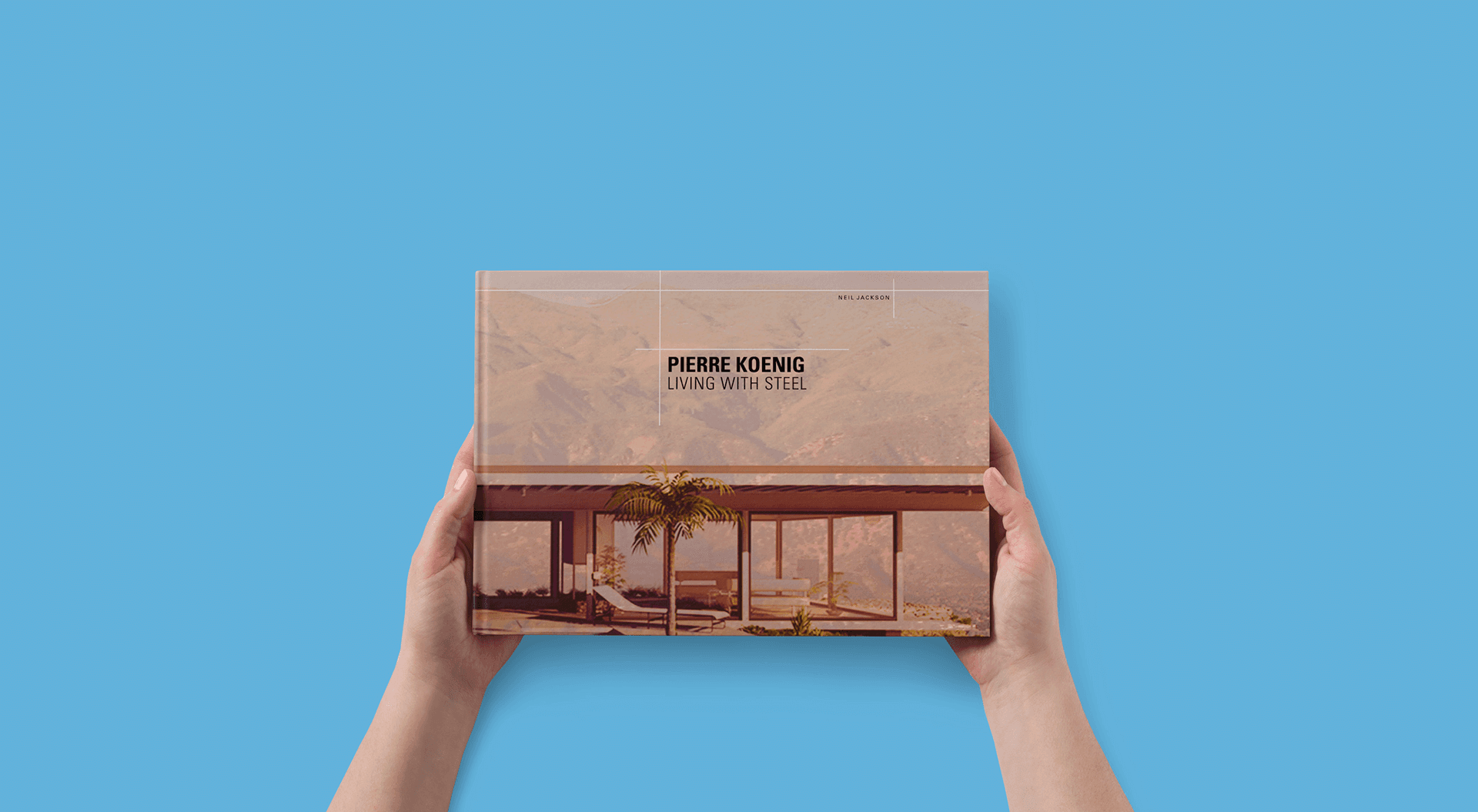
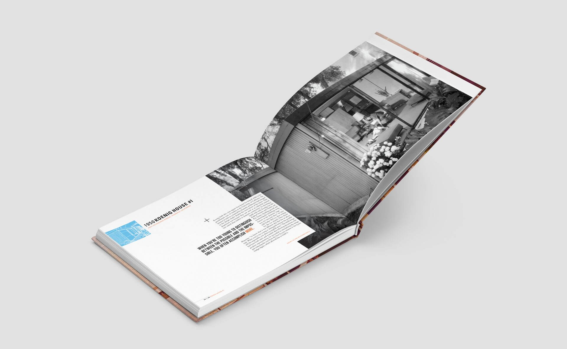
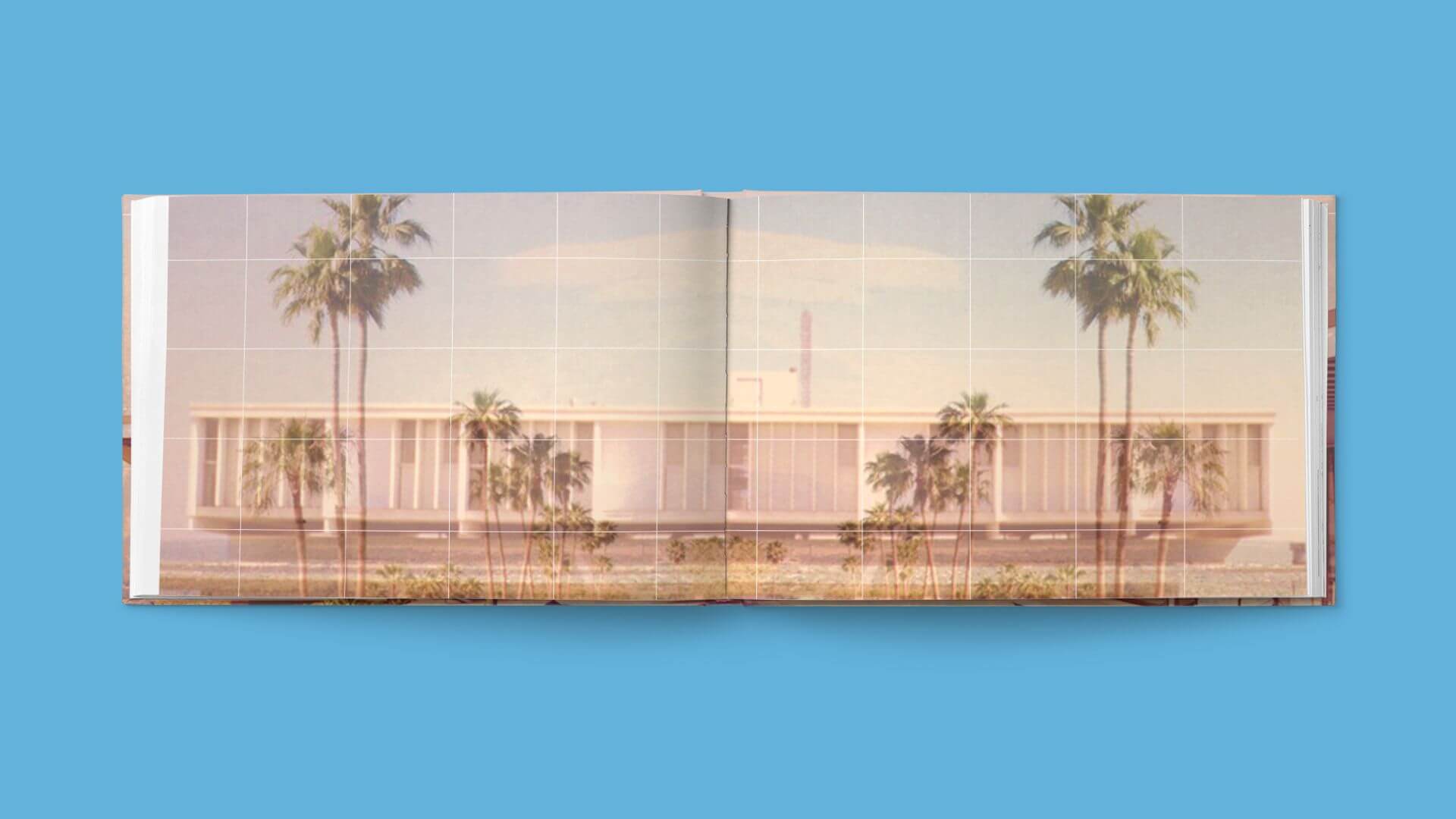
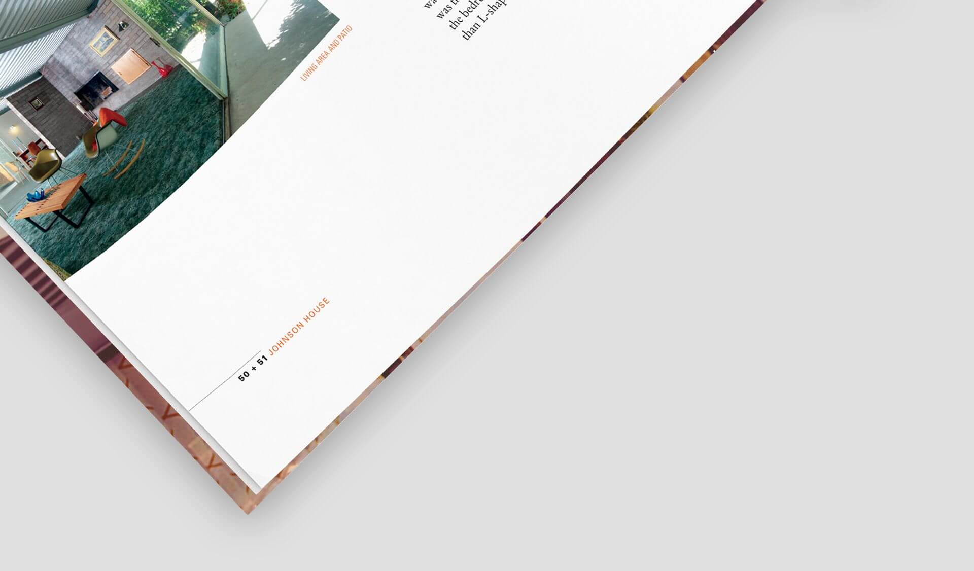
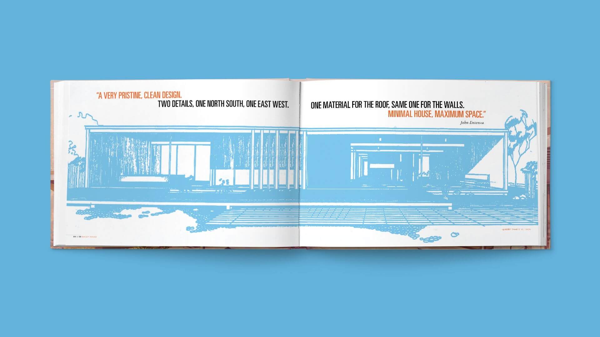
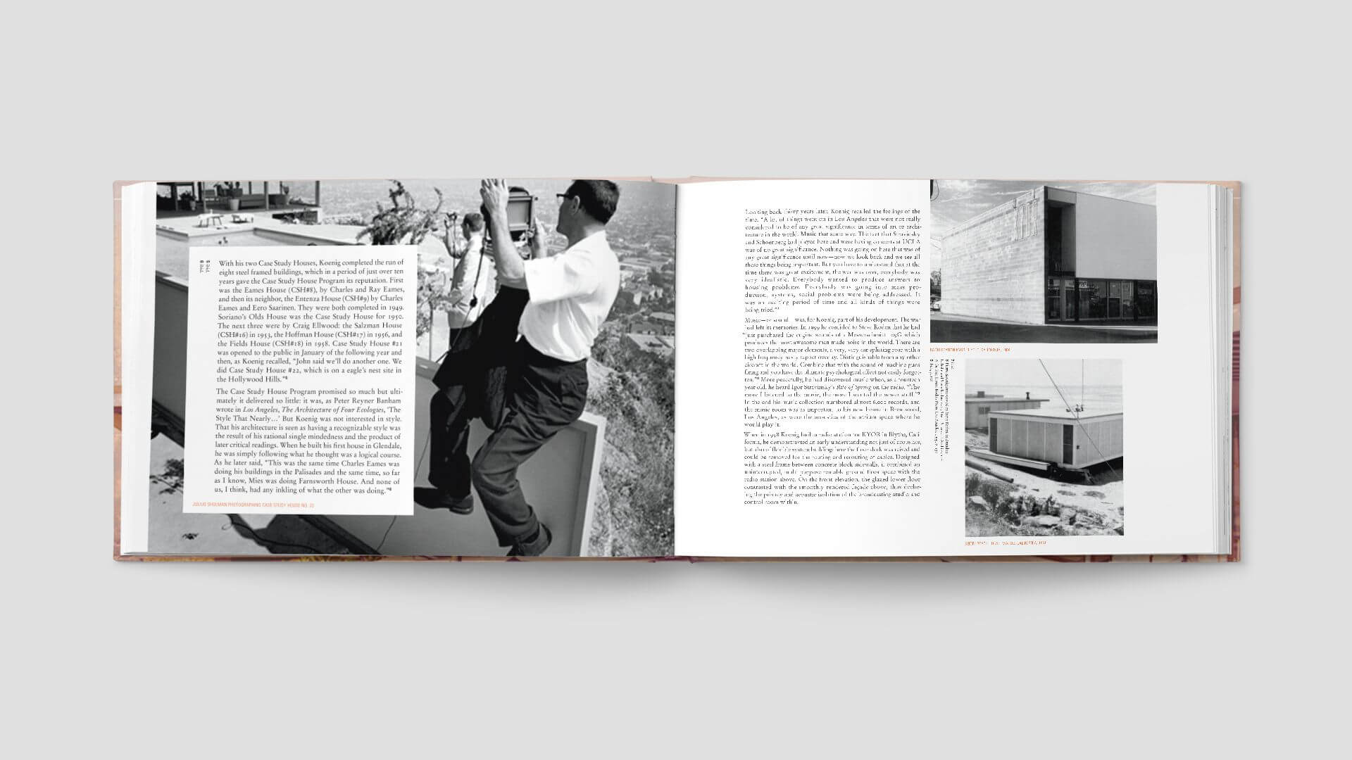
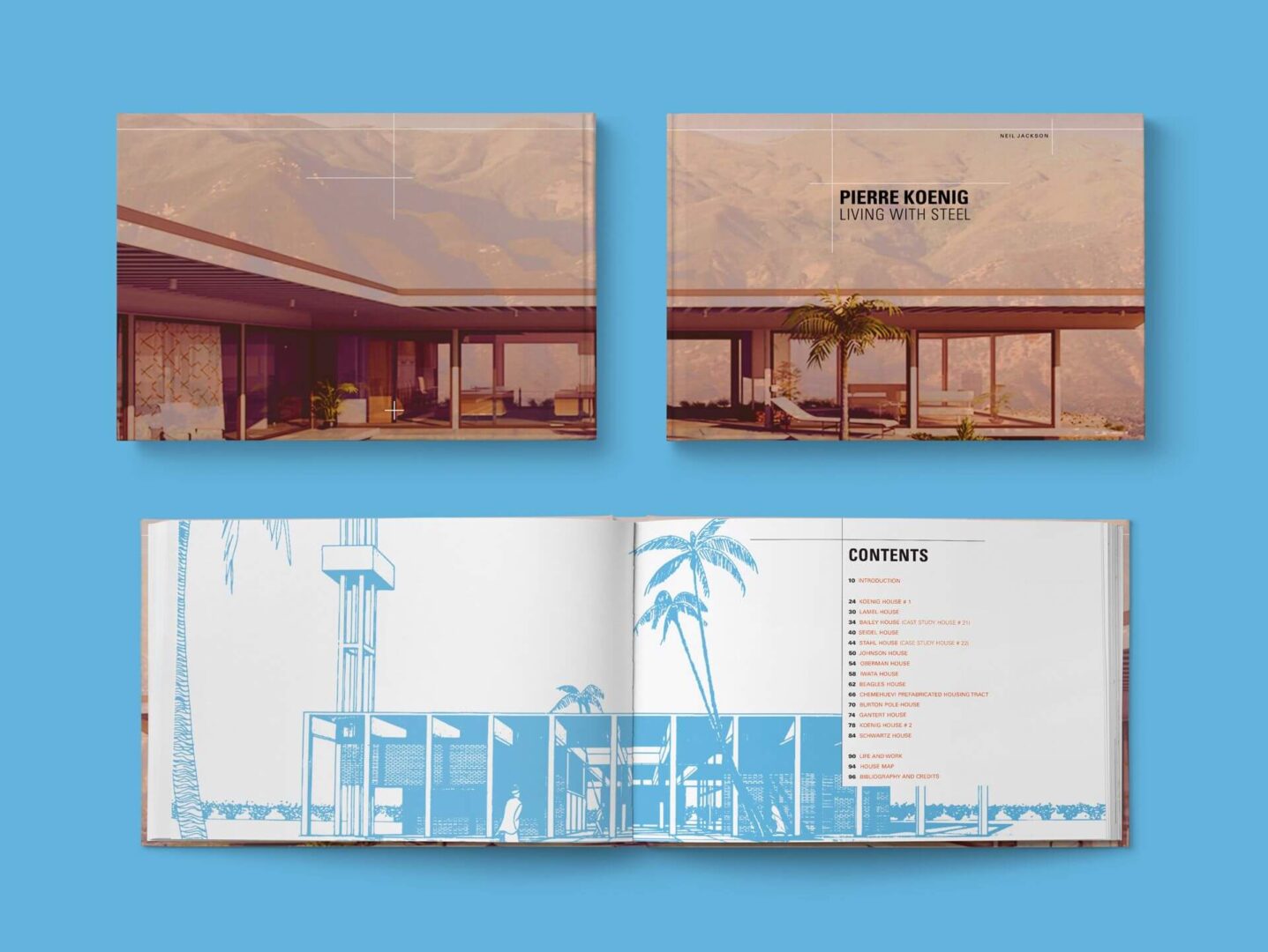
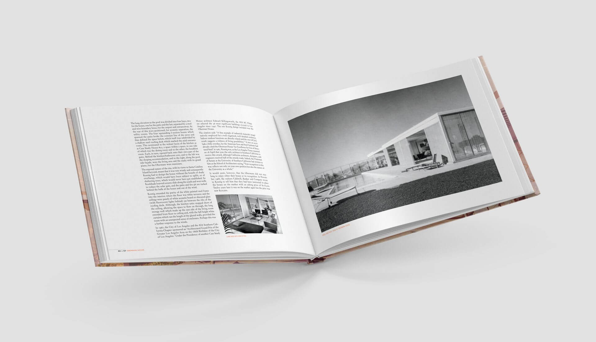
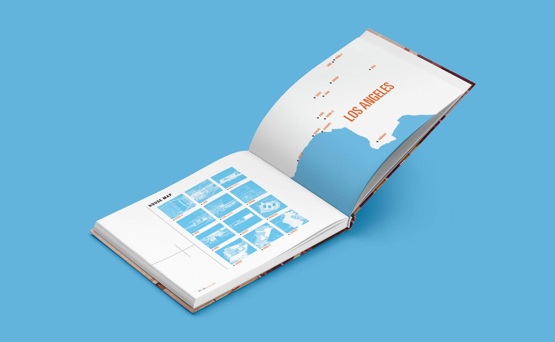
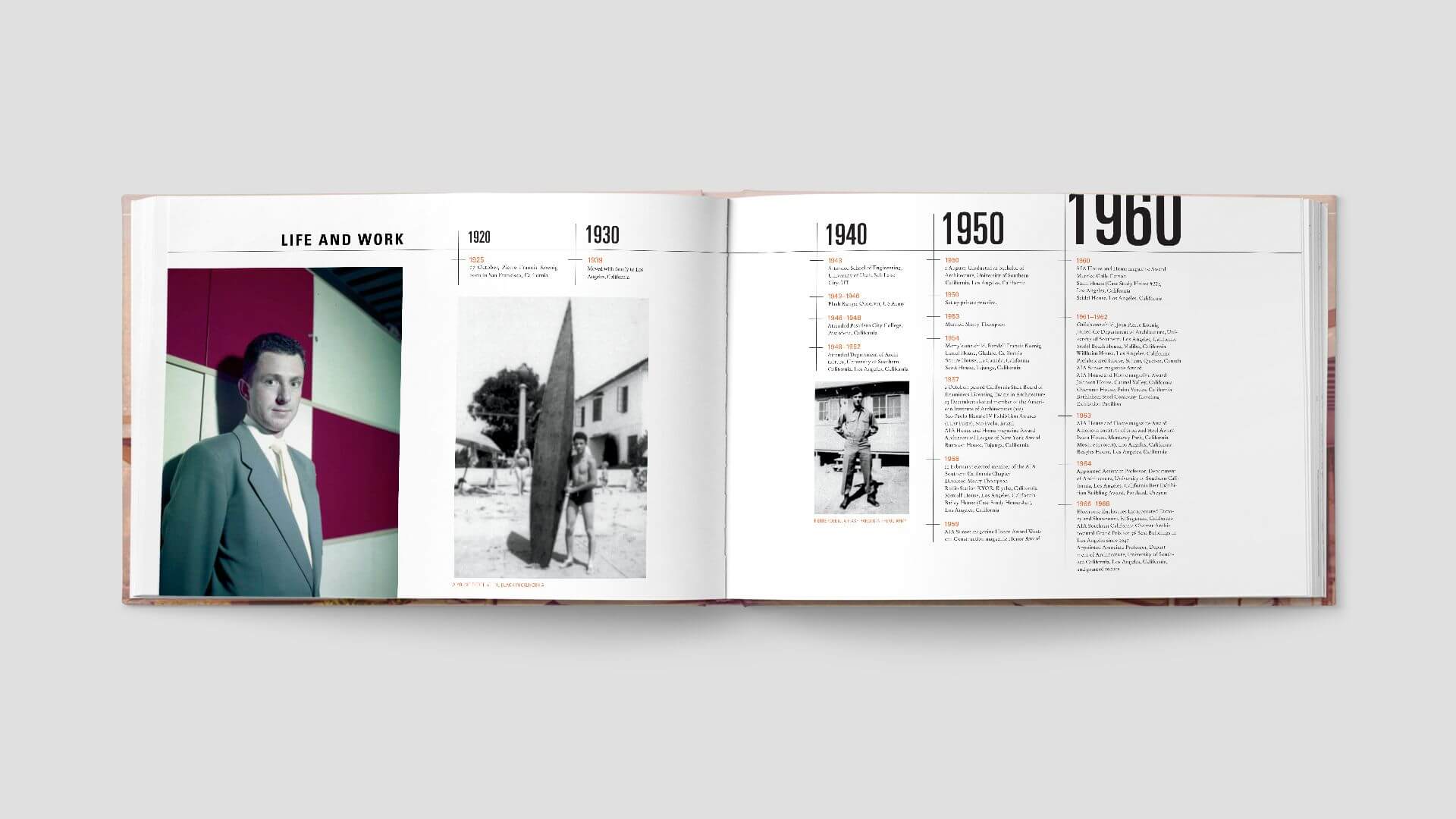
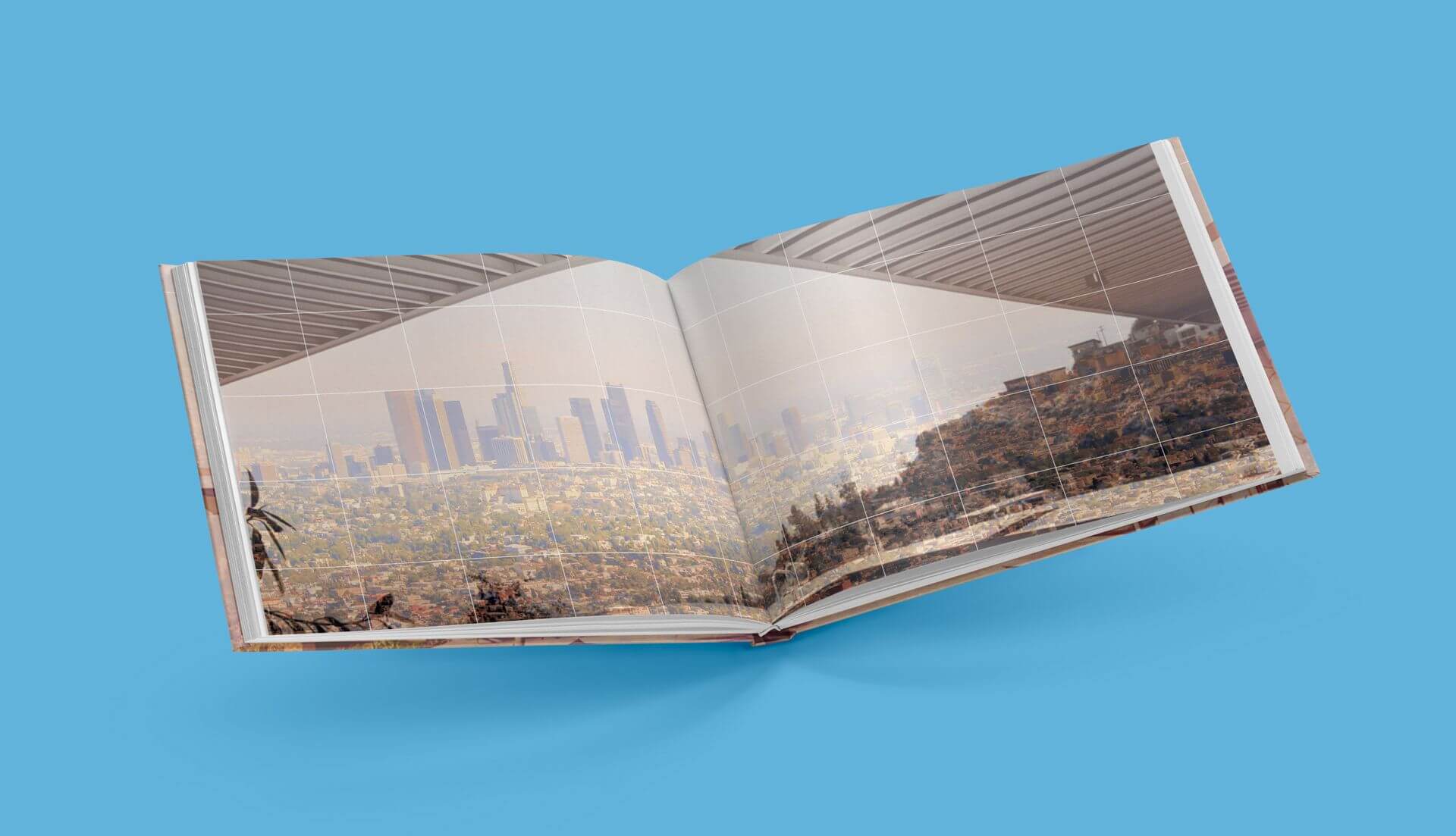
A full redesign of the book Living with Steel by Neil Jackson. The book is about the modern architect Pierre Koenig and features architectural case studies, life events and achievements from the 1960s to the early 2000s. Pierre Koenig designed homes and structures which were built primarily in California. While working on the redesign, I focused heavily on structural aspects of the architecture, materials Koenig utilized, and the environment around the homes he designed.
A full redesign of the book Living with Steel by Neil Jackson. The book is about the modern architect Pierre Koenig and features architectural case studies, life events and achievements from the 1960s to the early 2000s. Pierre Koenig designed homes and structures which were built primarily in California. While working on the redesign, I focused heavily on structural aspects of the architecture, materials Koenig utilized and the environment around the homes he designed.
A full redesign of the book Living with Steel by Neil Jackson. The book is about the modern architect Pierre Koenig and features architectural case studies, life events and achievements from the 1960s to the early 2000s. Pierre Koenig designed homes and structures which were built primarily in California. While working on the redesign, I focused heavily on structural aspects of the architecture, materials Koenig utilized, and the environment around the homes he designed.
My Role
Print Design
Completed
2012
Completed
2012
Completed
2012
Sam Small Design
© 2024
Contact
Connect