CASE STUDY
Visa SavingsEdge Redesign
Redesigning the Visa SavingsEdge platform to be a best-in-class customer experience.
OVERVIEW
During my time as a Senior Visual & Interaction Designer at Punchcut, I worked on an 8-week project aimed at reimagining the Visa SavingsEdge platform. Our goal was clear: to transform the platform into a best-in-class experience, providing global users with an engaging and scalable solution.
CLIENT
Visa
ROLE
Sr. Visual & Interaction Designer
SERVICES
Research & Discovery, IA, Wireframing, User Flows, UI/UX Design, Design Systems, Prototyping, Content Strategy
TEAM
Punchcut
DURATION
8 weeks
TOOLS
Figma
CONTEXT
What is Visa SavingsEdge?
Visa SavingsEdge offers discounts to small businesses when they use Visa Business cards at participating merchants. The website is used for enrollment, offer browsing, account mgmt, and support.
↑ Original Visa SavingsEdge website
THE PROBLEM
A Dated Experience
The SavingsNow enrollment experience and loyalty website needed modernization. The dated interface and user experience were hindering user engagement and integration.
↑ Before & after of Instant Savings & Instant Coupons from Visa SavingsEdge
Business Goals
A Modernized Experience
Foster user engagement by creating a modernized program that delivers an improved experience.
Global Scalability
Design with flexibility in mind to ensure easy scalability across global markets.
Seamless Integration
Craft a design tailored for effortless integration of APIs across a spectrum of client environments.
Project Approach
Week 1
Discovery
• Discovery Workshop
• Discovery Summary
• Competitive/Comparative Audits
Week 2–4
Define
• User Archetypes
• User Hero Flows
• Tone Exercise
• Experience Board Concepts
• Information Architecture
• UX Concepts
• Content Strategy
• Wireframing
Week 5–8
Design
• Final Wireframing
• High-Fidelity Design
• Copywriting
• Clickable Prototypes
• Mobile Design
• Whitelabel Designs
Week 8
Final Handoff!
Success Metrics
1
Seamless Migration
Streamline seamless migration of over one million Visa Business cardholders.
2
Improve Core Metrics
The new product will boost engagement, enrollment, and payment volume.
3
Generate Excitement
Build excitement with Visa teams and issuer partners about the new experience.
4
Drive New Partnership
Reposition Visa as a valuable partner with an experience that can be scaled globally.
DISCOVERY
Competitive Audit
We examined navigation, content hierarchy, brand presentation of member benefits, enrollment process, and overall brand personality.
Themes
• Messaging tailored to business needs
• Streamlined & segmented forms
• Easy to understand & access offers
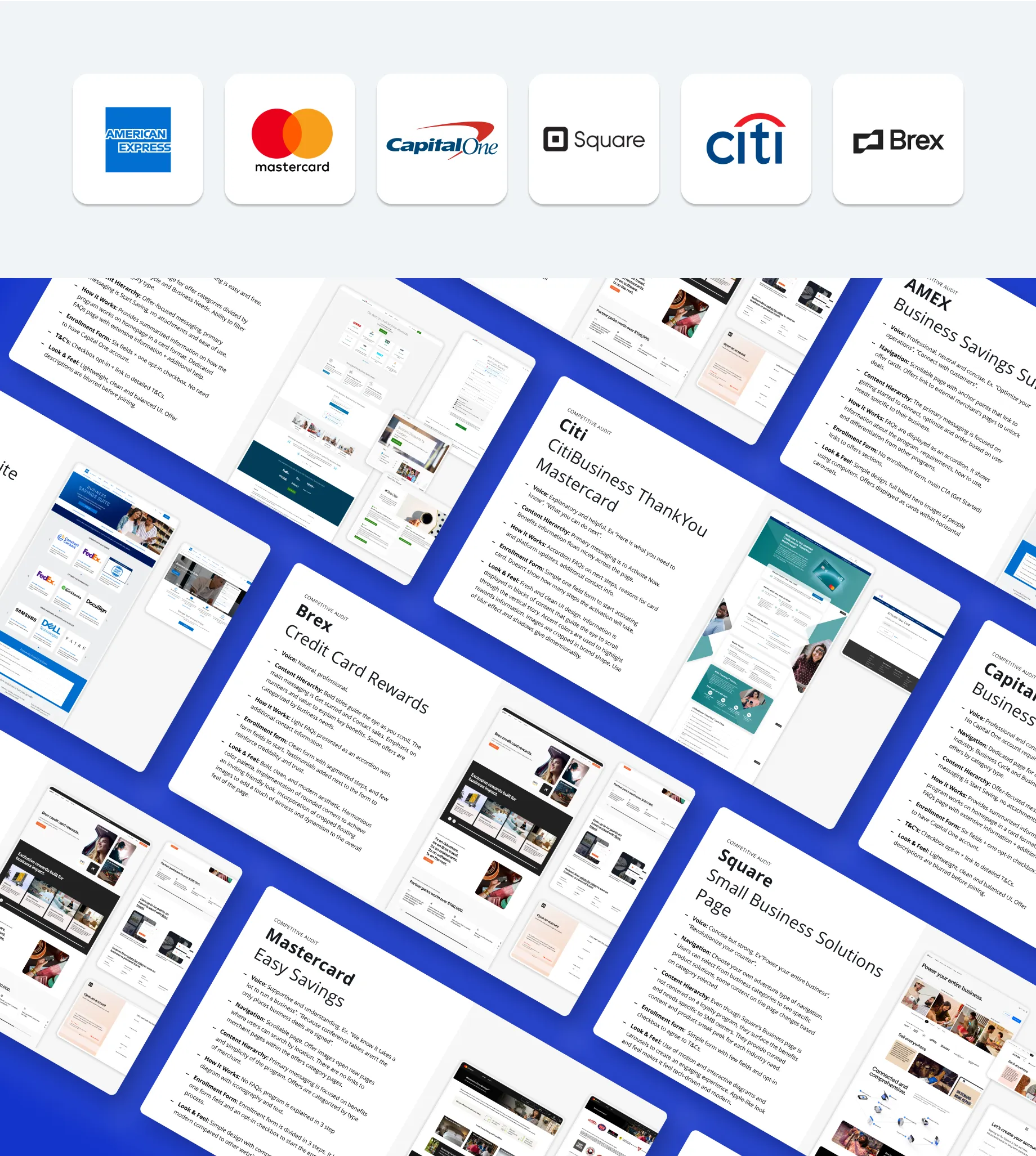
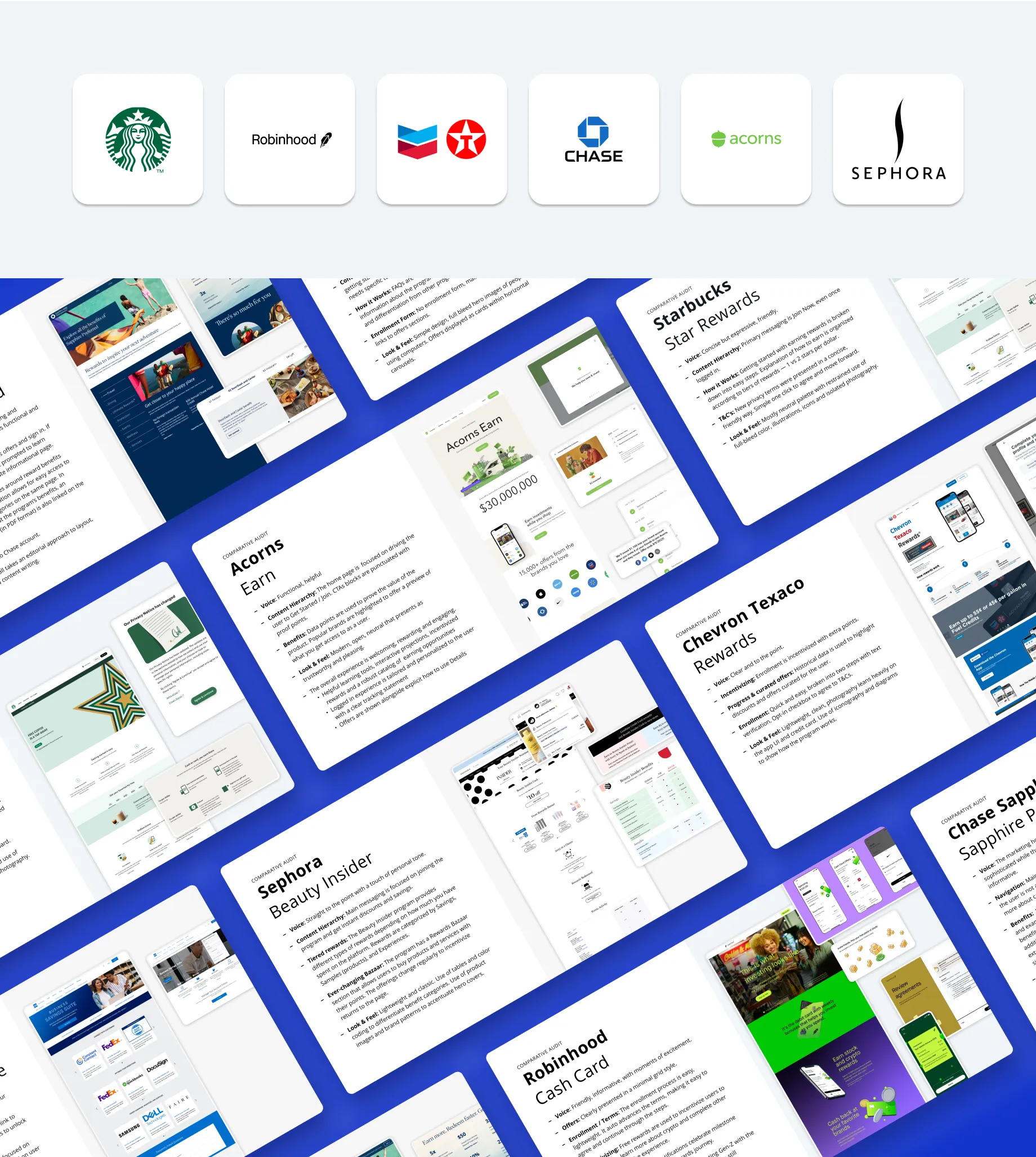
DISCOVERY
Comparative Audit
Consumer loyalty programs provide valuable insights into content strategy, UX, and visual design. We analyzed benefit presentation, content hierarchy, and overall brand presence.
Themes
• Incentivized enrollment & tasks
• Enrollment-protected offer marketplace
• Progress is clear
DISCOVERY
Information Architecture + Hero Flows
I collaborated with my team to revamp information architecture, simplifying enrollment and offer discovery and usage. User hero flows were then crafted to define key interactions.
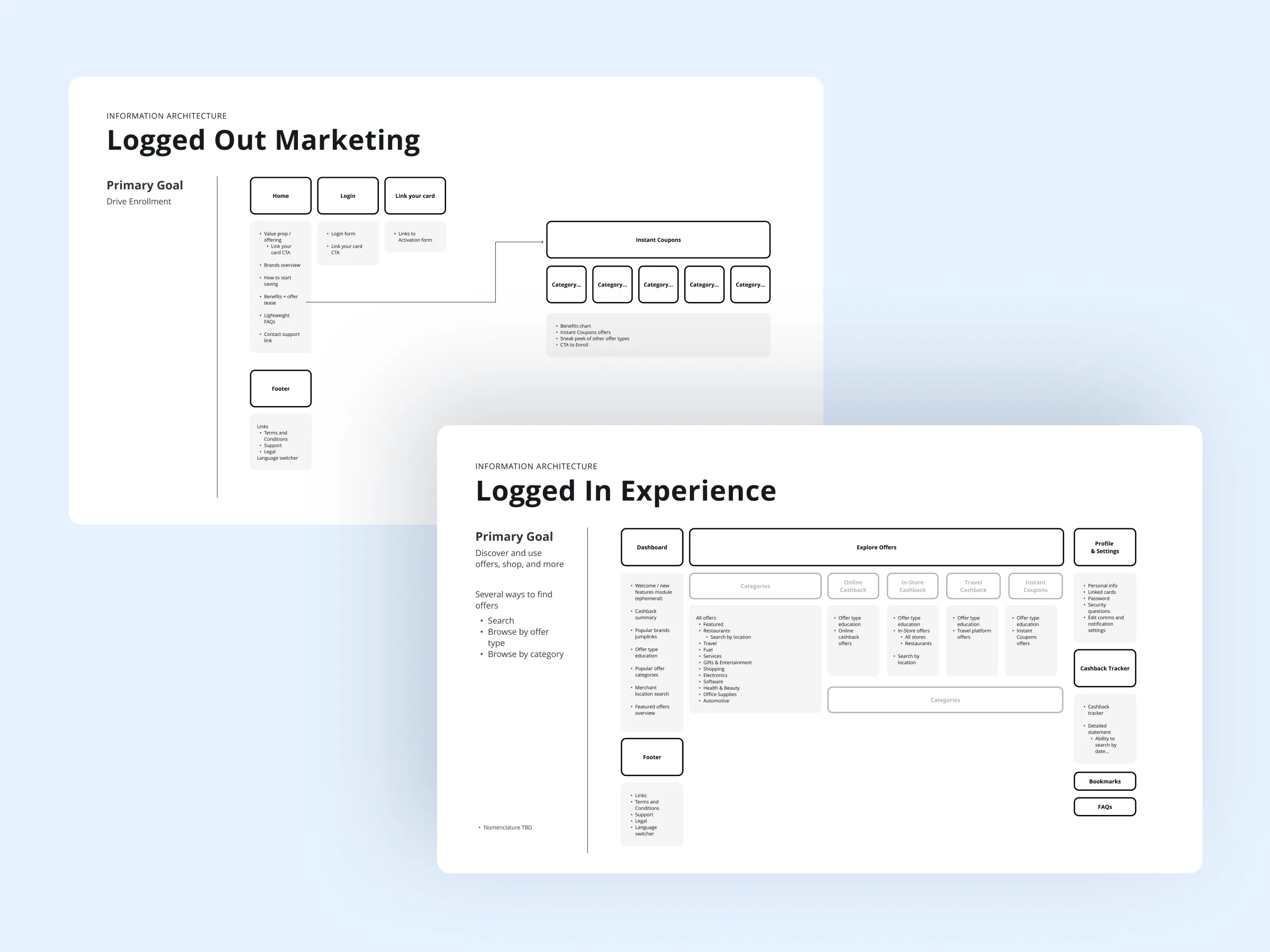
↑ Information Architecture diagrams
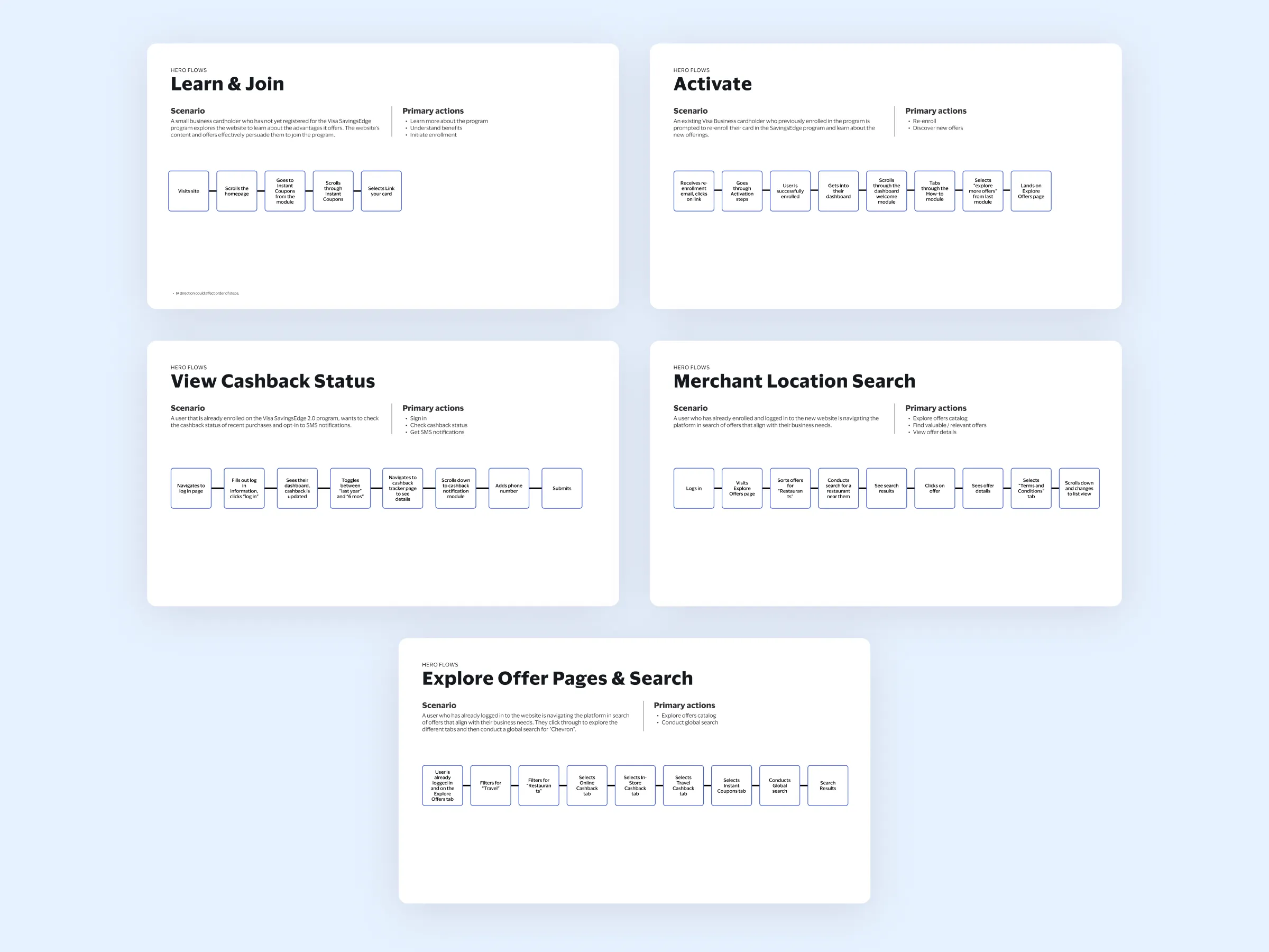
↑ User Flows helped to define key interactions
The Solution

Over the course of 8 weeks, we redesigned the Visa SavingsEdge website to create a best-in-class experience for customers that’s both engaging and scalable.

A new experience, with more comprehensive offerings, guides users to enroll, discover benefits, and fosters repeated engagement with the platform.
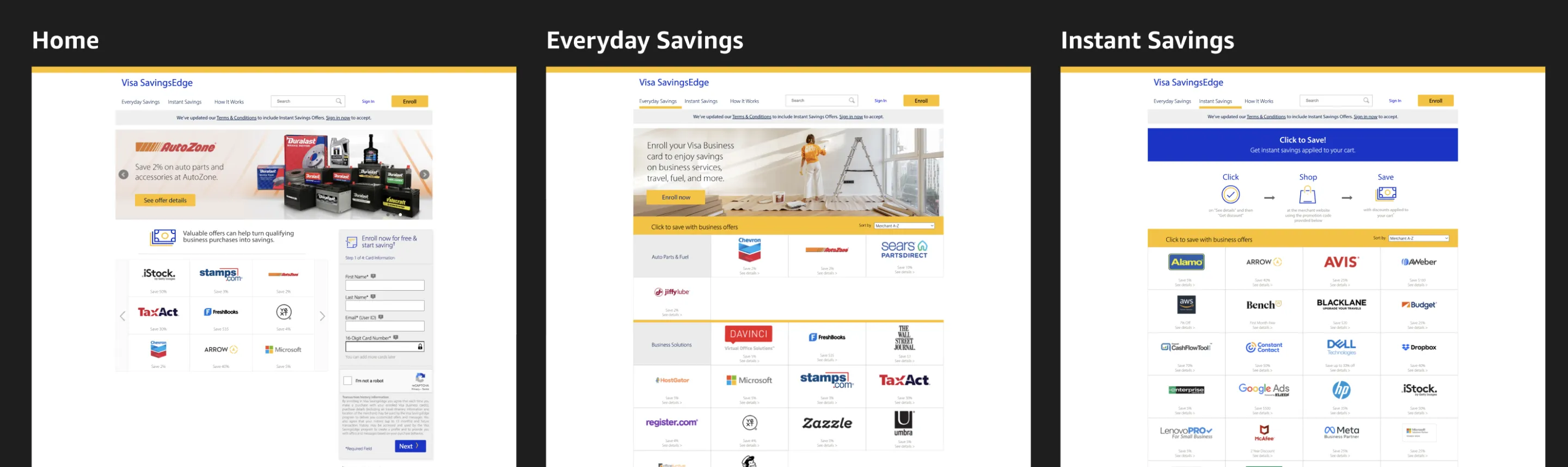
LOGGED-OUT EXPERIENCE
Homepage
The new design for the marketing Homepage, accessible when logged-out, encourages users to initiate activation and link their card through visually appealing prompts optimized for better conversion rates.
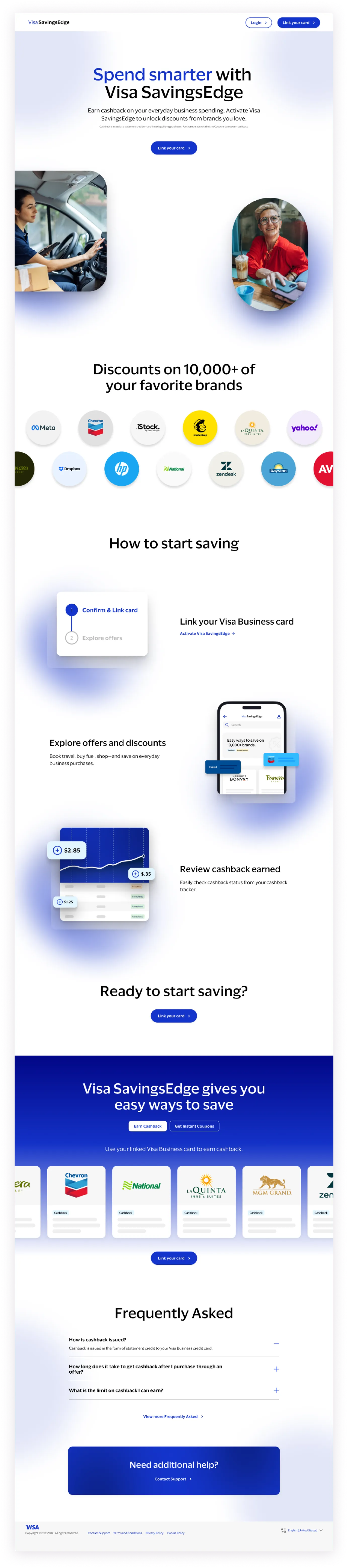
↑ Redesigned logged-out Homepage
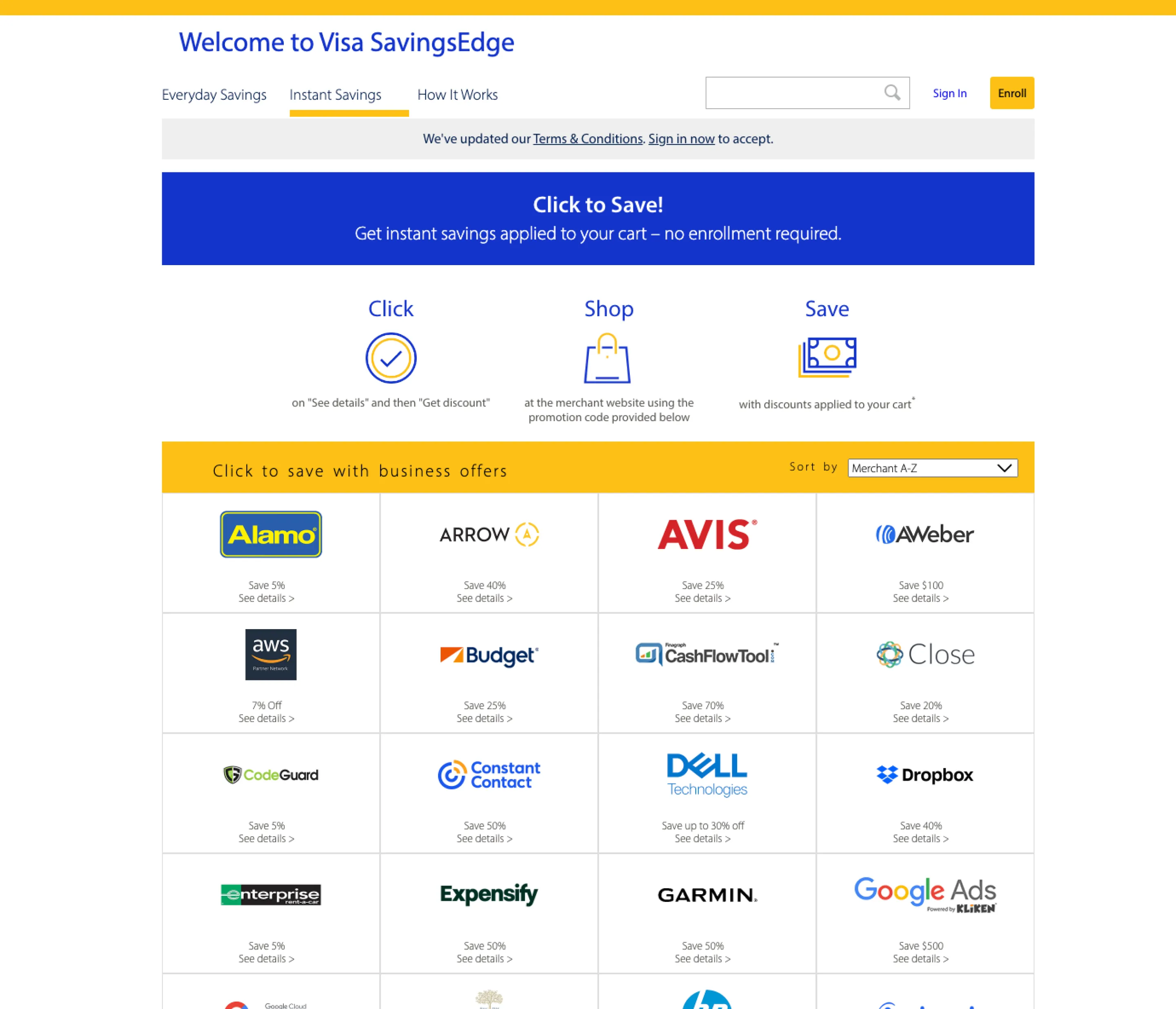
LOGGED-OUT EXPERIENCE
Instant Coupons
Instant Coupons facilitates user activation by guiding them to link their card, while also offering access to view Instant Coupons without a card linked.
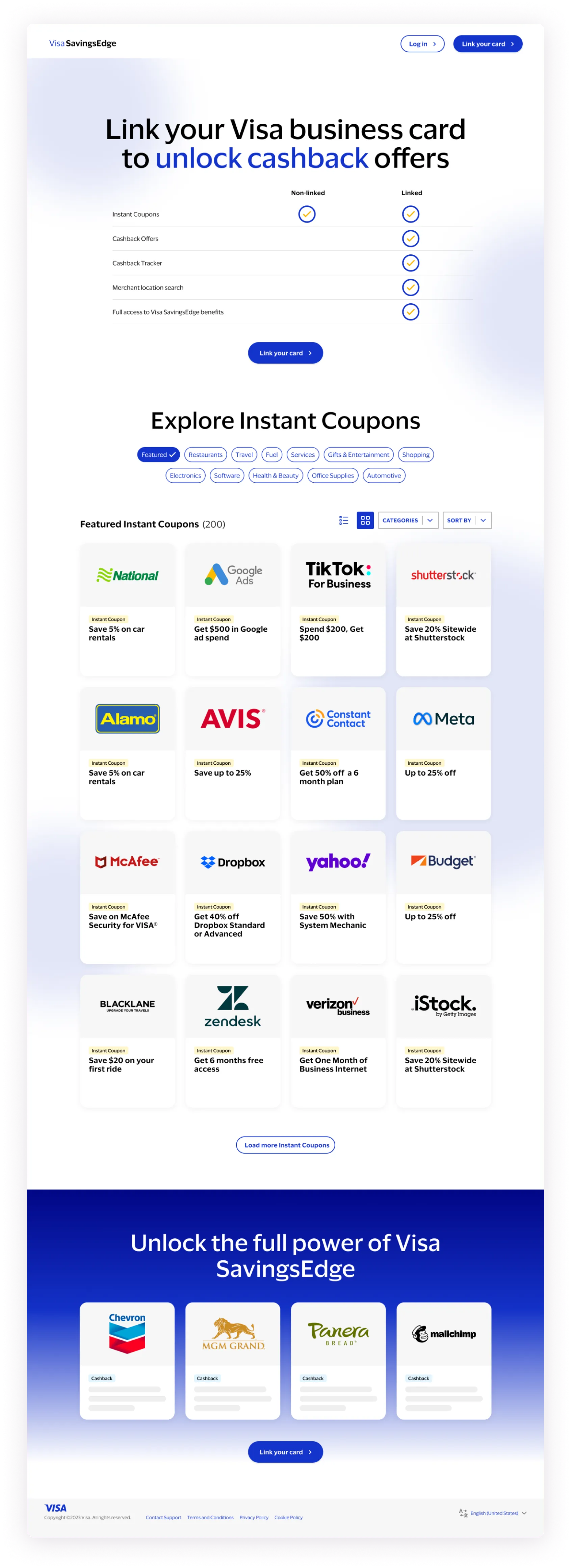
↑ Redesigned logged-out Instant Coupons
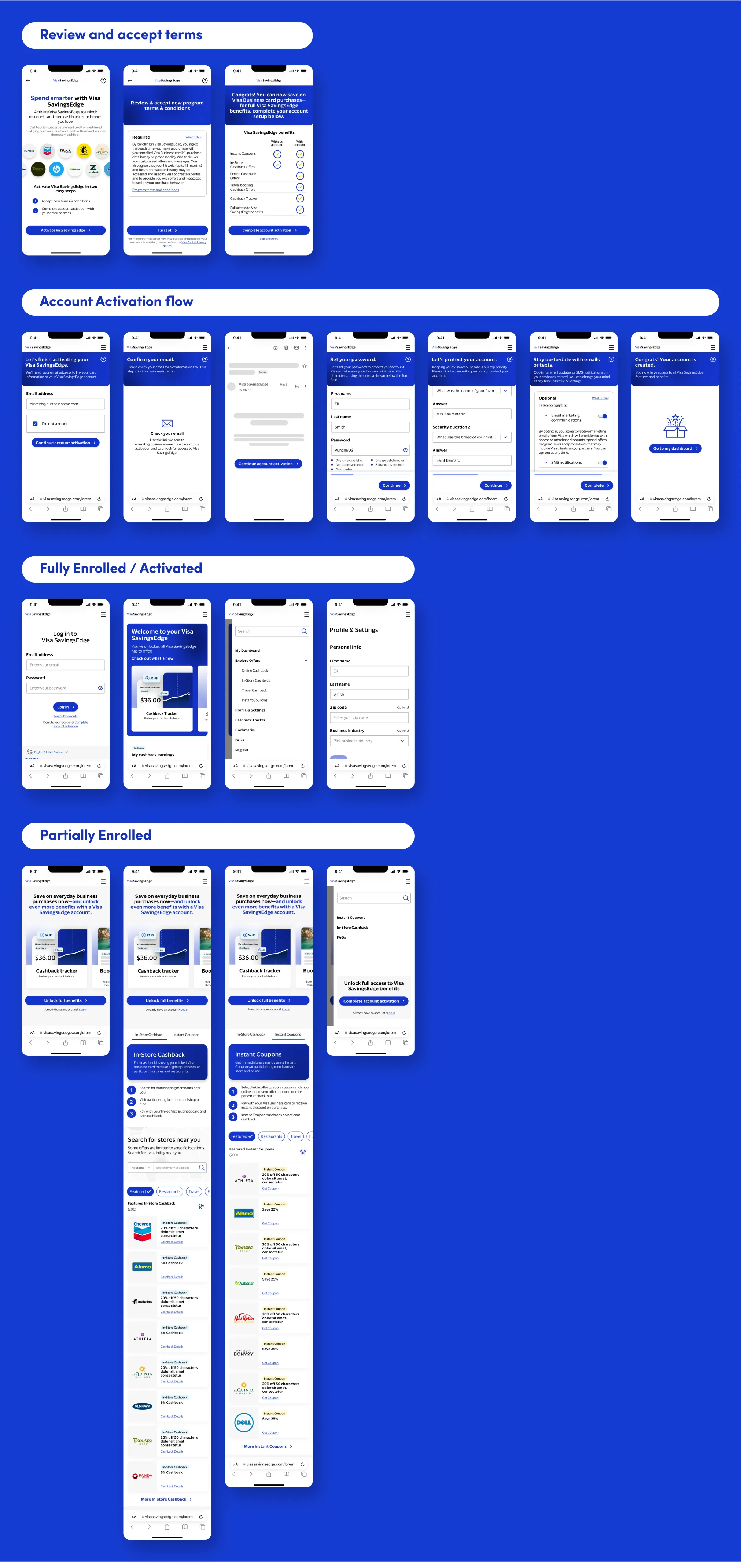
ACTIVATE
Enroll & Activate
Activation and enrollment is designed with ease of use in mind. Steps are broken into digestible chunks with support copy guiding the user.
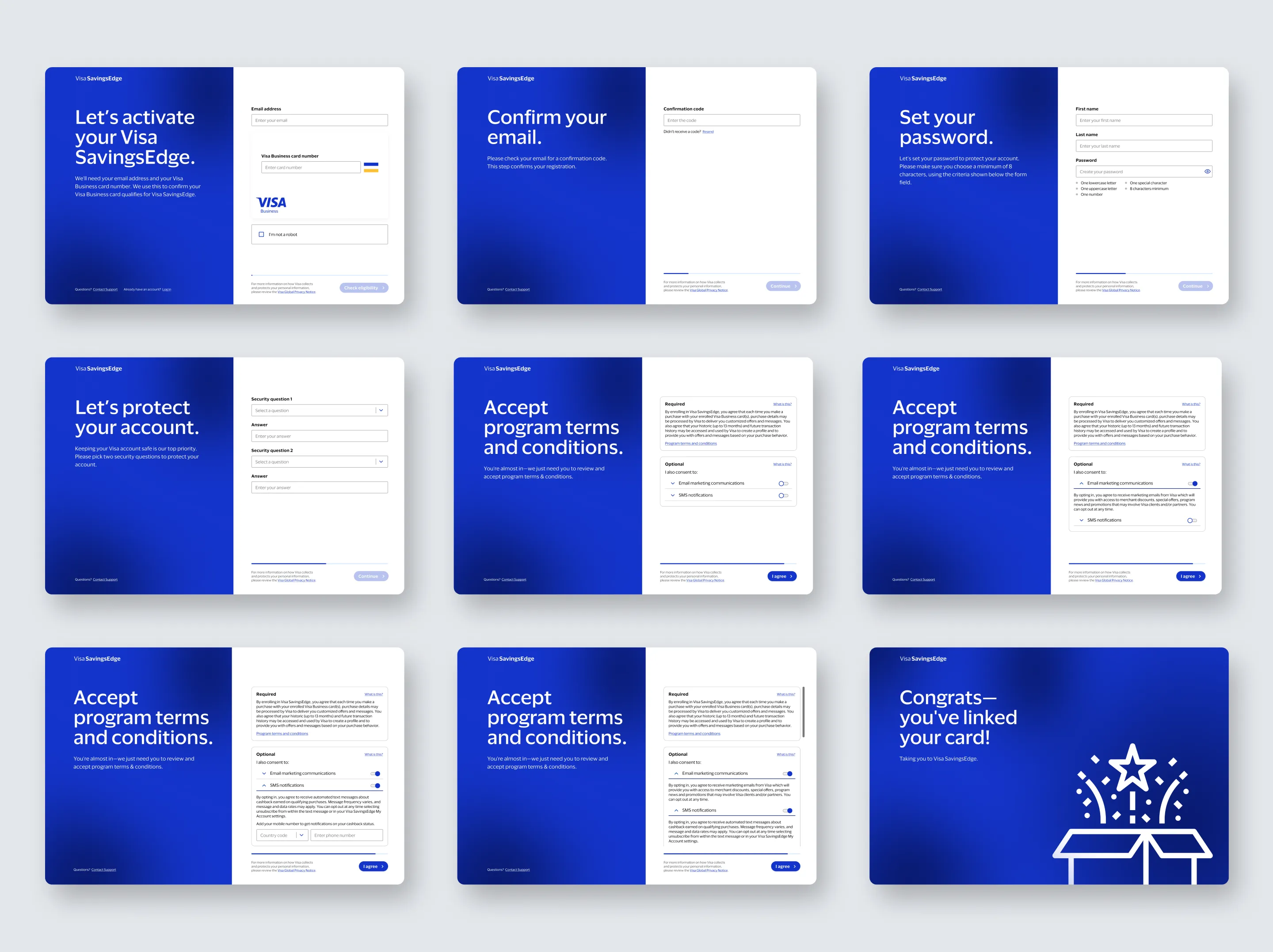
↑ Redesigned Activation & Enrollment flow
GETTING STARTED
Login
Login screen redesigned with new visual styles and components.
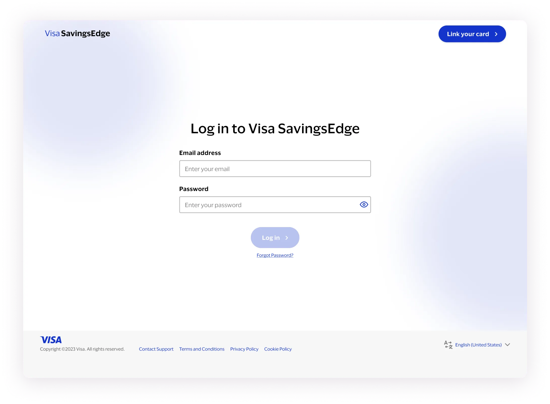
↑ Updated Login screen for enrolled users
LOGGED-IN (NEW USER)
Dashboard
The updated Visa SavingsEdge Dashboard offers improved onboarding and a clear overview of earnings and offers for new users.
Educational Modules
Time-based Interactive educational modules simplify user onboarding and prompt feature exploration.
CHECK EARNINGS
Cashback Tracker
Users can access the Cashback Tracker for intuitive earnings monitoring through interactive modules and a more indepth transaction table.
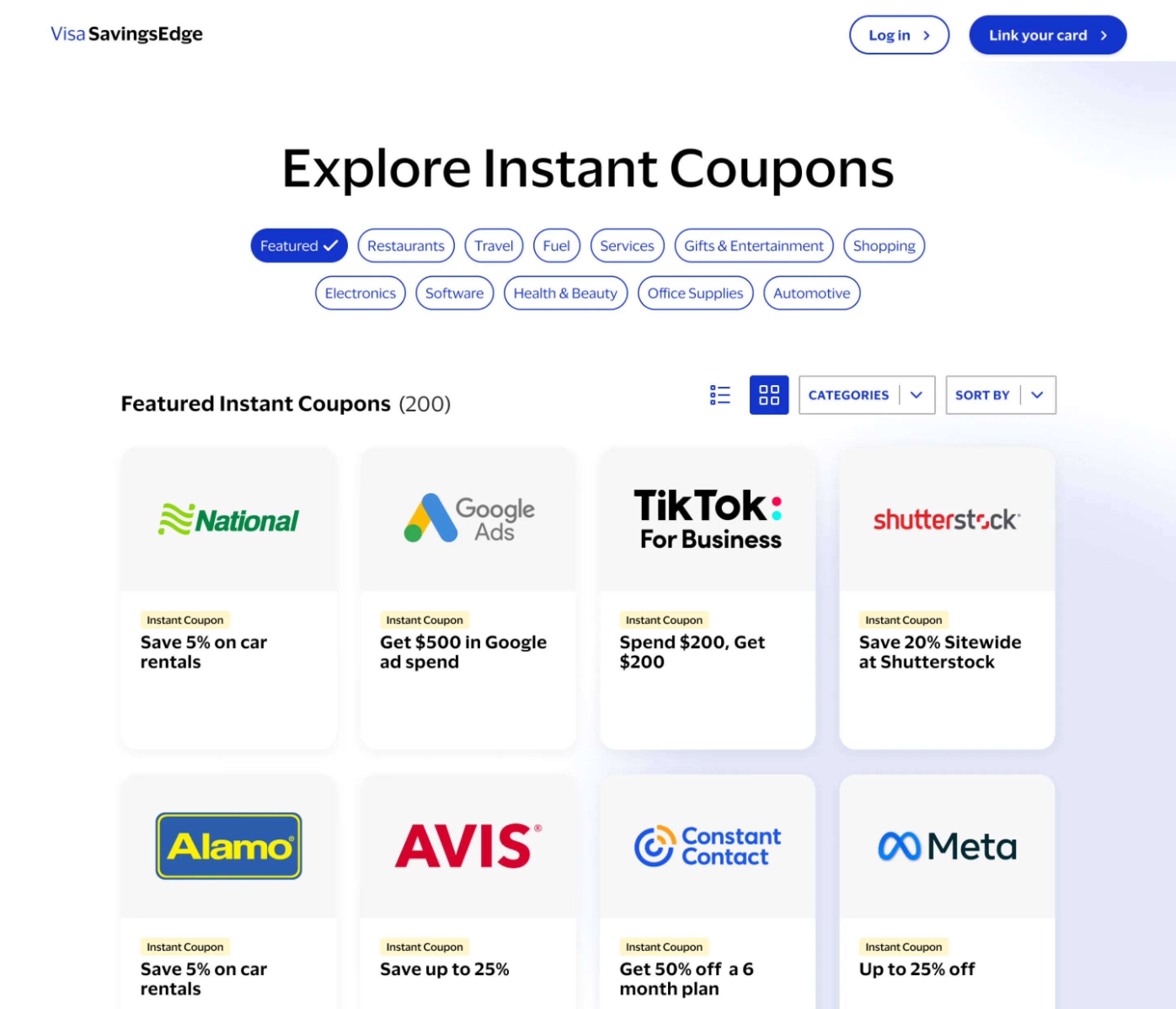
EXPLORE OFFERS
Filtering Offers
Revamped Explore Offer pages with simplified filtering and location search, allowing users to find and engage with relevant offers.
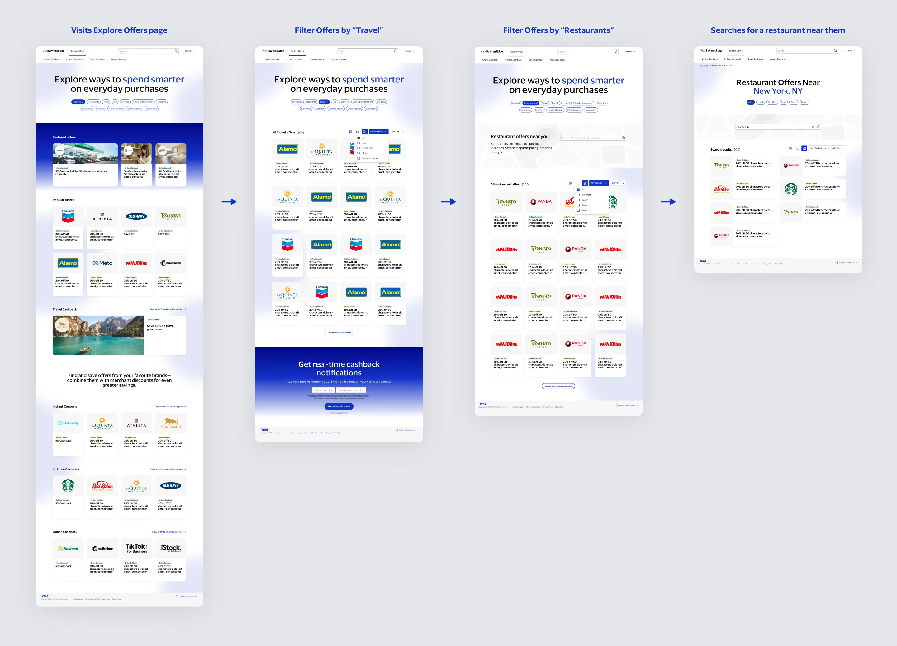
↑ Explore Offers lets users easily filter merchant offers & search by location
EXPLORE OFFERS
Offer Types
Selecting "Explore Offers" reveals a sub-navigation for offer types: Online Cashback, In-Store Cashback, Travel Cashback, and Instant Coupons. Each tab includes a "how it works" guide to familiarize users.
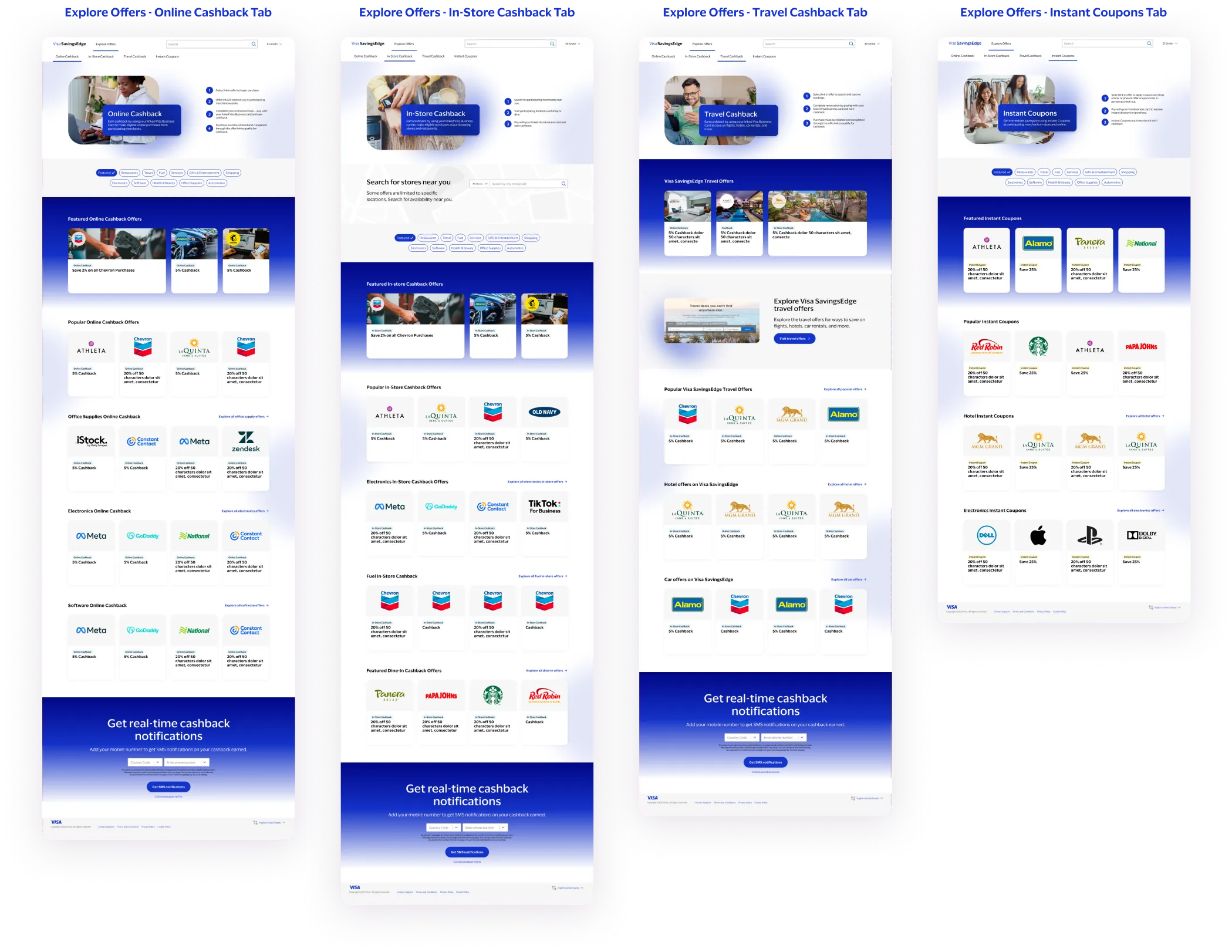
↑ Explore Offer tabs for different offer types
FIND OFFERS
Global Search
Users can find offers easily with the redesigned Global Search, with featured offers and real-time suggestions for quicker results.
EXPLORE OFFERS
Offer Details
Location-specific Offer Details provides a map/list view for convenience, and Standard Offer Details provide more relevant offers.
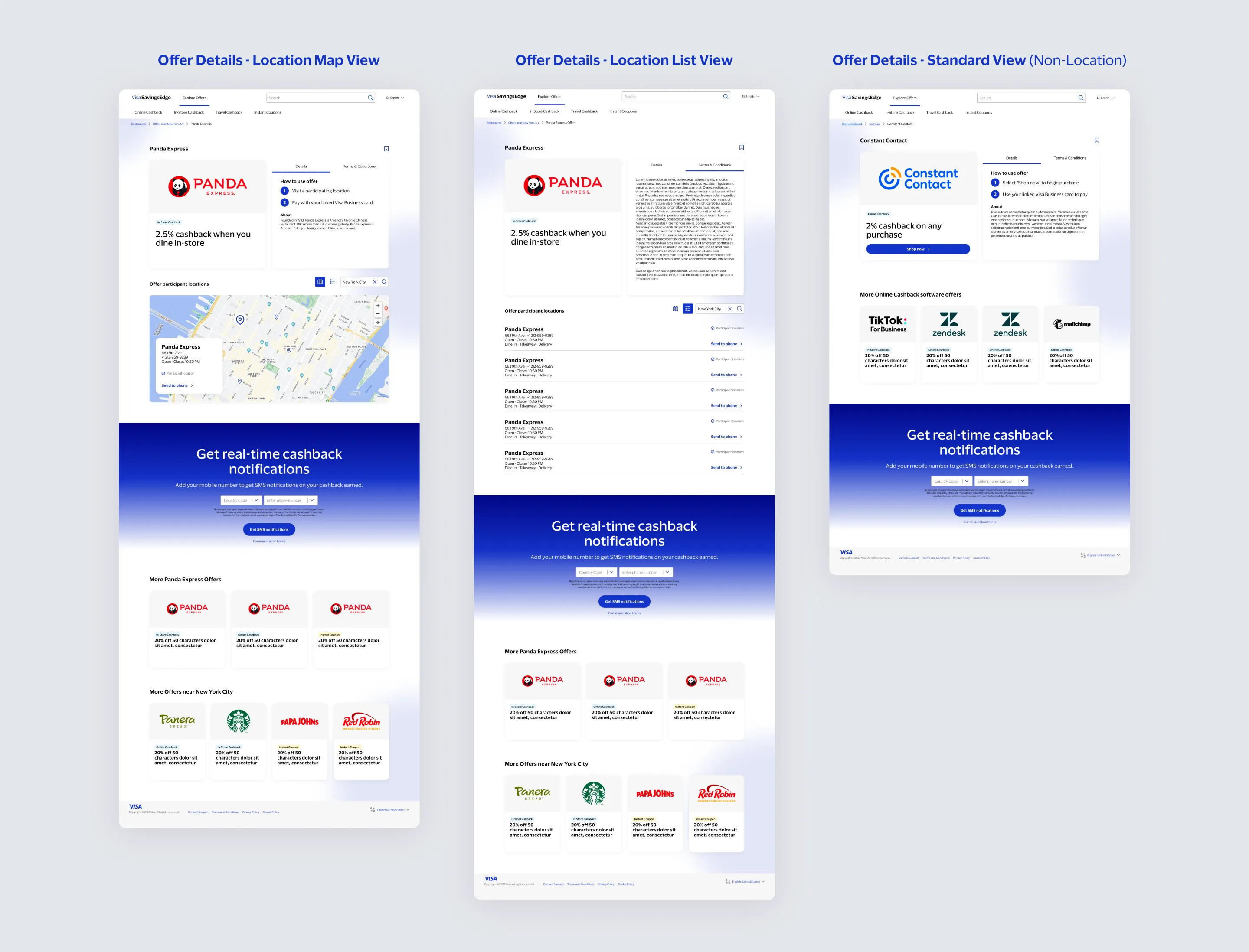
↑ Location-based & Standard Offer Details
ACCOUNT
Profile & Settings
User Profile and Settings with personal info, linked cards, password/security, and notification settings.
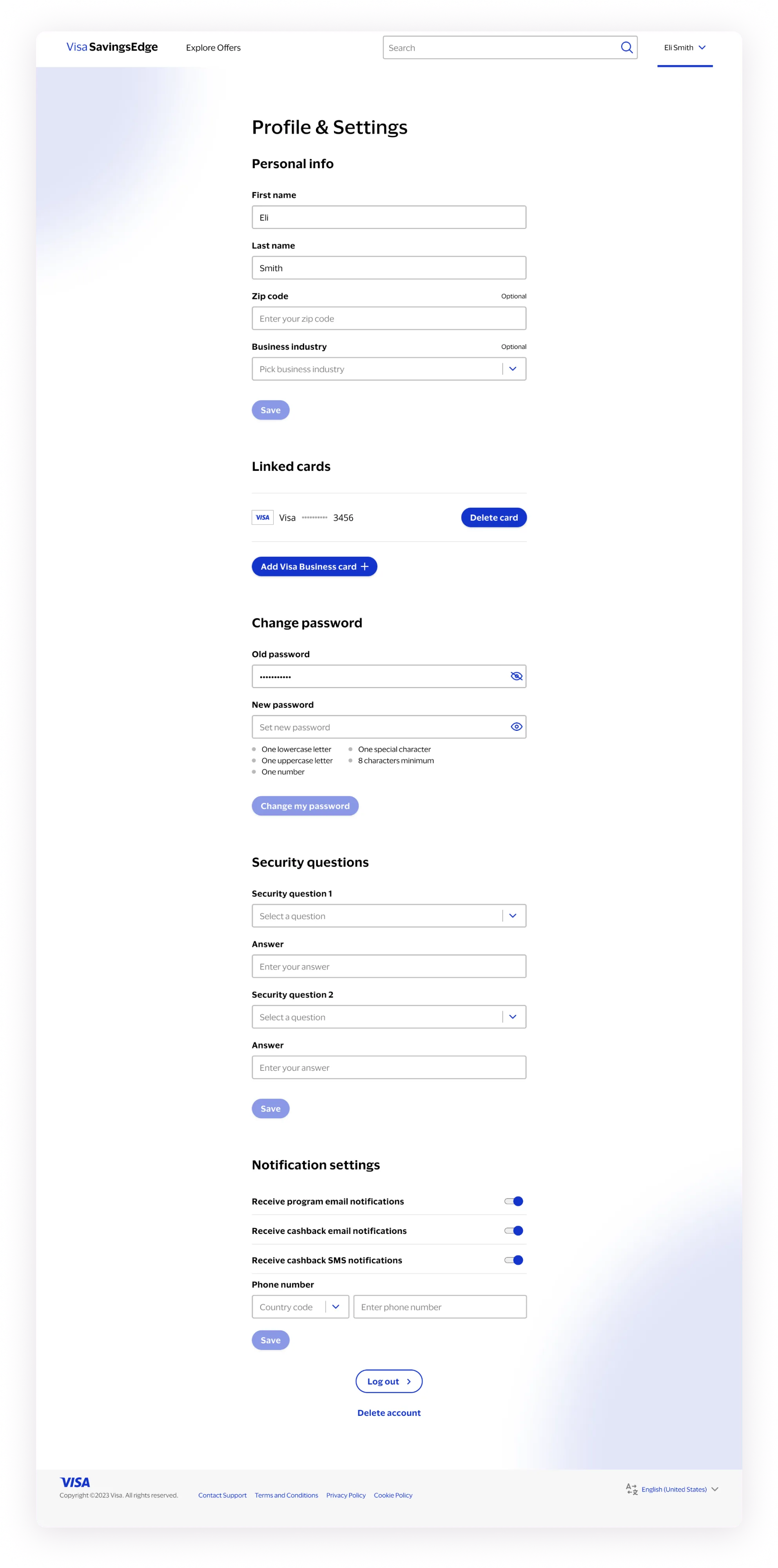
↑ Redesigned Profile & Settings for user account settings
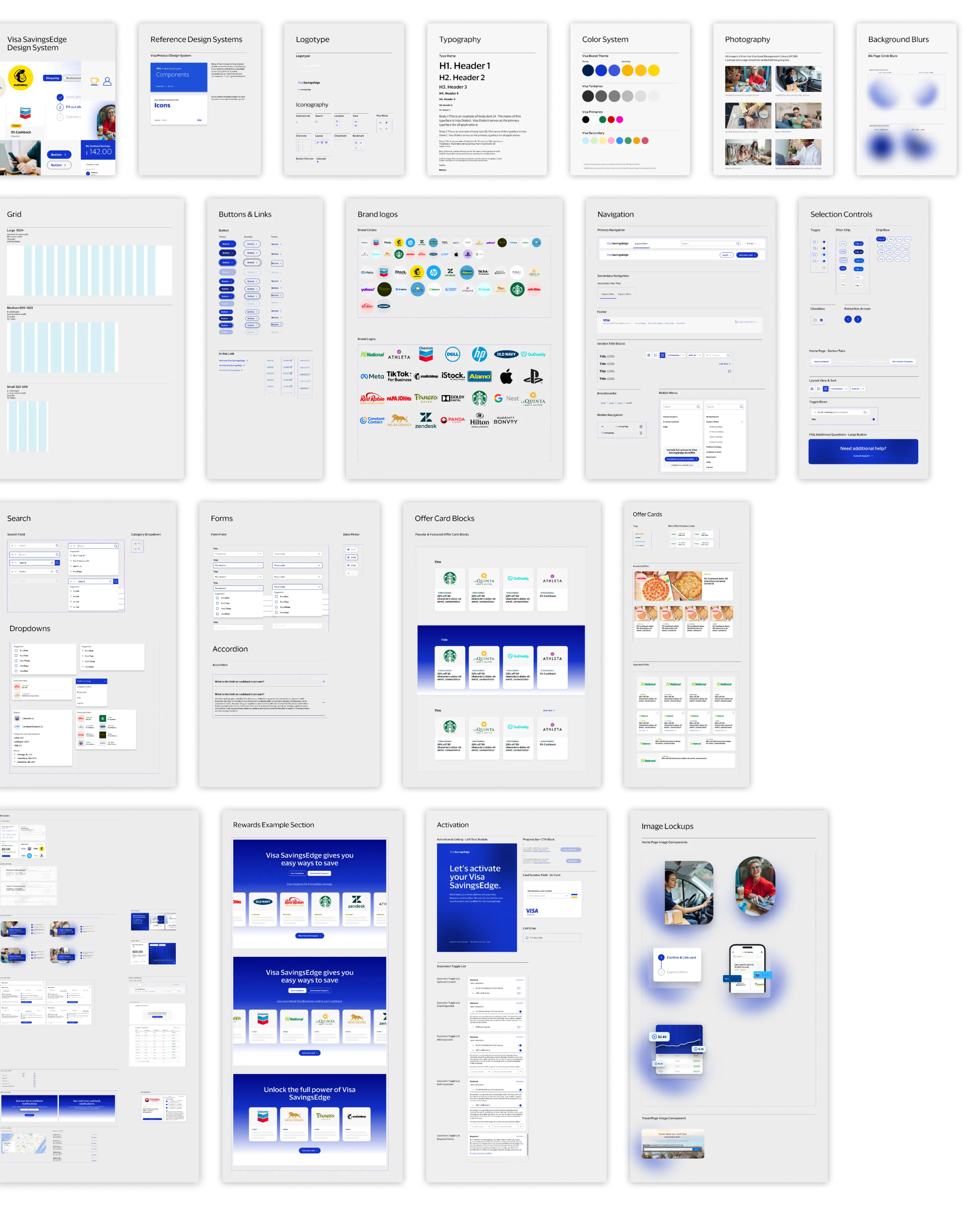
↑ Design System for Visa SavingsEdge
BUILDING BLOCKS
Design System
Throughout the design phase, I worked to establish a robust design system for the new SavingsEdge website, referencing patterns from Visa's Product Design System. I prioritized accessibility and responsiveness, crafting interactive Figma components for streamlined prototyping and a toolkit for Visa to use in development.
PARTNER EXPERIENCE
Whitelabel System
Boosting global partnerships was a primary goal for Visa. Whitelabeled examples of SavingsEdge designs for issuer partner brands like DoorDash and Lili show how the system can be applied to custom experiences while maintaining a unified UX across platforms.
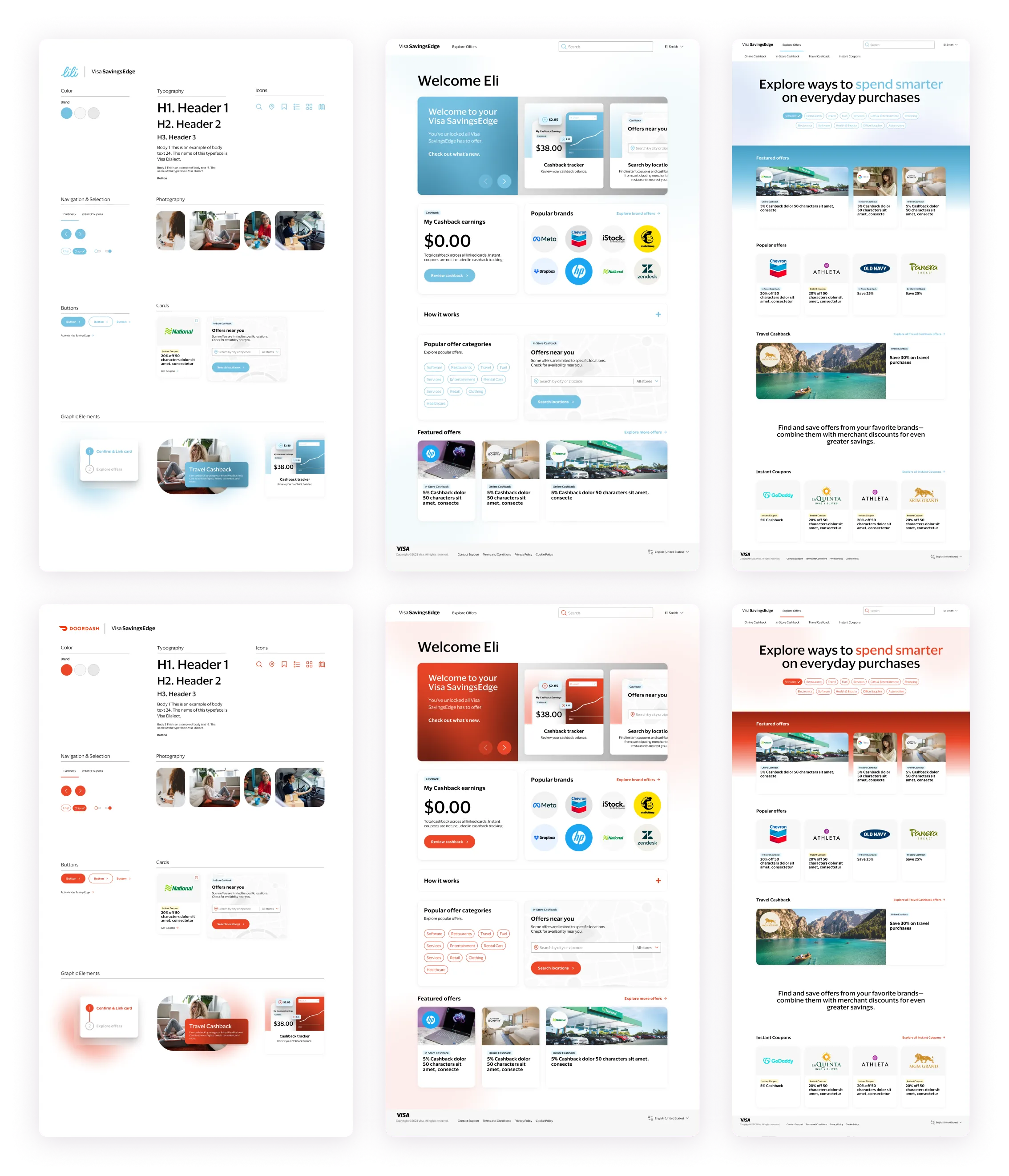
↑ Whitelabel design system & screen examples for DoorDash & Lili
Mobile Experience
MOBILE
A Responsive Experience
In addition to the web experience, it was important to consider how the experience would translate to mobile. For the first version, the focus was on core features, but the design was created to scale for future mobile enhancements.
Key Takeaways
User-Centric Approach
Emphasizing clear pathways and effective communication prioritized user engagement and enrollment, ensuring a seamless experience.
Adaptable Design
The design adapts to partner merchant branding needs, ensuring a cohesive user experience while maintaining consistent UI.
Innovation Sparks Change
Embracing innovation drove transformative outcomes for Visa, proving the power of design to catalyze positive change.
Real-world Impact
The project's success is measured by its tangible impact on users' lives, reaffirming the power of thoughtful design.