CASE STUDY
Harmonizing UX for PathFactory to Boost Efficiency for Marketers
OVERVIEW
I co-led a five-week initiative for PathFactory, a content intelligence platform, to unify their design system and solve critical UX issues caused by rapid growth and new feature launches. Through a detailed design audit and strategy development, we improved navigation, optimized user flows, and increased design system accessibility, boosting user engagement, reducing navigation time, and improving platform efficiency.
CLIENT
PathFactory
ROLE
Sr. Visual & Interaction Designer
Research, Design Audits, IA, UI/UX, Interaction Design, Visual Design, Design Systems, Design Strategy & Governance, Roadmap & Backlog
TEAM
Punchcut
Collaborated with a PM, a solution lead, & two designers
DURATION
5 weeks
TOOLS
Figma, Figjam, Notion
Challenges
✦ Rapid growth led to UI issues
✦ Disjointed UX & navigation
✦ Reduced user engagement
Objectives
✦ Identify & resolve UI/UX issues
✦ Improve UX of key user flows
✦ Unify design system
The Solution
✦ Unified UX & design system
✦ Streamlined UX & navigation
✦ Established design strategy
Key Results
485 +
Components, Styles, UI Elements Audited
54% ↑
Increase in Design System Accessibility
32% ↓
Decrease in Platform Navigation Time
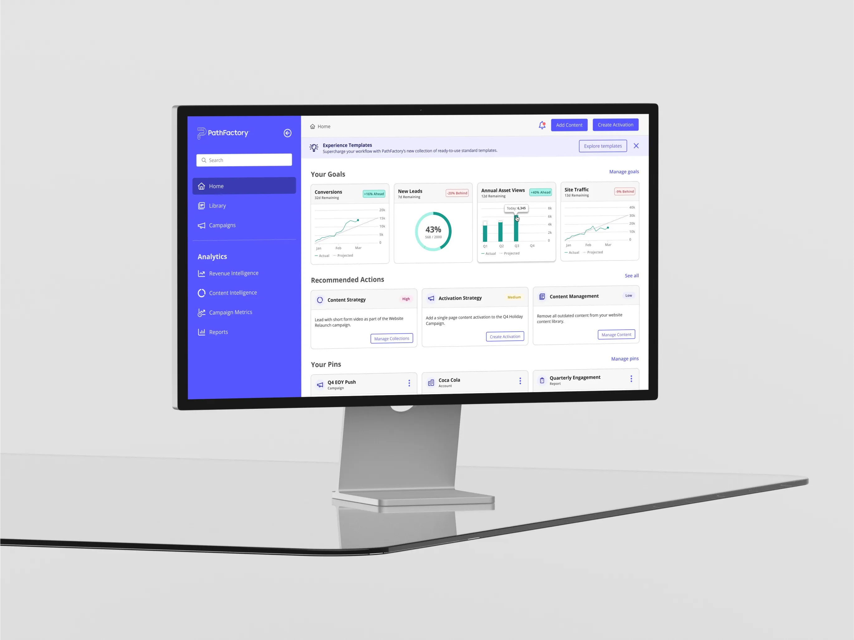
↑ Final Home screen design with improved UI & streamlined navigation.

BACKGROUND
Setting the Stage
PathFactory's Platform Innovation
PathFactory's platform provides marketers and content strategists with advanced analytics tools. Focused on innovation, they continually launch new features to stay ahead of competition and better serve their users.
Why They Sought Our Expertise
After launching over 10 new features, PathFactory faced major UI/UX inconsistencies. They sought our expertise to unify their design system and harmonize the user experience.
↑ Platform features with disjointed layouts, navigation, & UI elements.
The Process
The project was broken down into four main phases:
Discovery
Discovery Workshops
User & Competitive Research
User Persona Definition
Audit & Assess
Audit Scope Definition
Product & System Audits
Audit Findings Analysis
Define
Heuristic Definition
Opportunity Brief
IA & Navigation Updates
UI/UX Iteration
Deliver
Audit & Brief Handoff
Key User Flow Updates
Wireframes & Hifi Concepts
Design Roadmap & Backlog

Discovering the Vision
The process kicked off with discovery workshops to better understand PathFactory’s business goals, challenges, and constraints.
DISCOVERY FOCUS AREAS:
• Discovery Workshops
• Goals, Challenges, Constraints
• User Research & Personas
Business Goals
✦ Identify UX issues & opportunities
✦ Improve intuitiveness & efficiency
✦ Establish governance & consistency
✦ Streamline workflows for updates
Challenges
✦ Broken design system with gaps
✦ Disjointed UX in flows & navigation
✦ Misaligned design system/platform
✦ Lack of governance & sporadic UI
Constraints
✦ Vast platform & features to assess
✦ Tight timeline due to new launches
✦ Complex design system to grasp
✦ No time to test designs with users
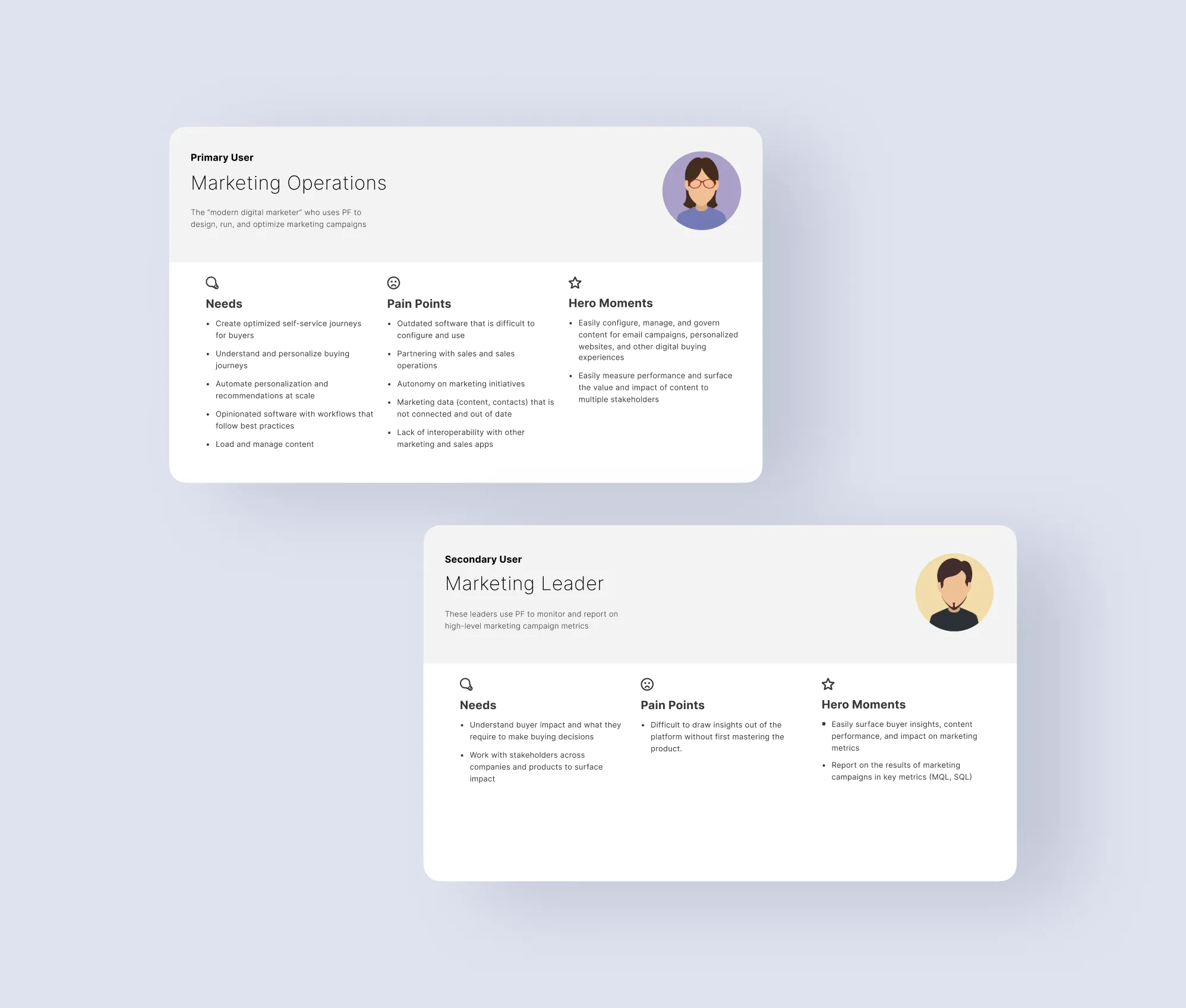
↑ User Personas for primary & secondary users.
DISCOVERY
Understanding Core Users
We conducted user interviews to thoroughly understand their needs and pain points. We defined primary personas to guide design decisions:
Primary User: Marketing Operations
Needs: Intuitive content management
Pain Points: Dated software, no autonomy
Secondary User: Marketing Leader
Needs: Easy access to insights and reports
Pain Points: Extracting insights, navigation
PROBLEM STATEMENT
PathFactory’s rapid growth led to a fragmented user experience with inconsistent UI and disjointed navigation, making the platform difficult to use and decreasing user engagement. The issues also disrupted internal design and dev workflows, reducing team collaboration and efficiency, compromising the platform’s effectiveness, and delaying updates and new launches.
HOW MIGHT WE?
How might we establish a holistic design strategy to enhance PathFactory’s consistency, UX, and scalability?
THE APPROACH
Conducting a comprehensive audit was the clear first step to identifying gaps, inconsistencies, and areas for improvement.

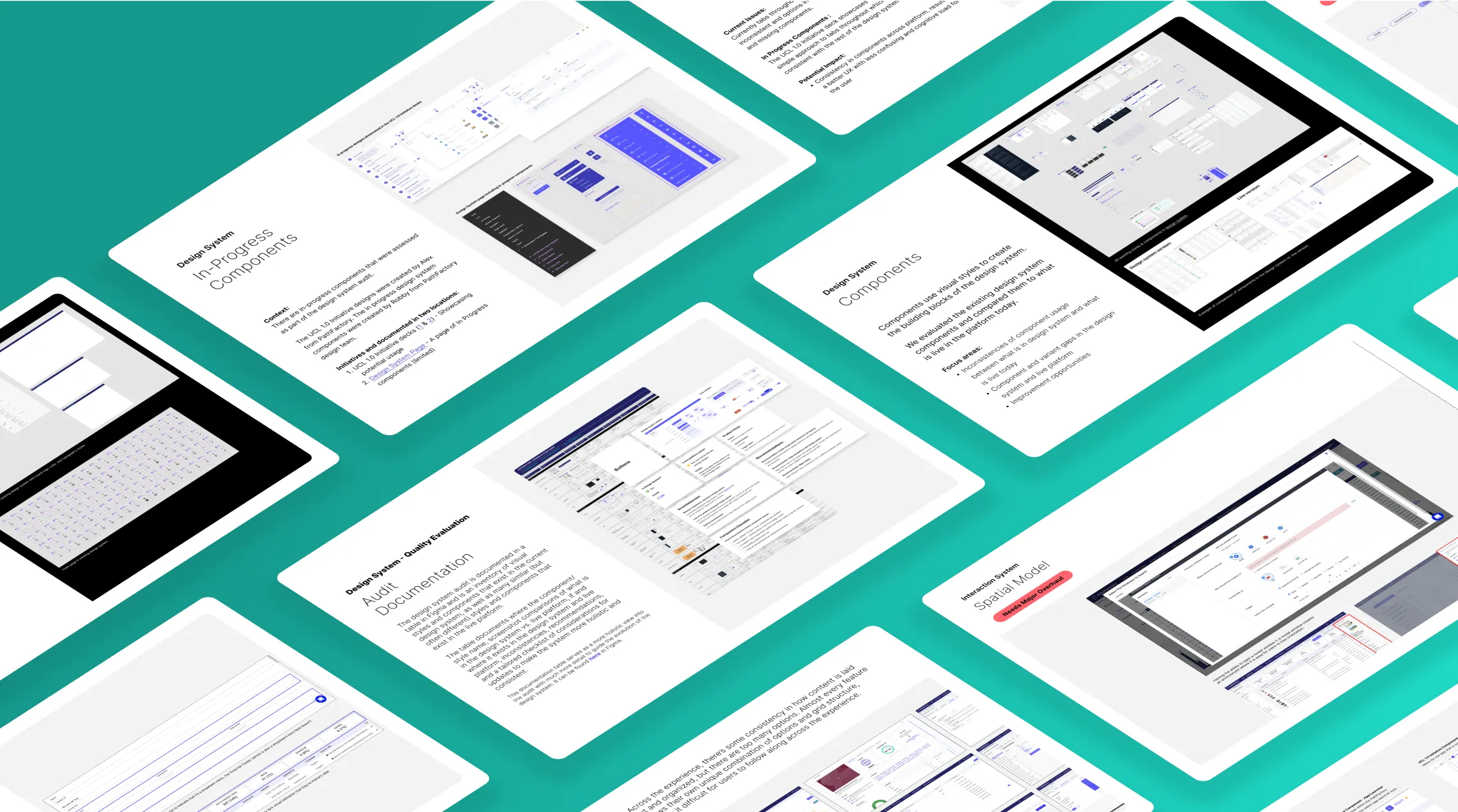
Audit Deep Dive
The first two weeks focused on conducting extensive audits of PathFactory's platform and design system to identify inconsistencies and areas to improve.
AUDIT FOCUS AREAS:
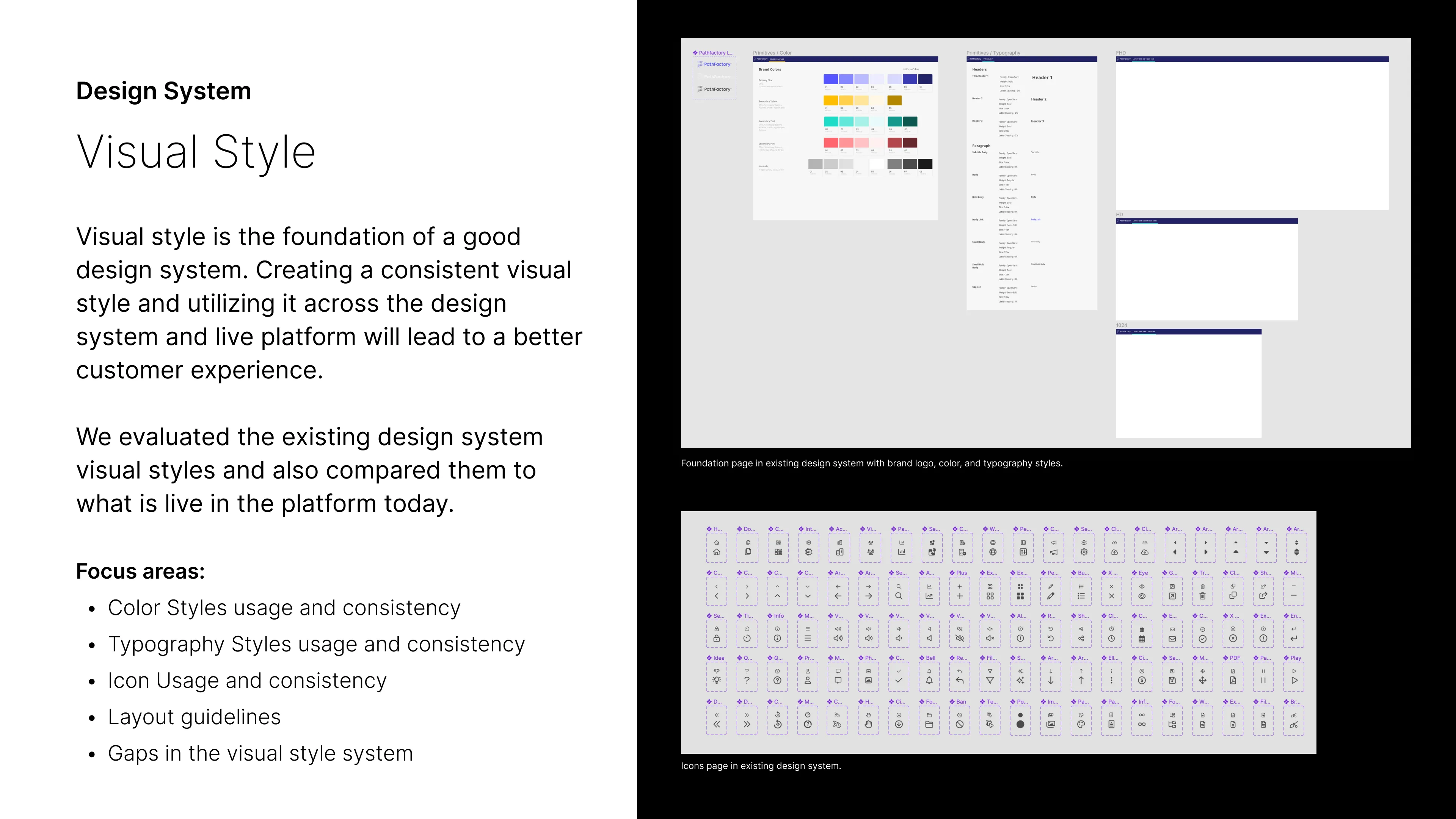
• Visual Styles
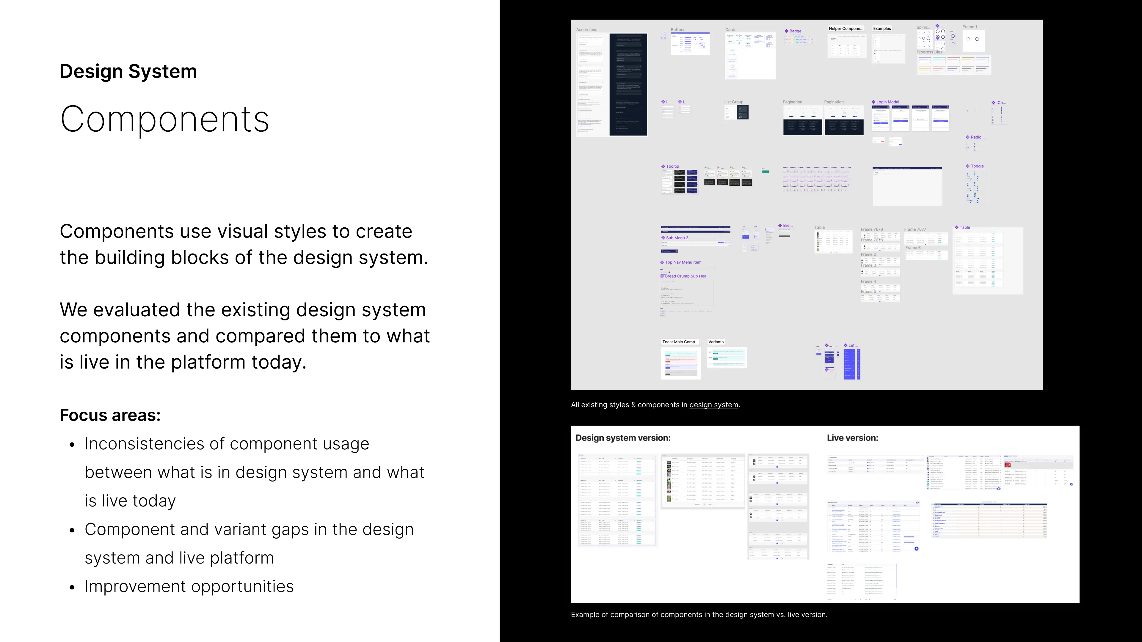
• Components
• Structural Elements
• UX Assessments
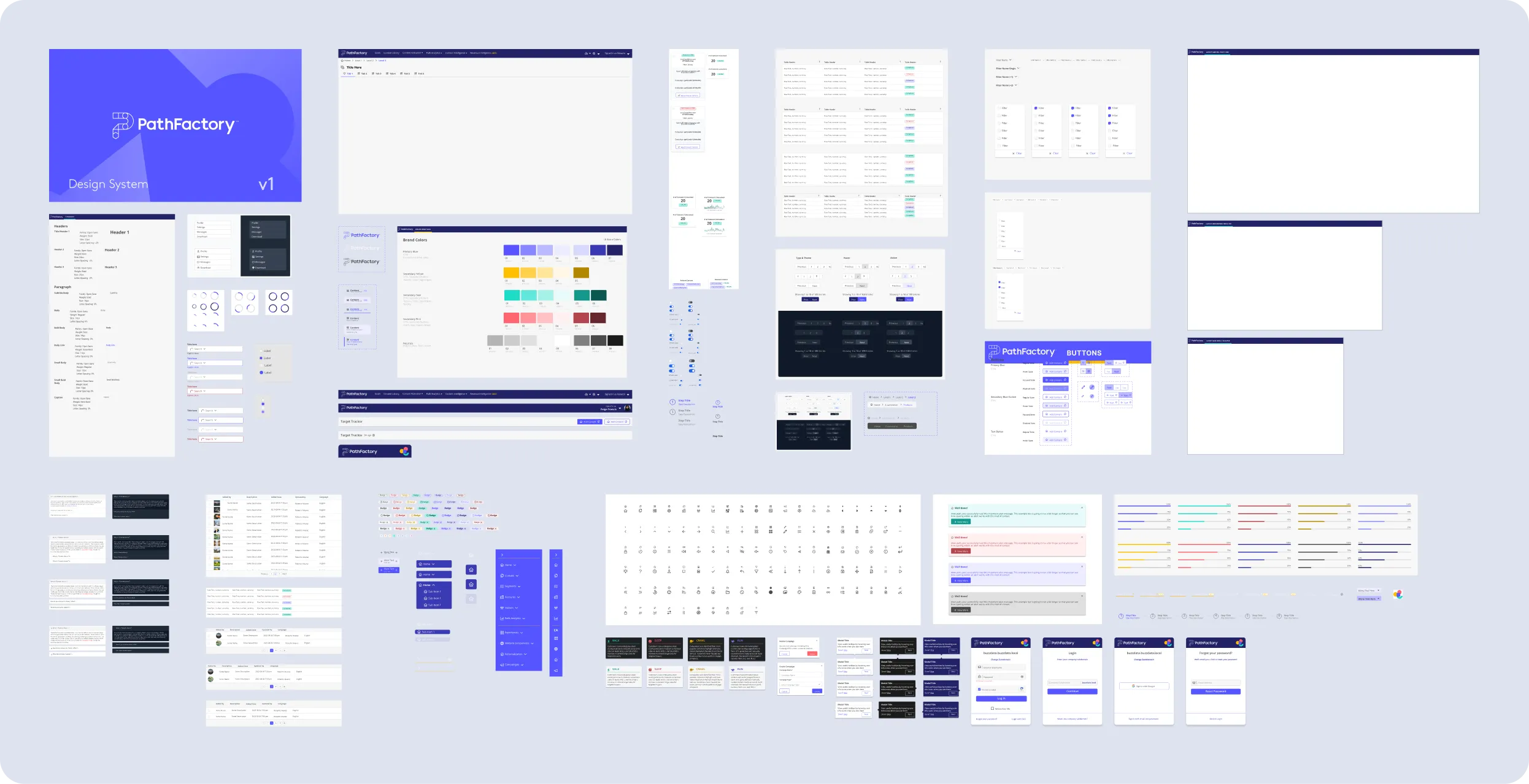
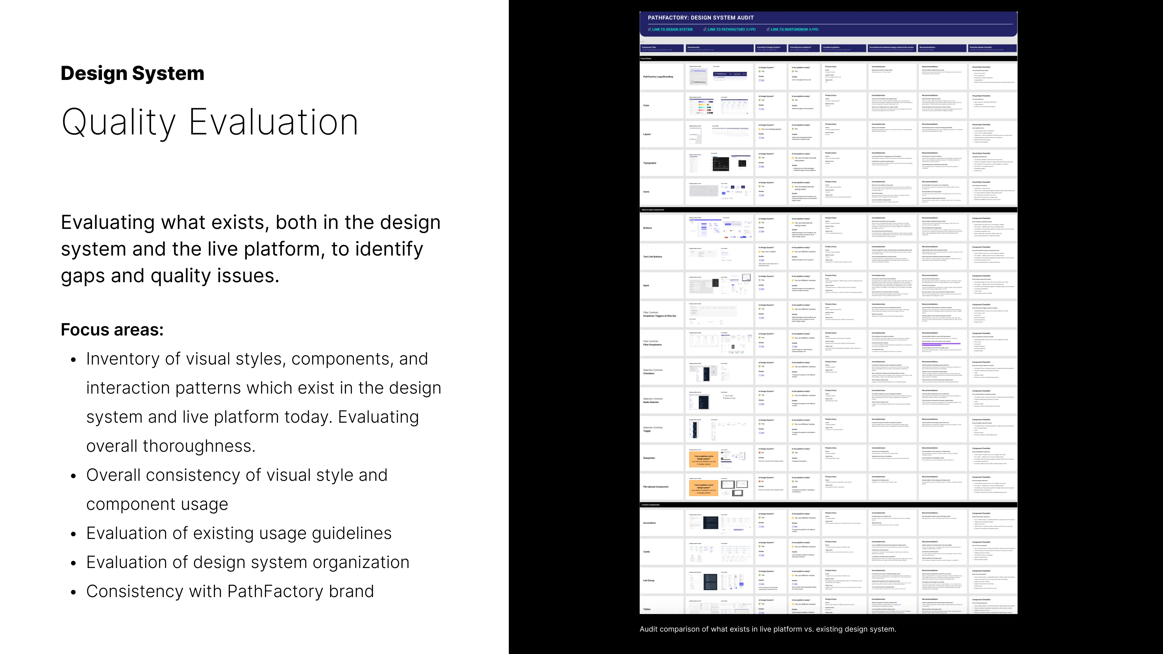
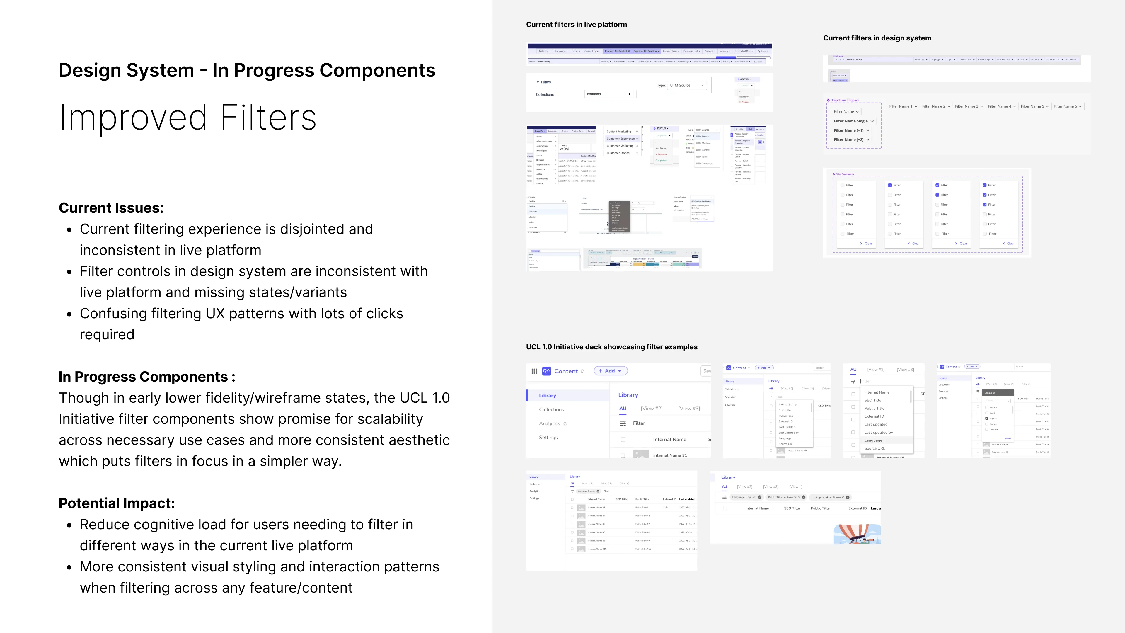
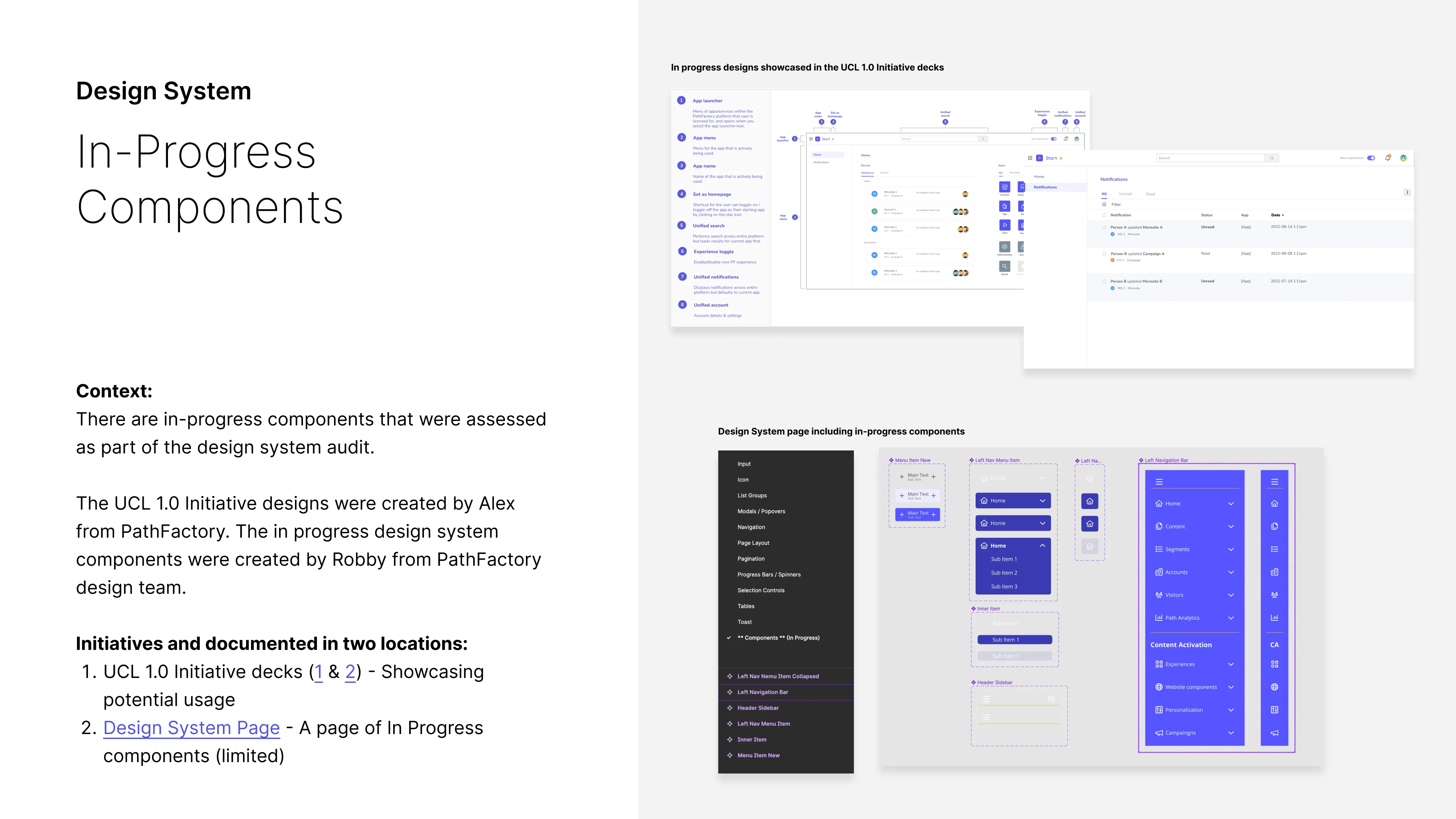
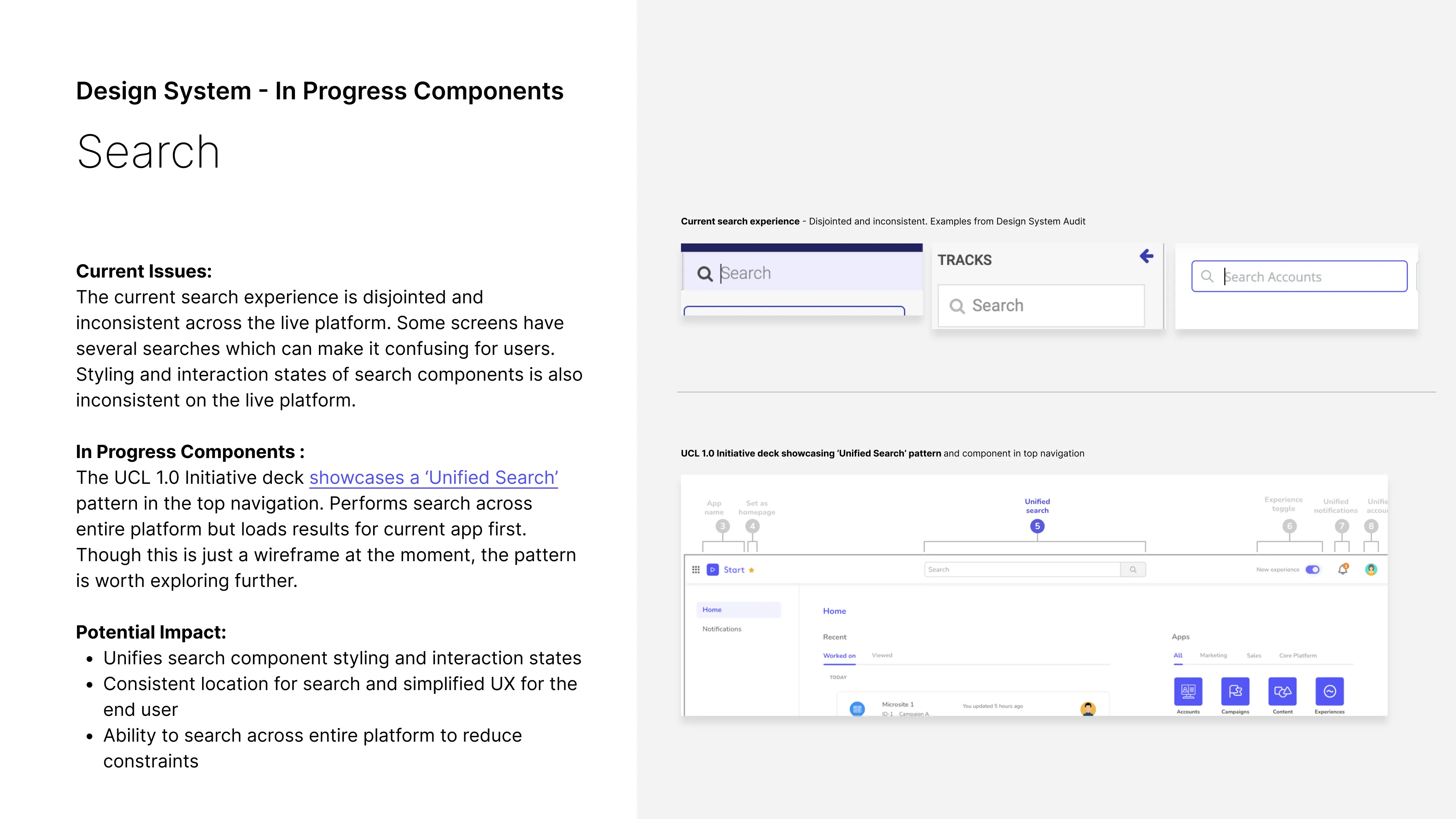
↑ Design System audit analyzing quality, completeness, & usage.
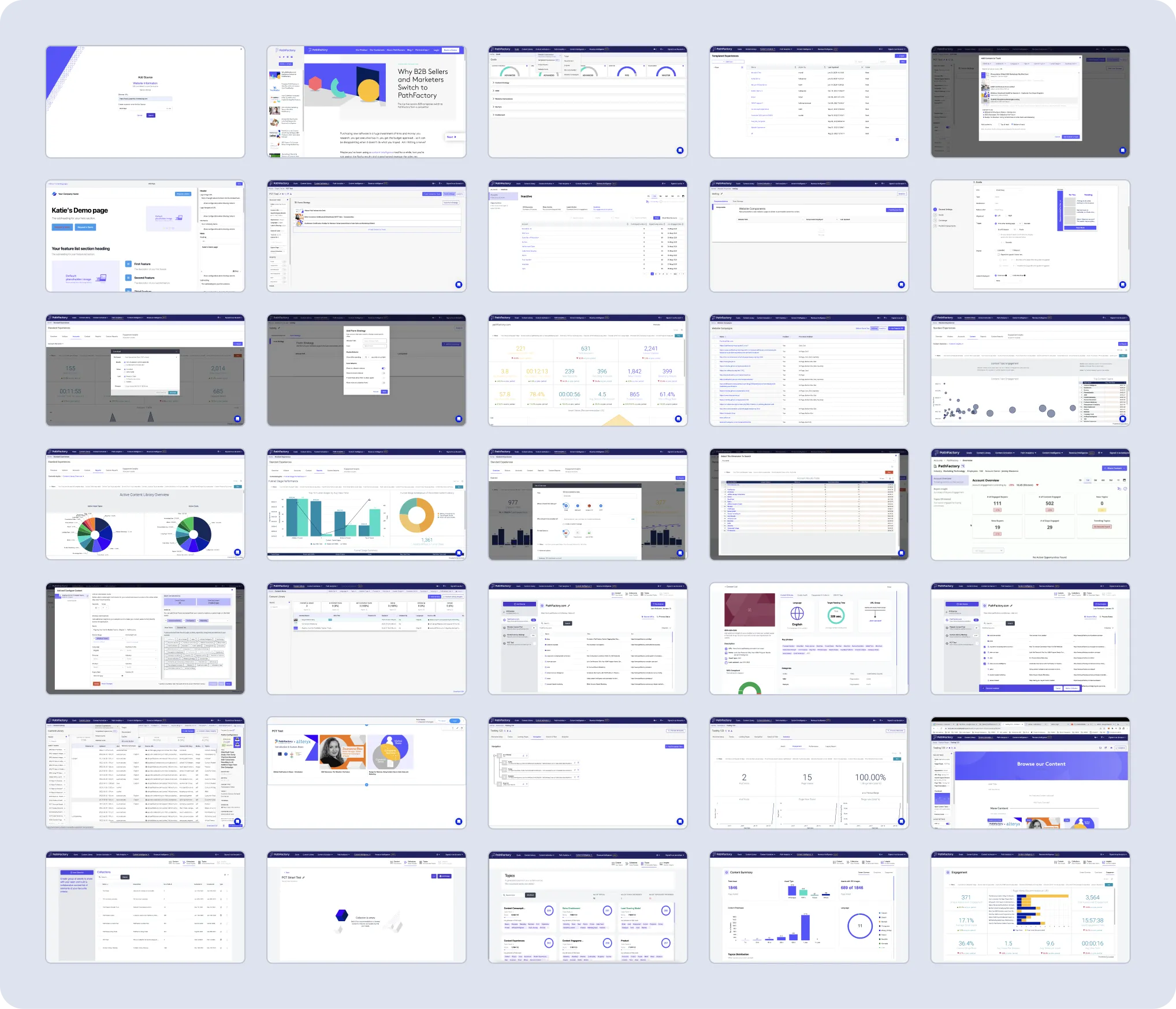
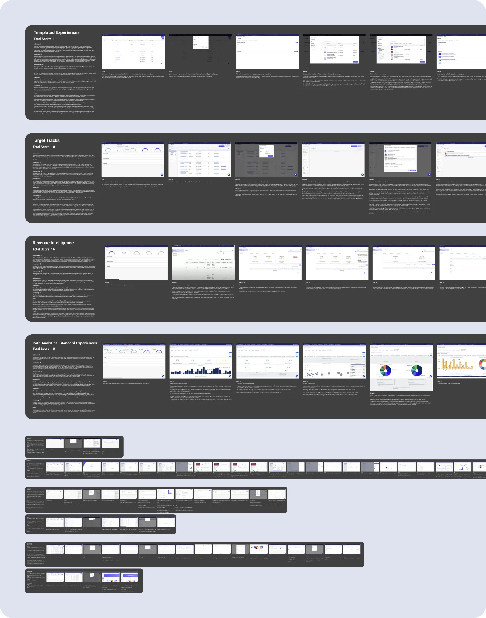
↑ Live Platform audit analyzing UI & interactions for inconsistencies.
AUDITS
Audit Approach
The audit aimed to identify gaps and quality issues by comparing the design system with the live platform and its core features.
AUDITS
Documenting Discrepancies
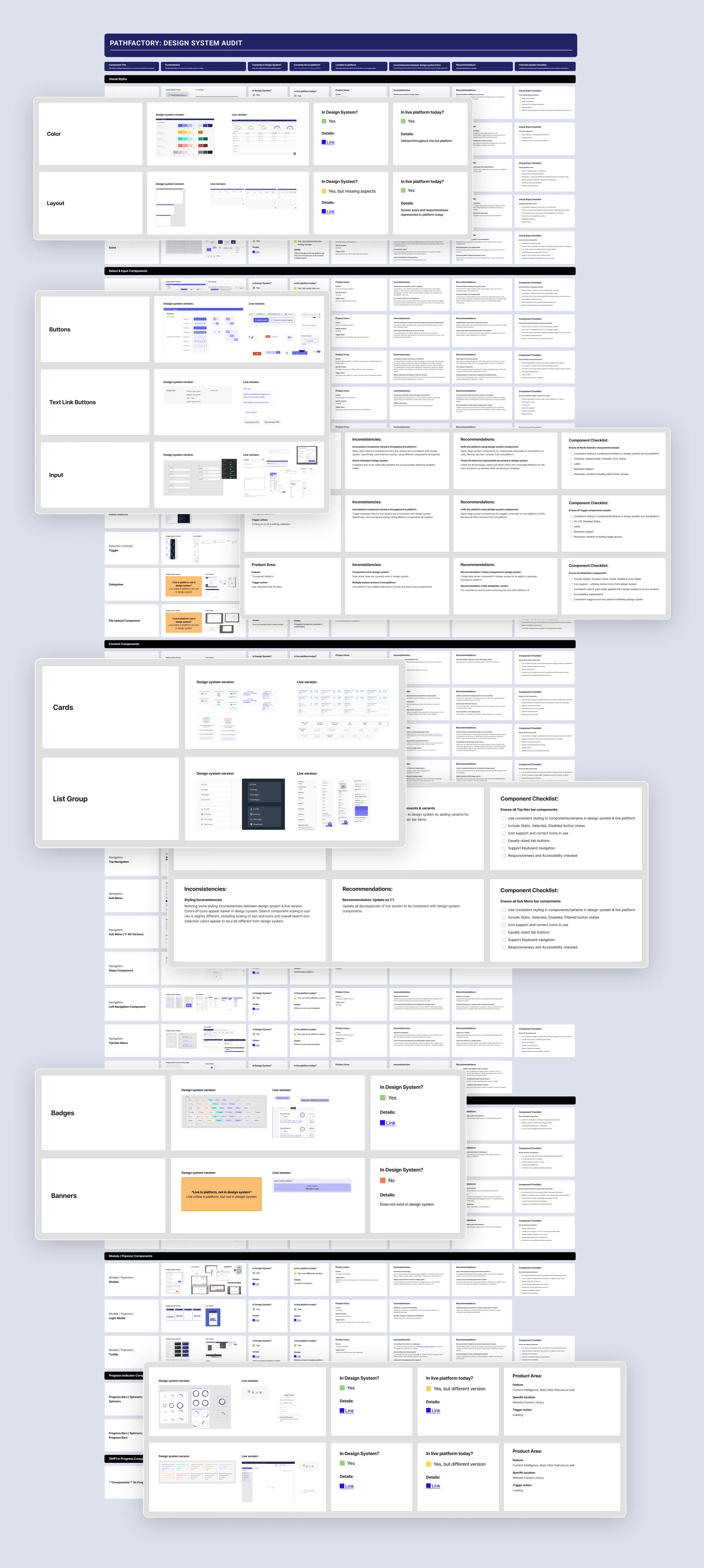
I created an audit overview in Figma to compare the design system with the live platform, highlighting discrepancies and opportunities for improvement.
I also documented key user flows to identify UX issues and provide a holistic view of the platform’s strengths and weaknesses.
↑ Audit Documentation with findings in an an overview for comparison.
↑ Key User Flow Audit analyzing common pathways & workflows for UX issues.
Audit Findings Deck
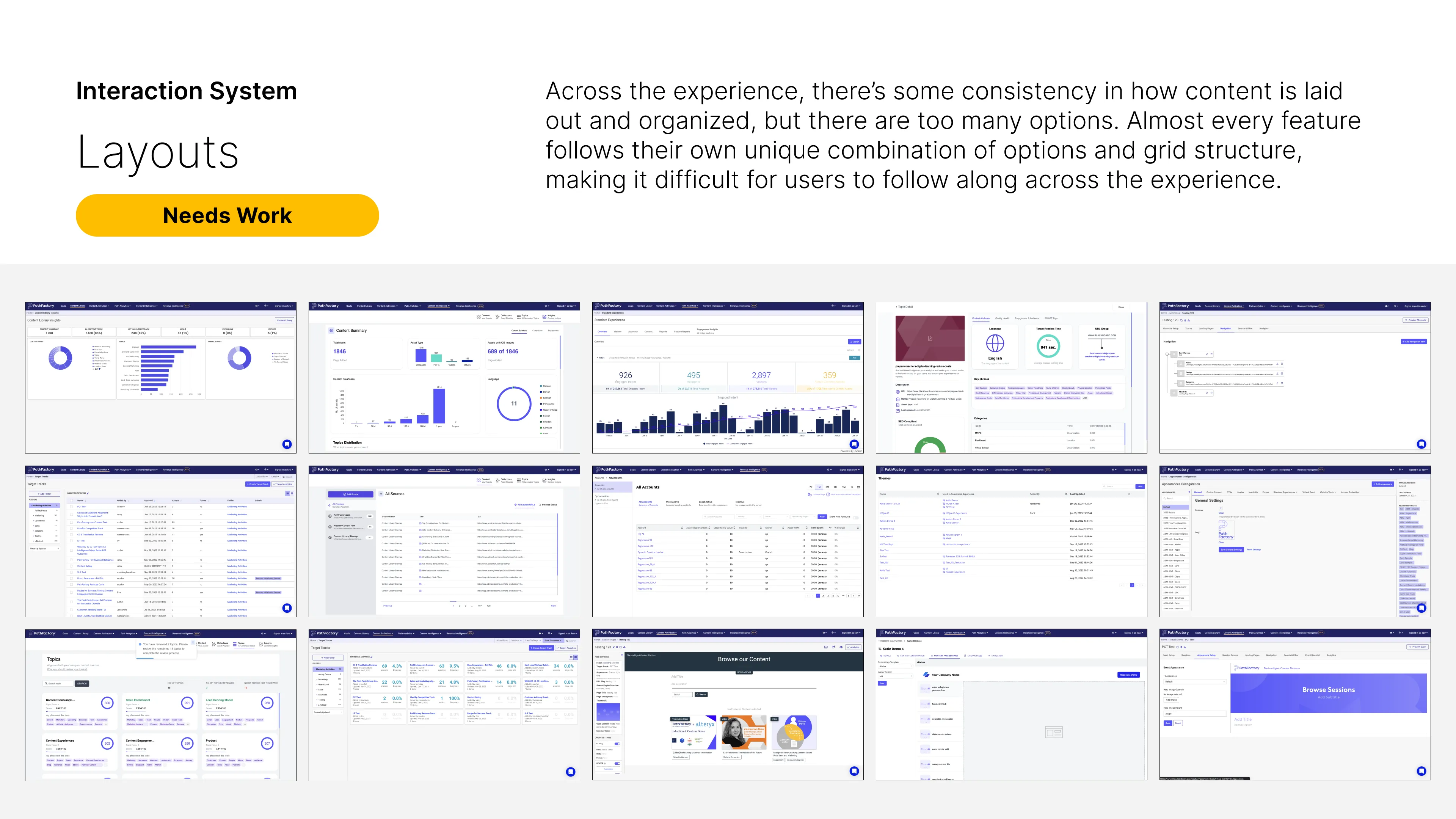
Slides from the audit findings deck we presented to PathFactory stakeholders and their design team. Select slides below were some of my specific audit focus areas.
AUDITS
Challenges & Insights
Despite challenges, the audit provided crucial insights for PathFactory's design evolution:
Complex Component Relationships
Intricate component relationships required a systematic mapping approach.
Design Inconsistencies
Many design disparities were identified, highlighting areas for improvement.
Redundancies & Missing Elements
Redundant, incomplete, or missing components & styles needed streamlining.
Implementation Disparity
Differences between design system & its live implementation significantly impacted UX.
Lacking Guidelines & Governance
Revealed a need for enhanced guidelines and governance to improve design integrity.
Insights into Opportunities
Audit findings were summarized in an Opportunity Brief, outlining short and long-term recommendations for platform and design system.
BRIEF FOCUS AREAS:
• Establishing Heuristics
• Short-term Opportunities
• Long-term Opportunities
OPPORTUNITIES
Establishing Heuristics
We established PathFactory Heuristics to guide the opportunity brief and lay the foundation for an optimal user experience.
PathFactory Heuristics
• Align with users’ mental models.
• Communicate status & next steps.
• Speak users' language in platform.
• Simplify actions & offer customization.
• Make help searchable & self-service.
• Provide solutions to reconcile errors.
OPPORTUNITIES
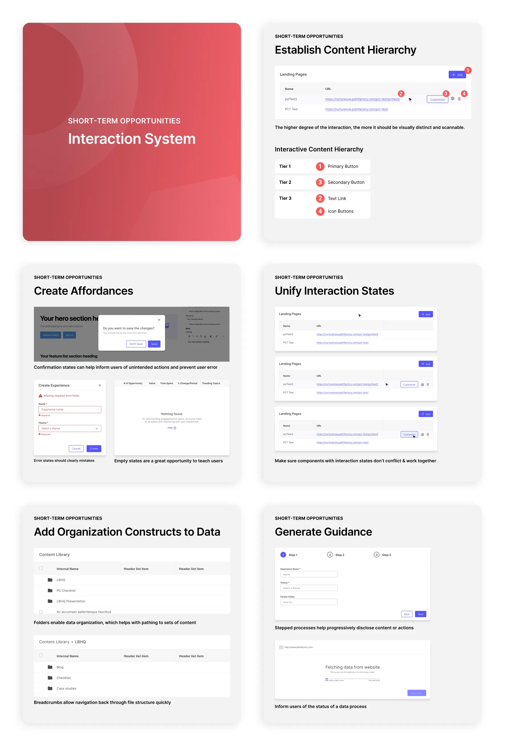
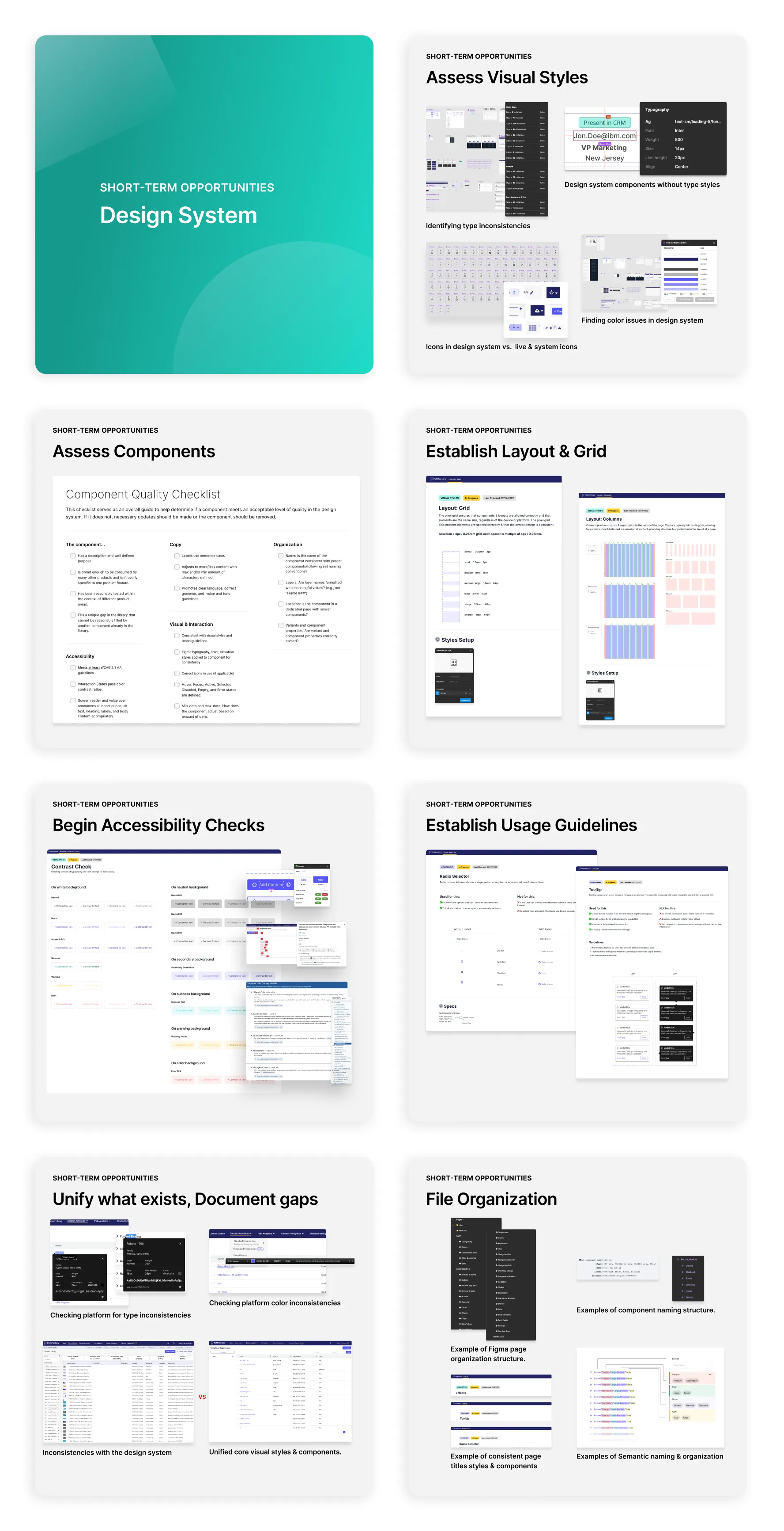
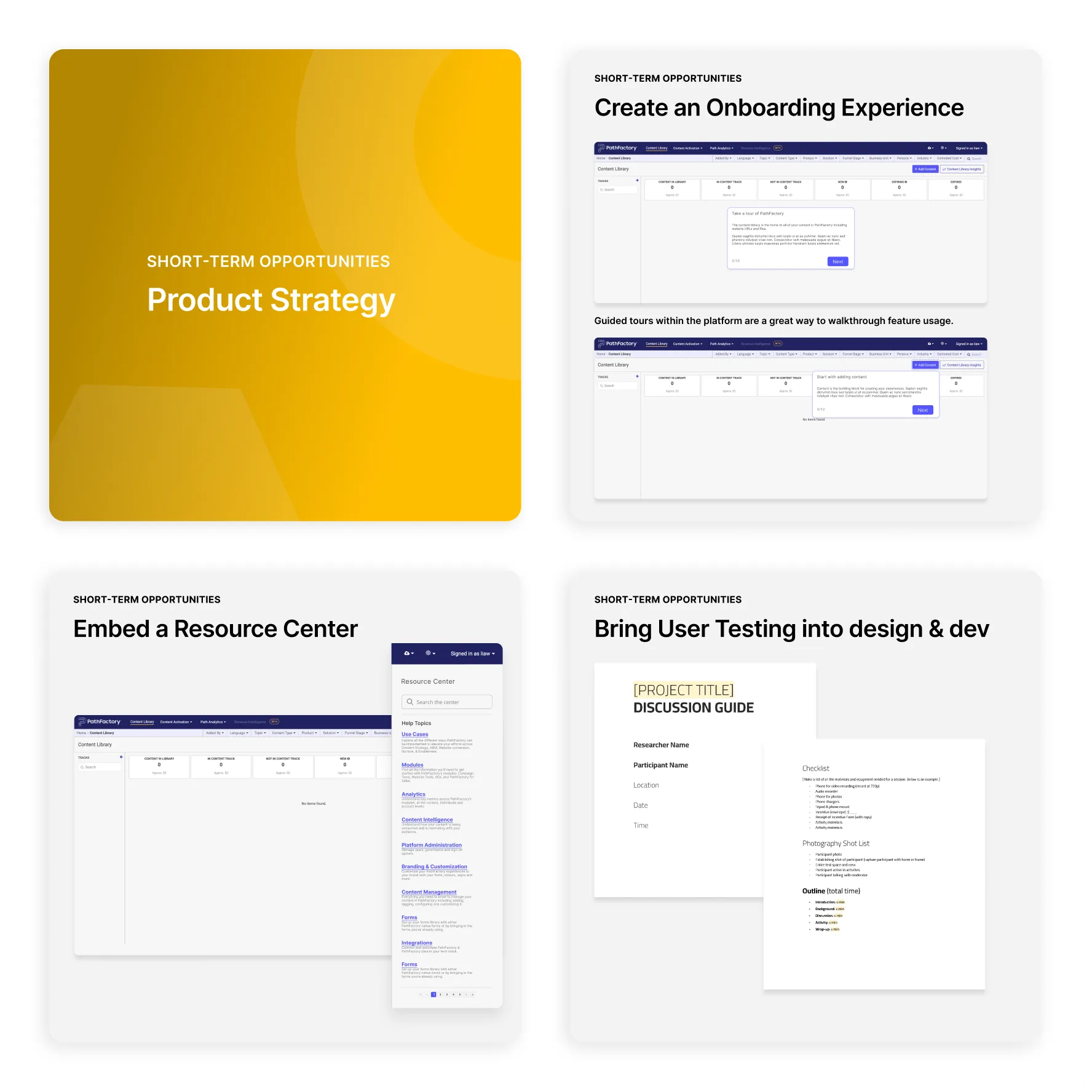
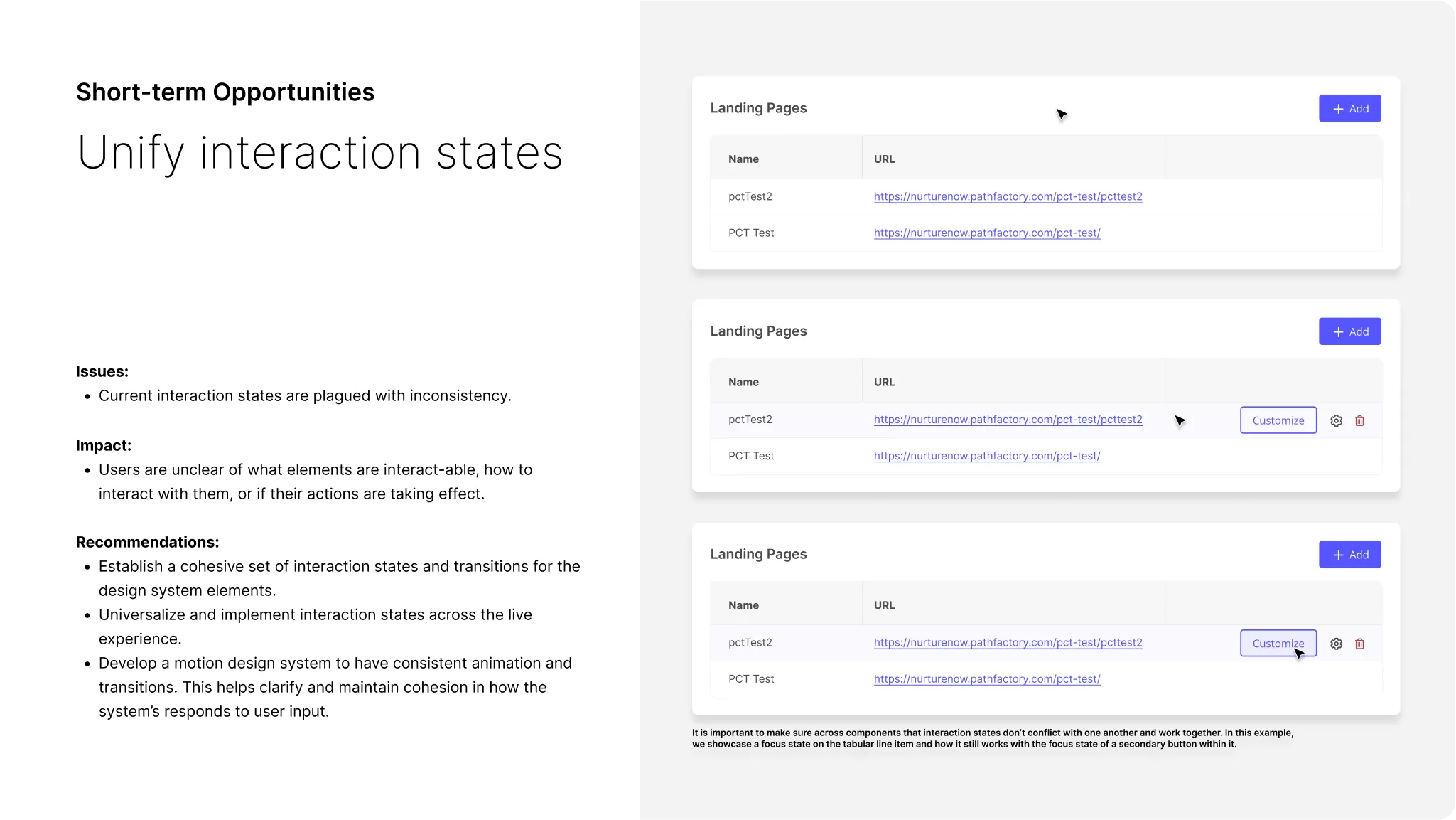
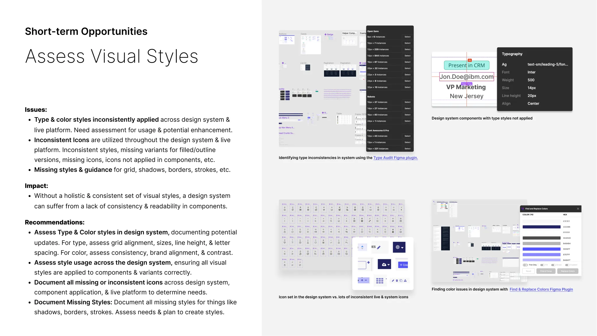
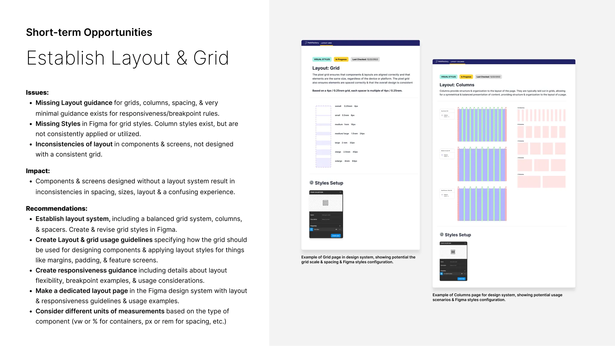
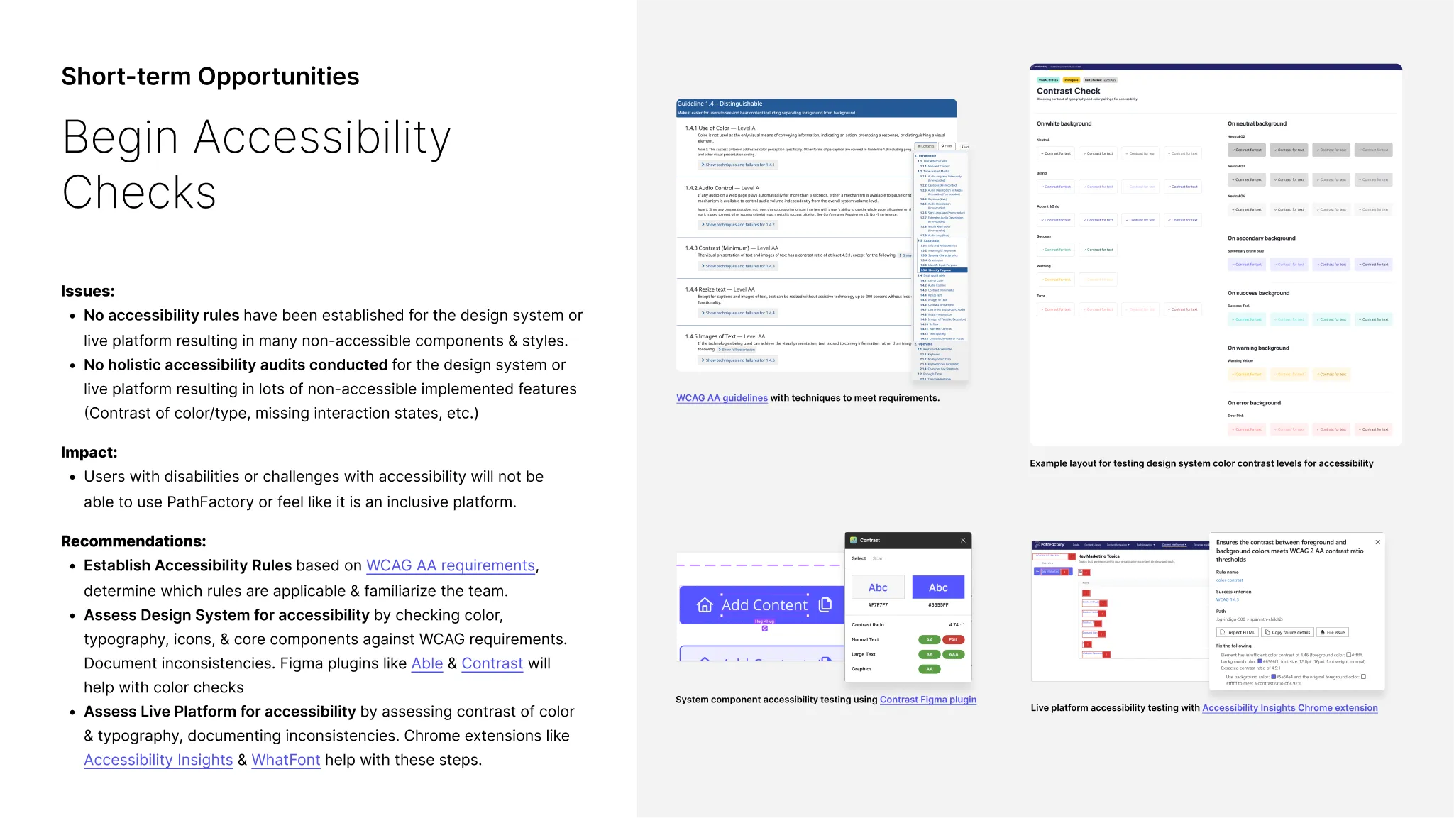
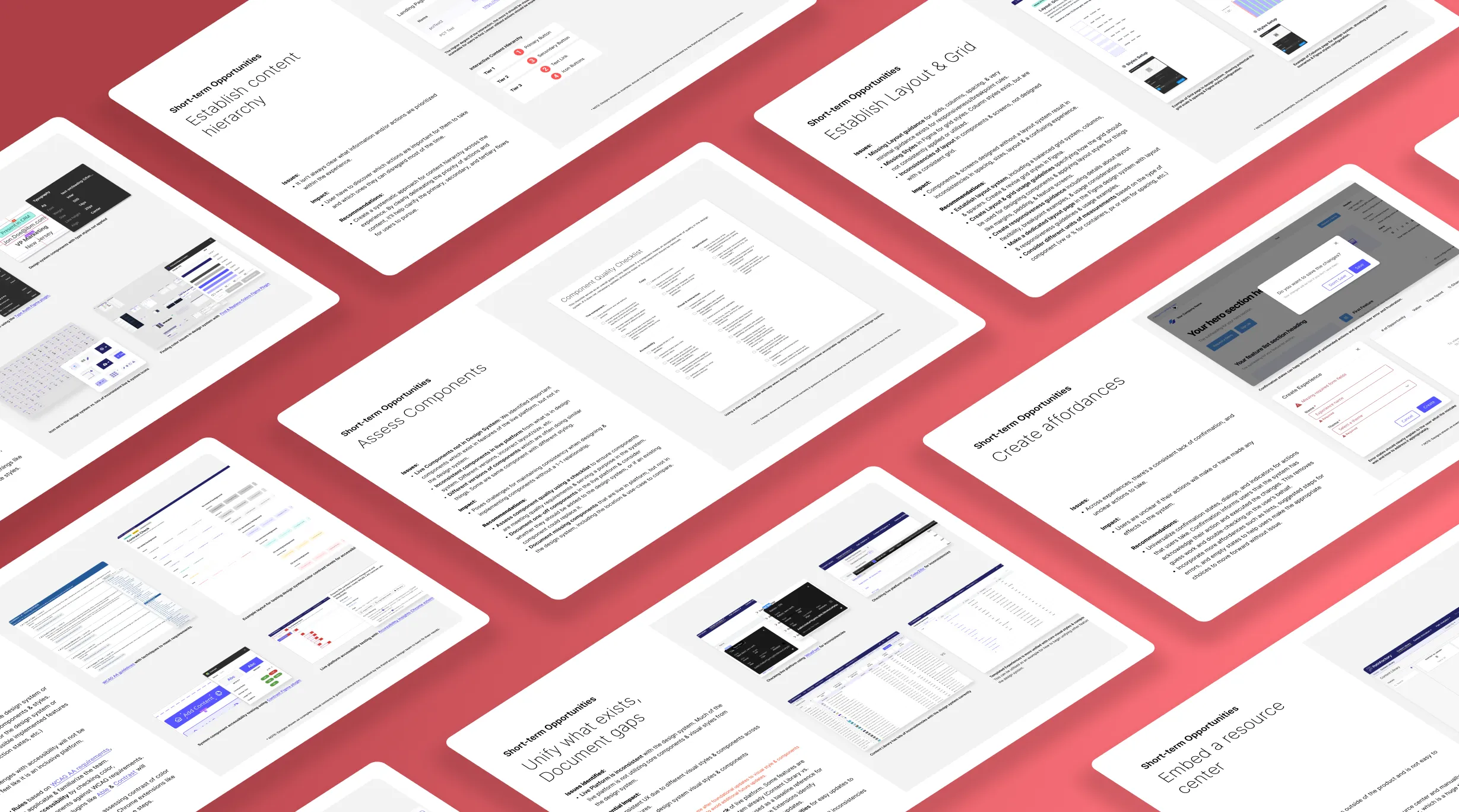
Short-term Opportunities
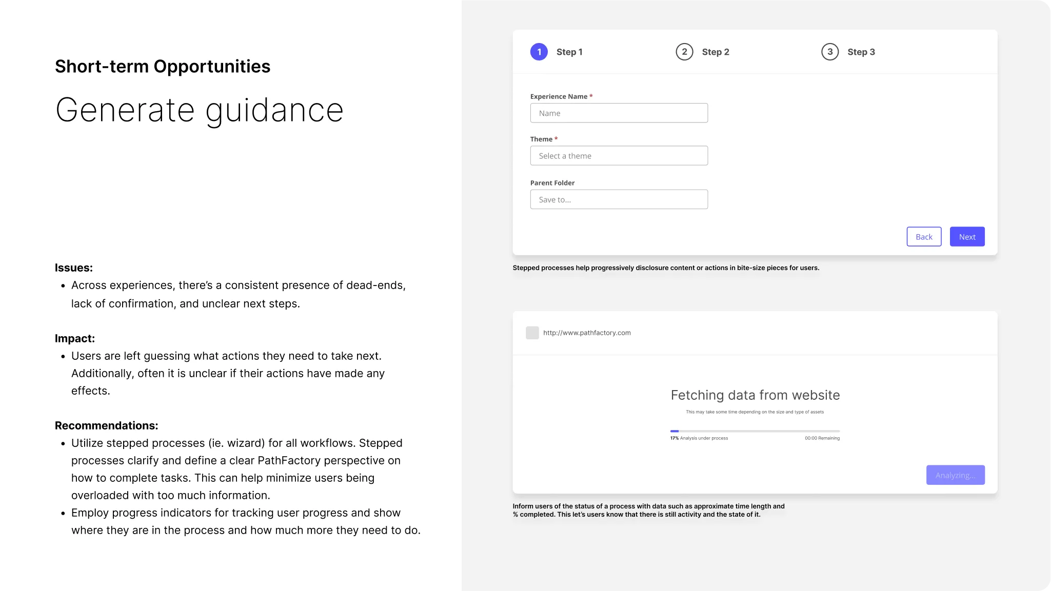
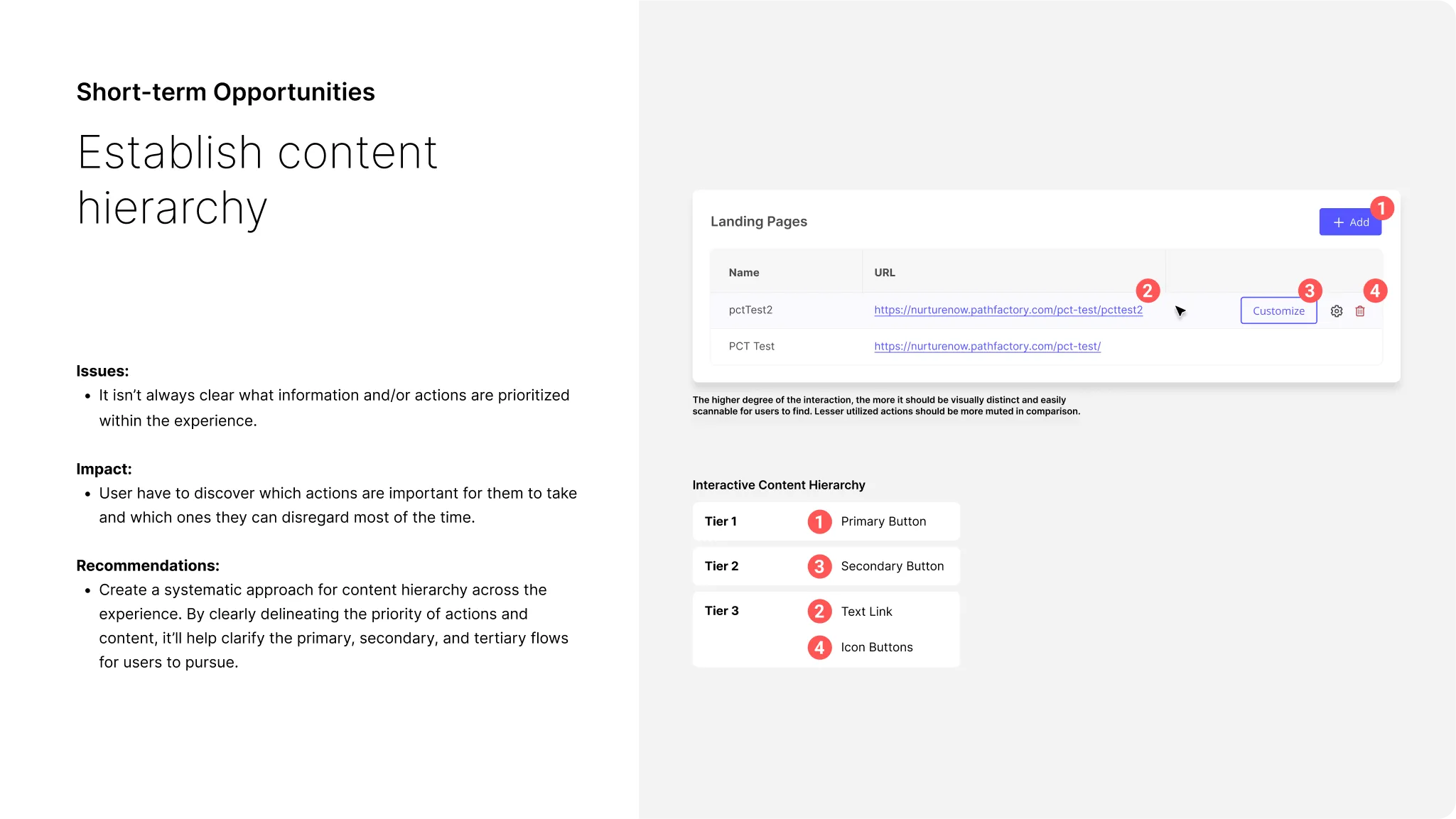
The audit revealed many short-term, low-effort improvements for PathFactory's product and design system to significantly enhance UX and efficiency.
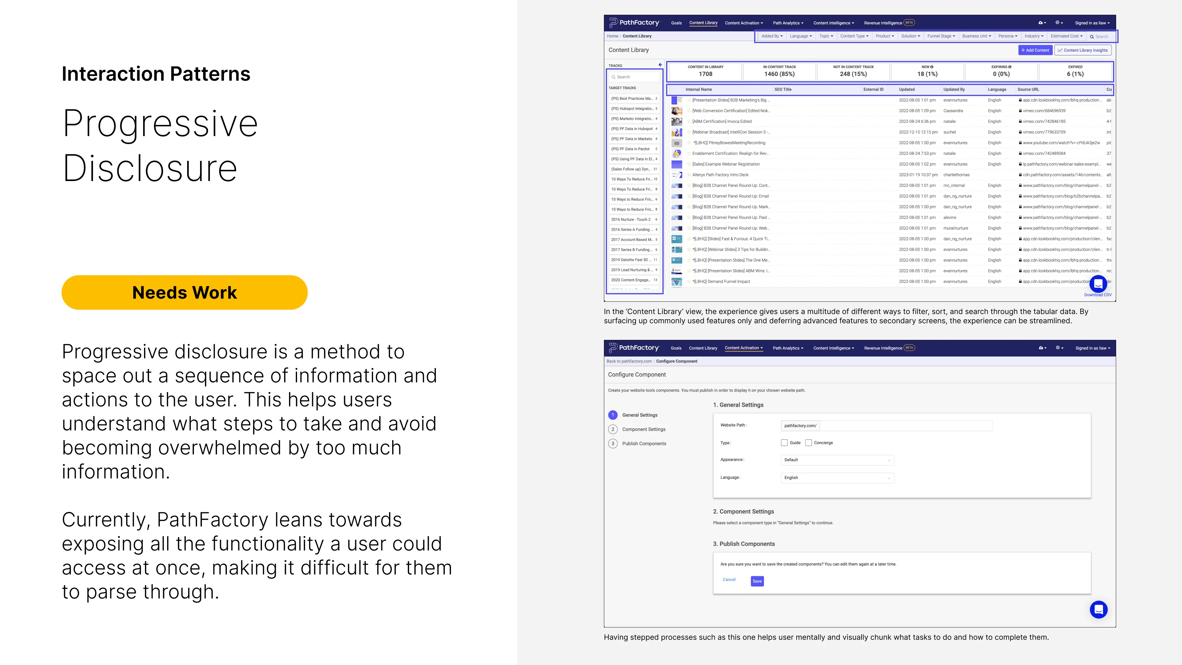
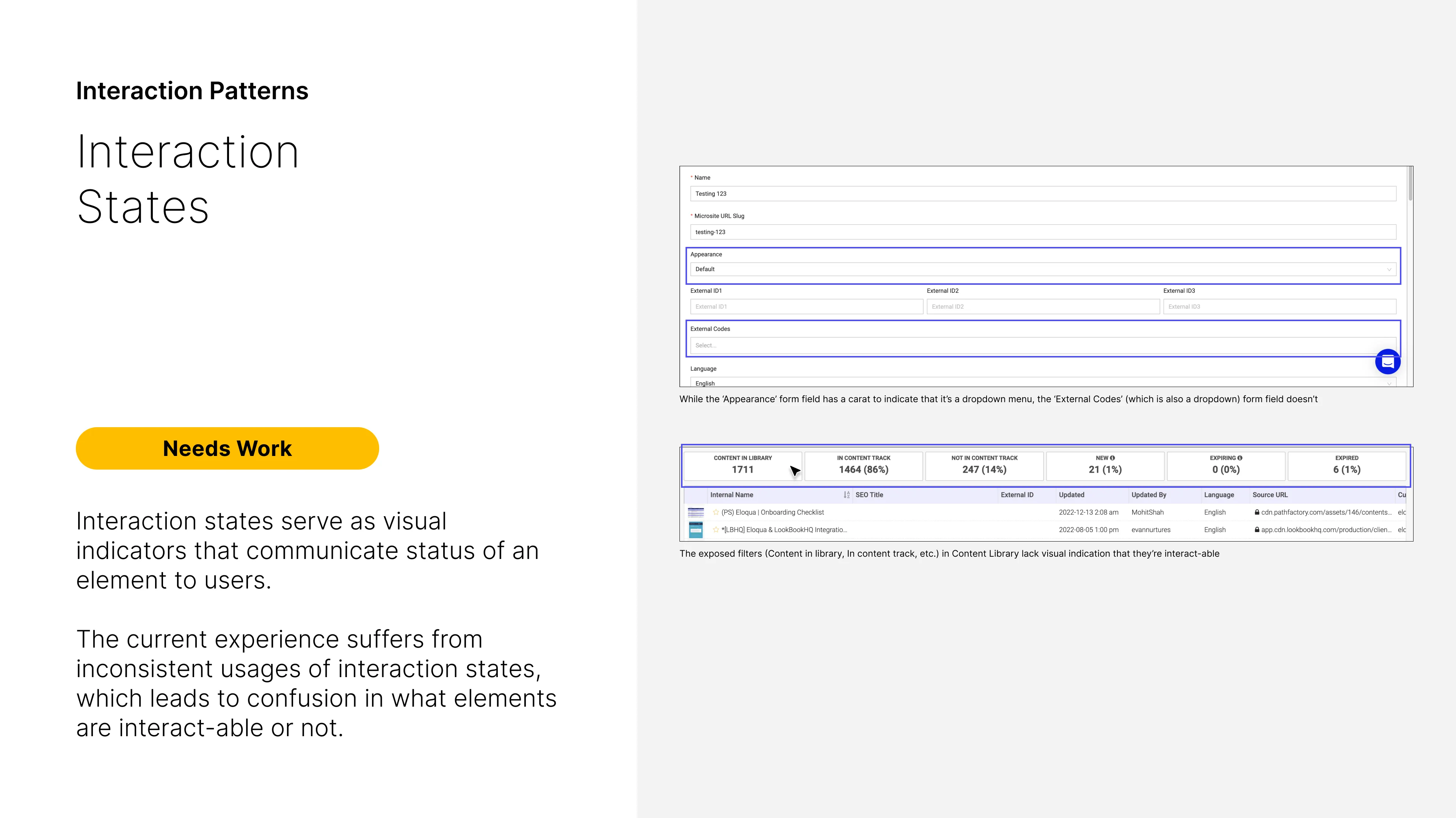
↑ Interaction System short-term opportunities
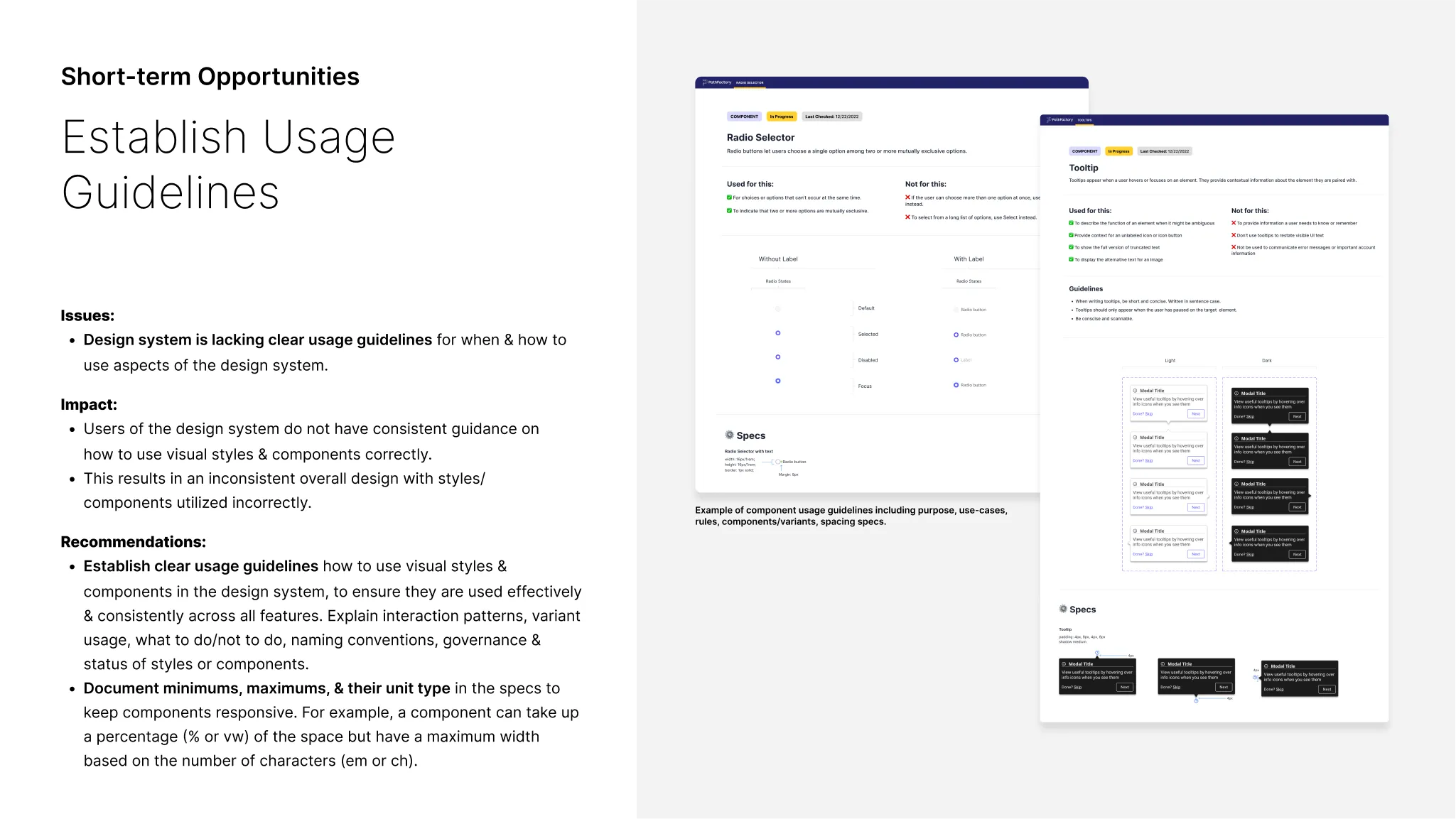
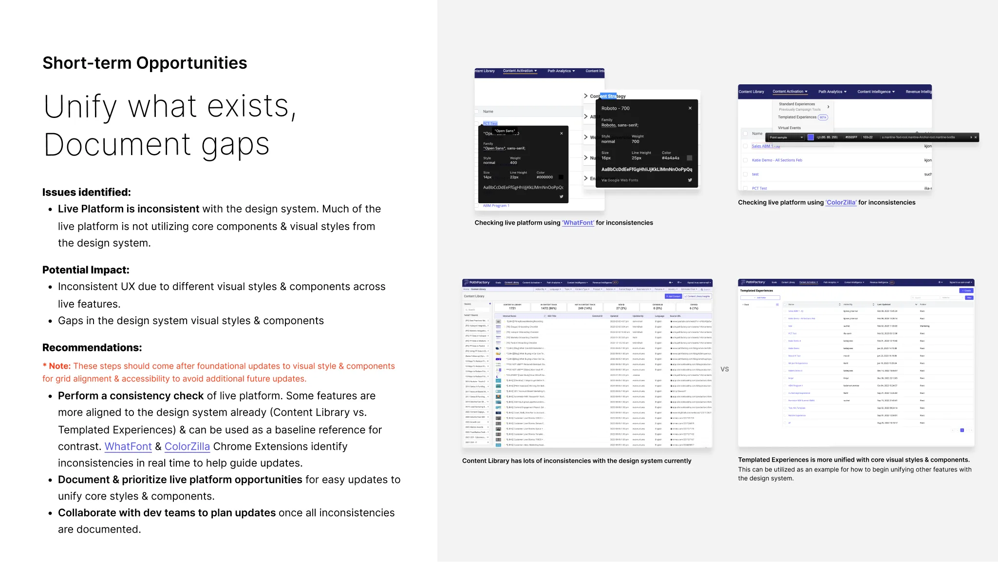
↑ Design System short-term opportunities
↑ Product Strategy short-term opportunities
OPPORTUNITIES
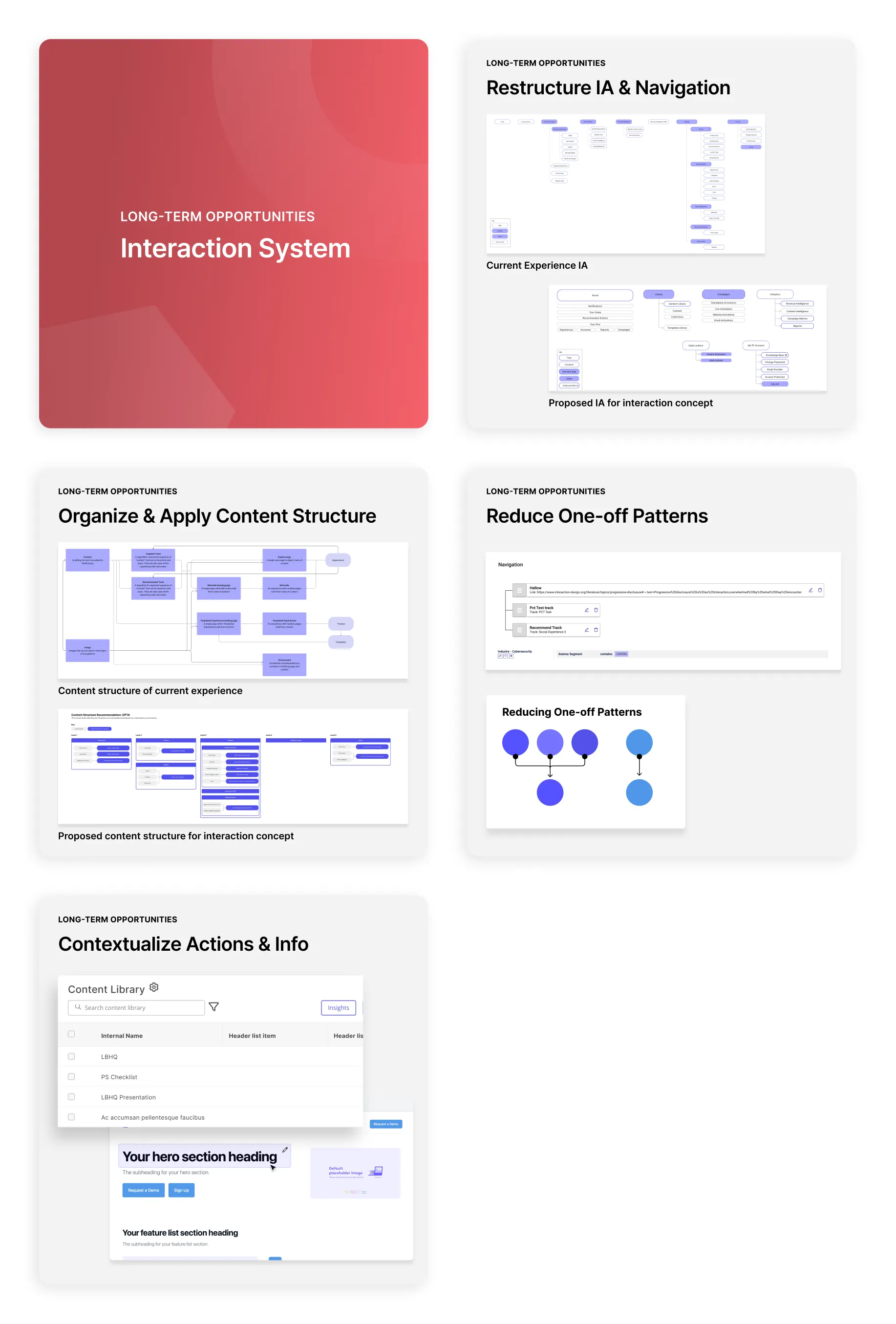
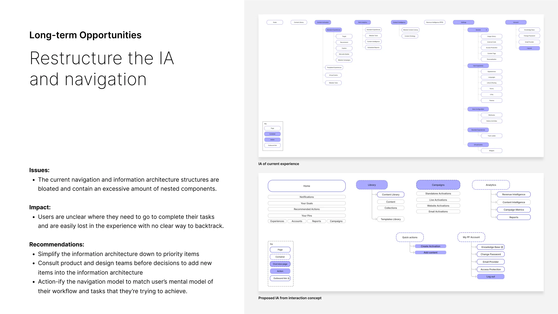
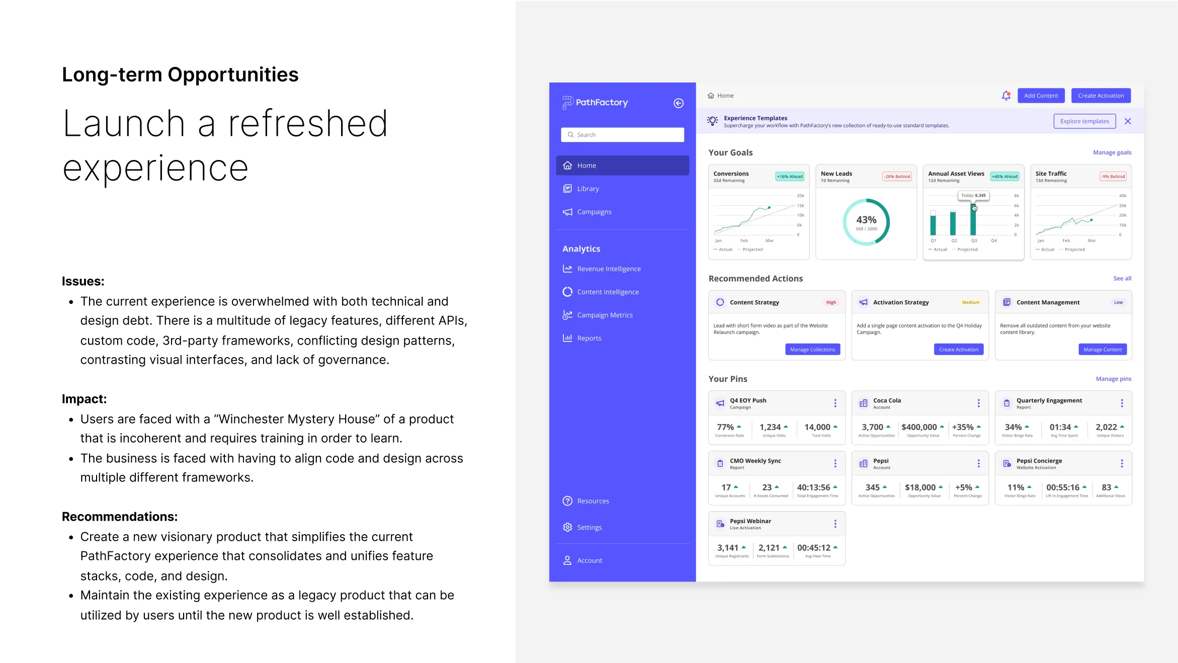
Long-term Opportunities
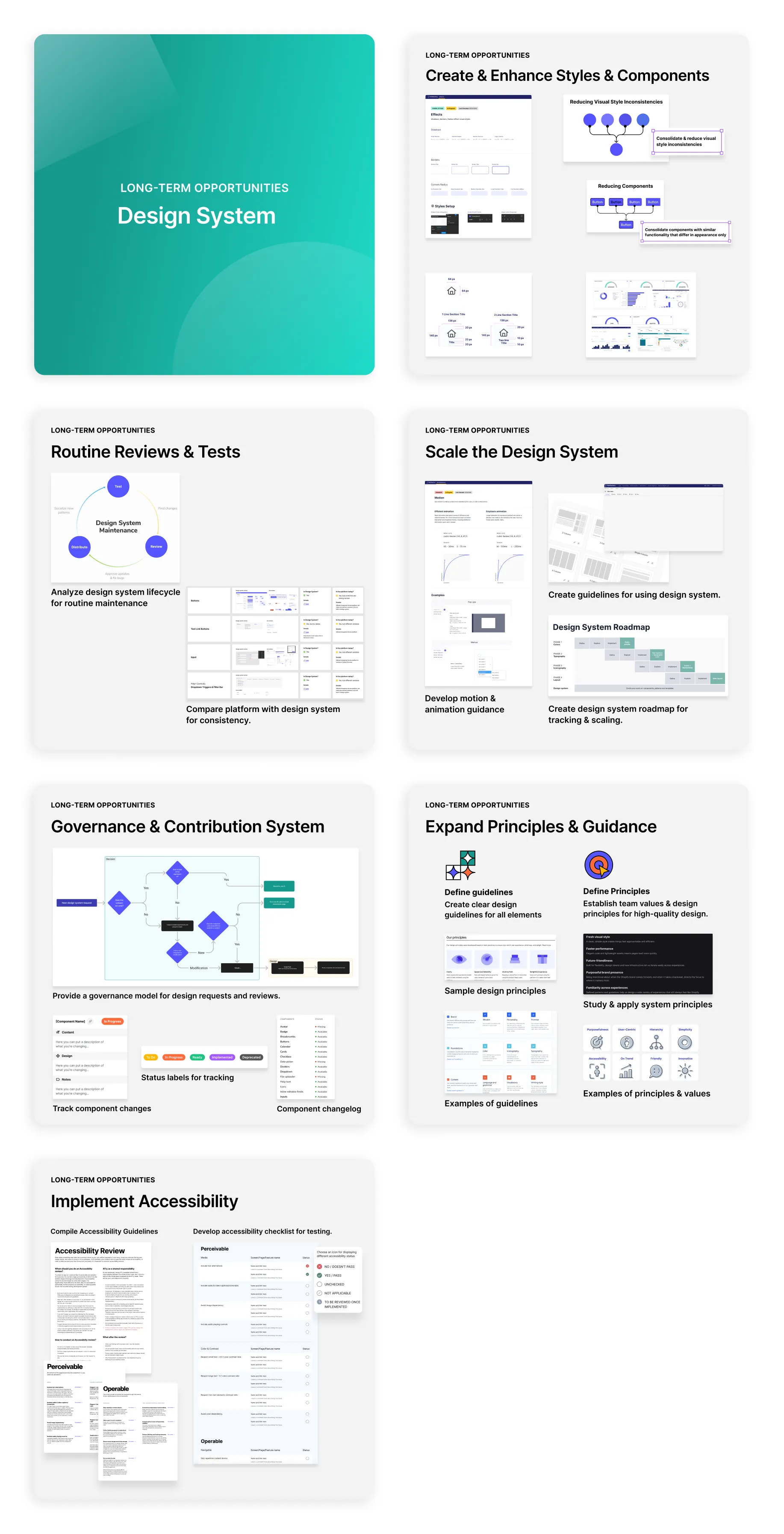
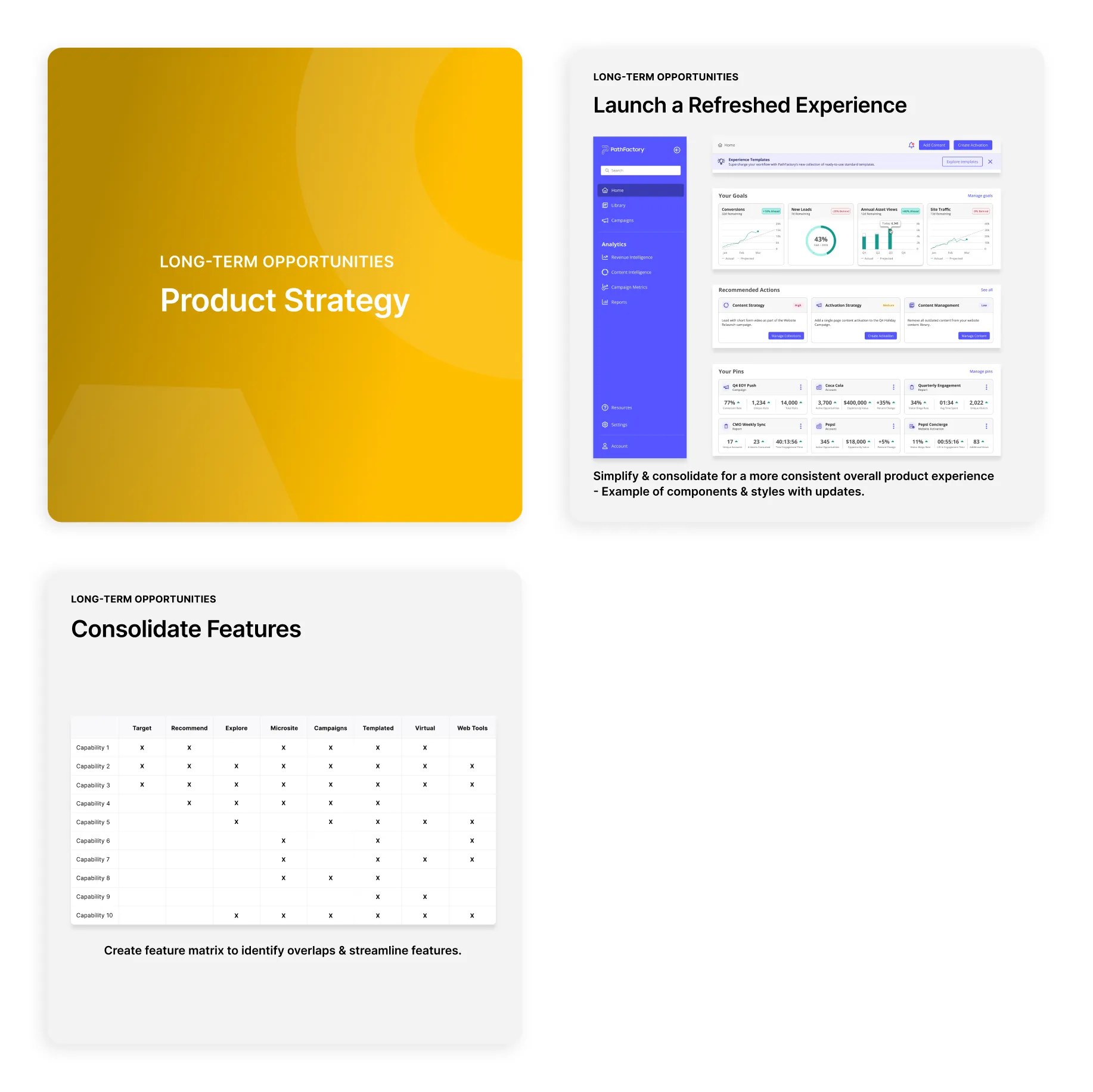
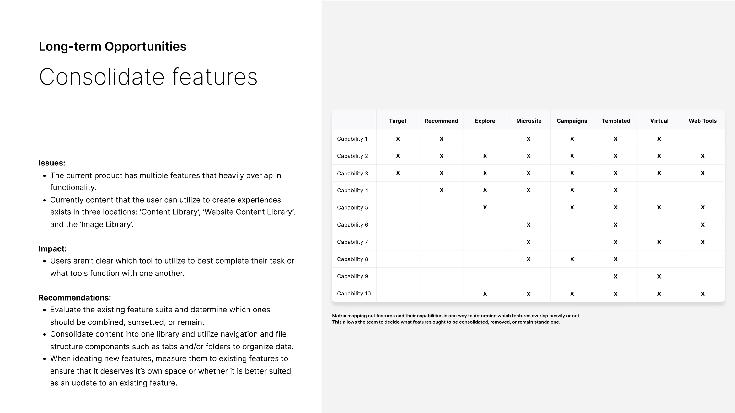
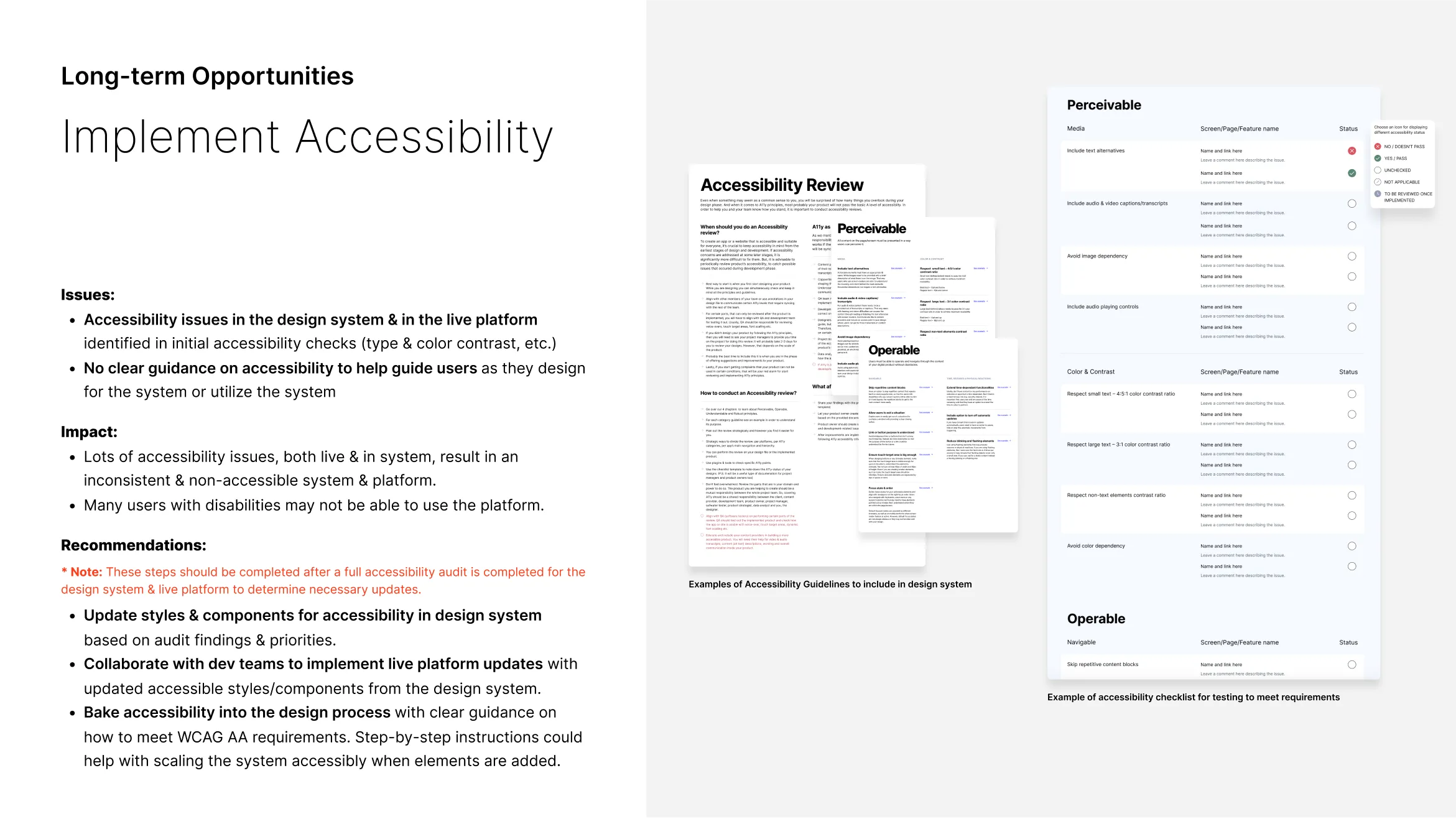
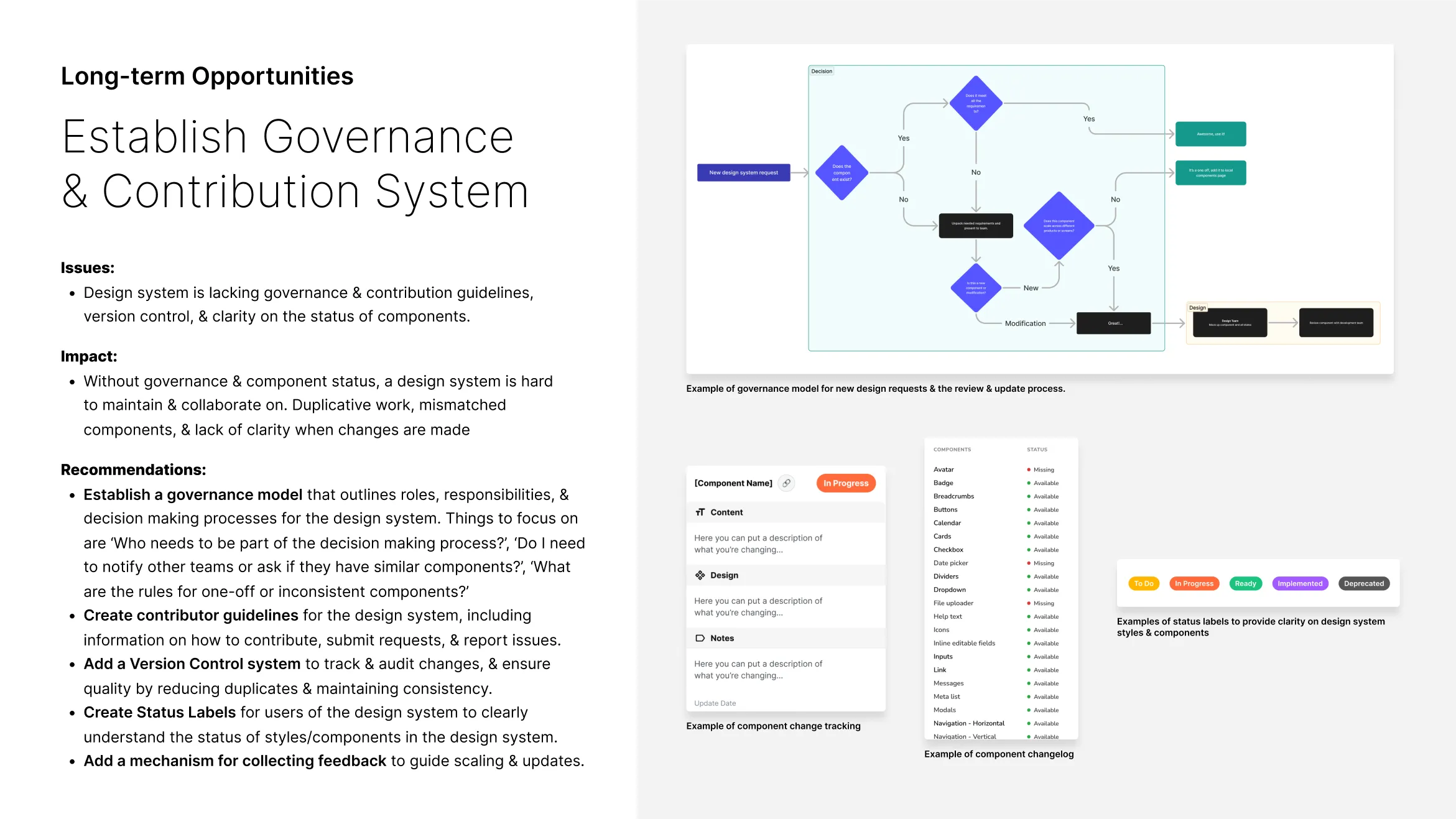
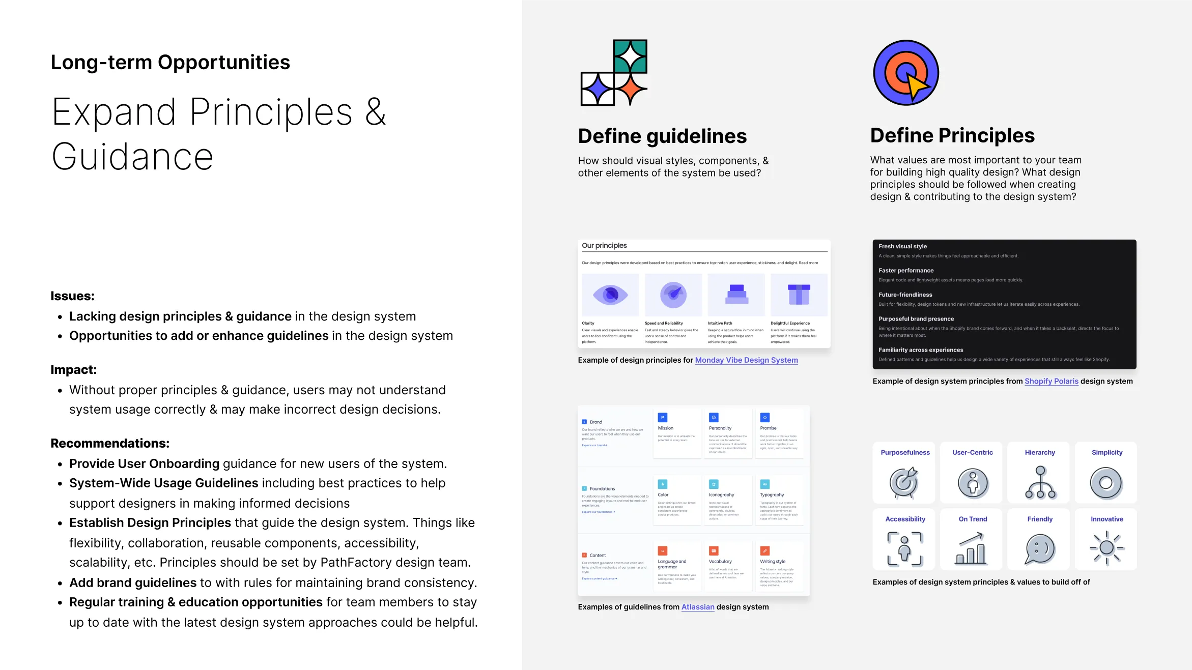
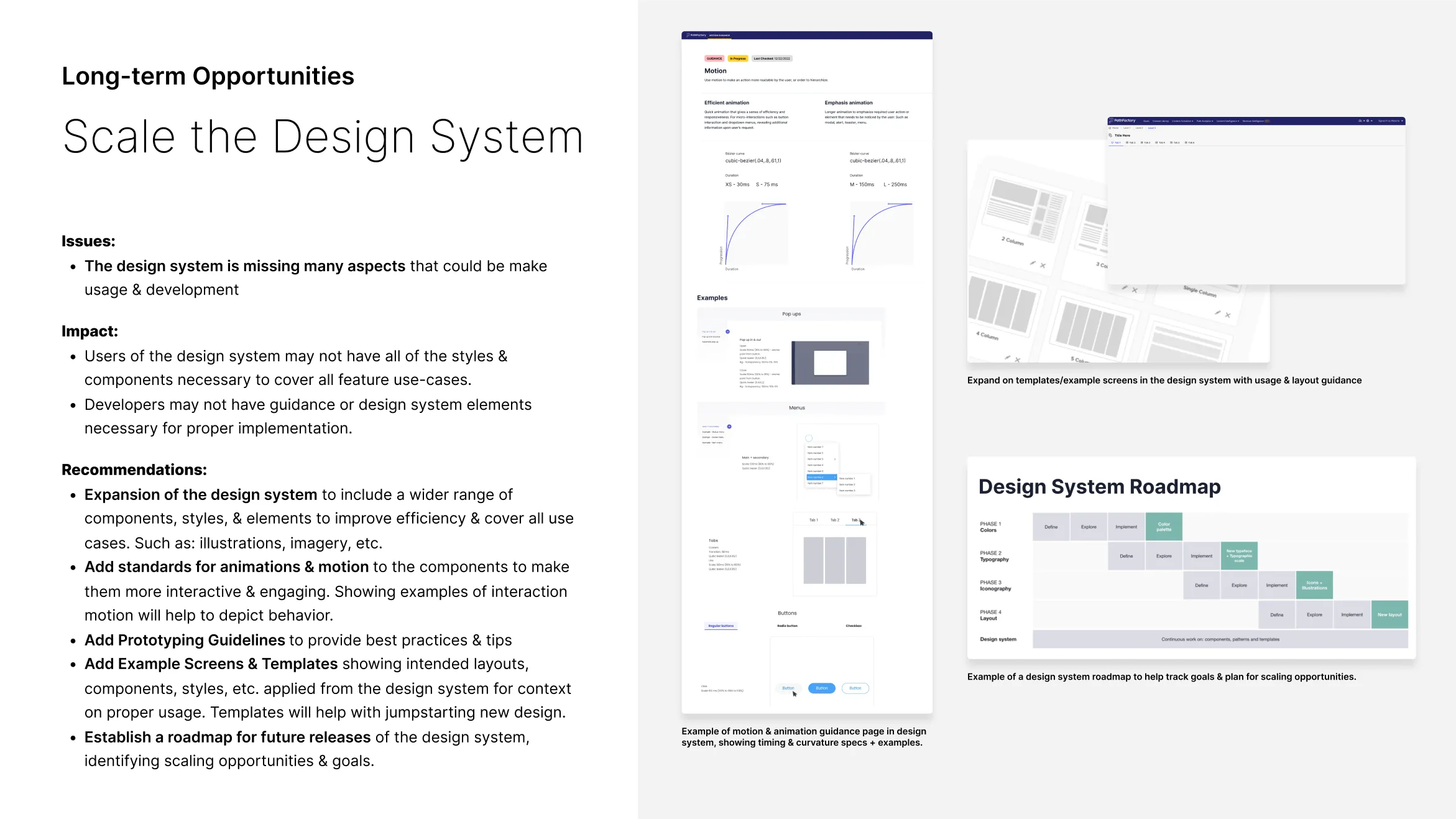
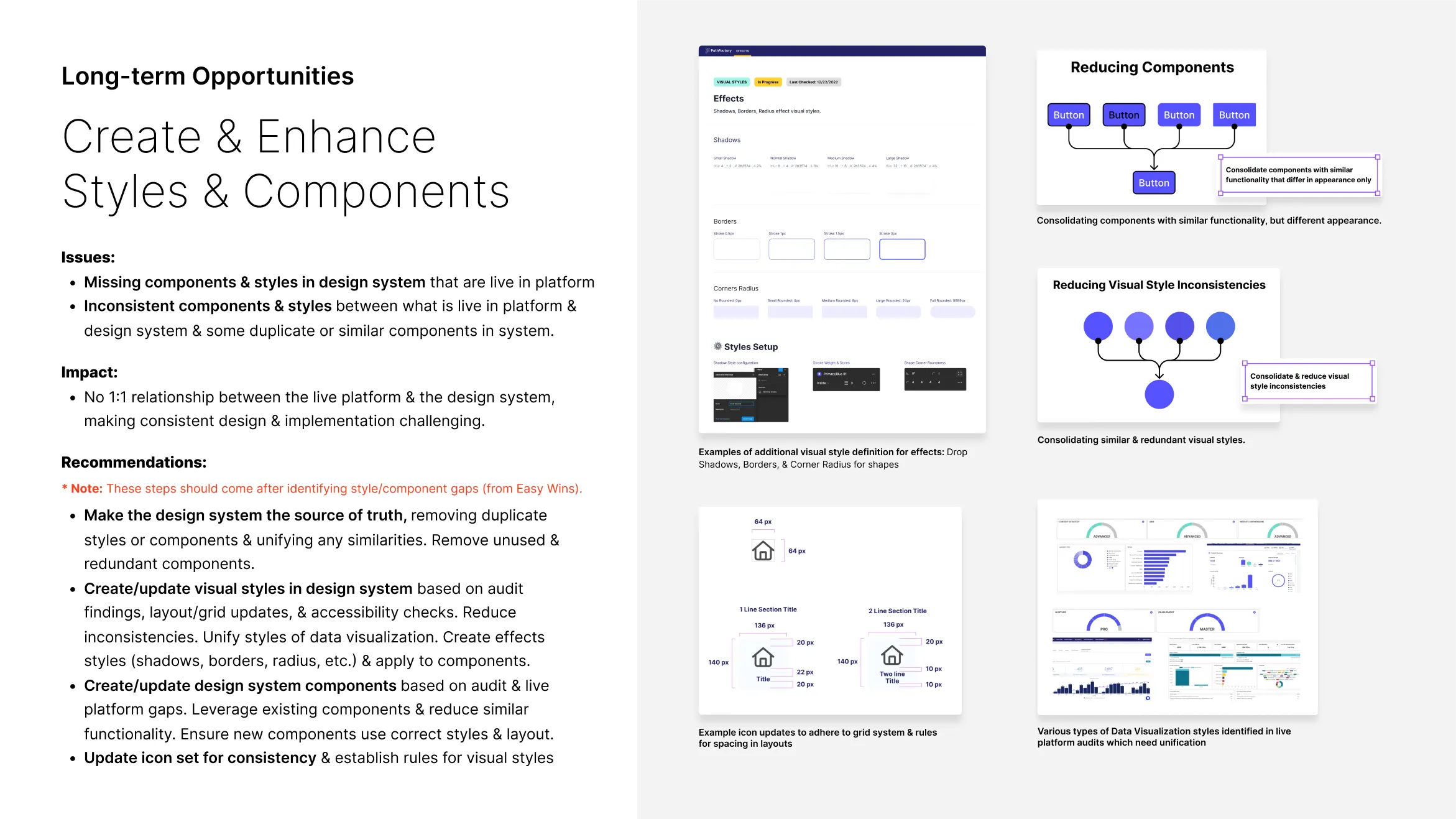
The audit also identified long-term opportunities that require more effort but could greatly enhance product and design system comprehensiveness and scalability.
↑ Interaction System long-term opportunities
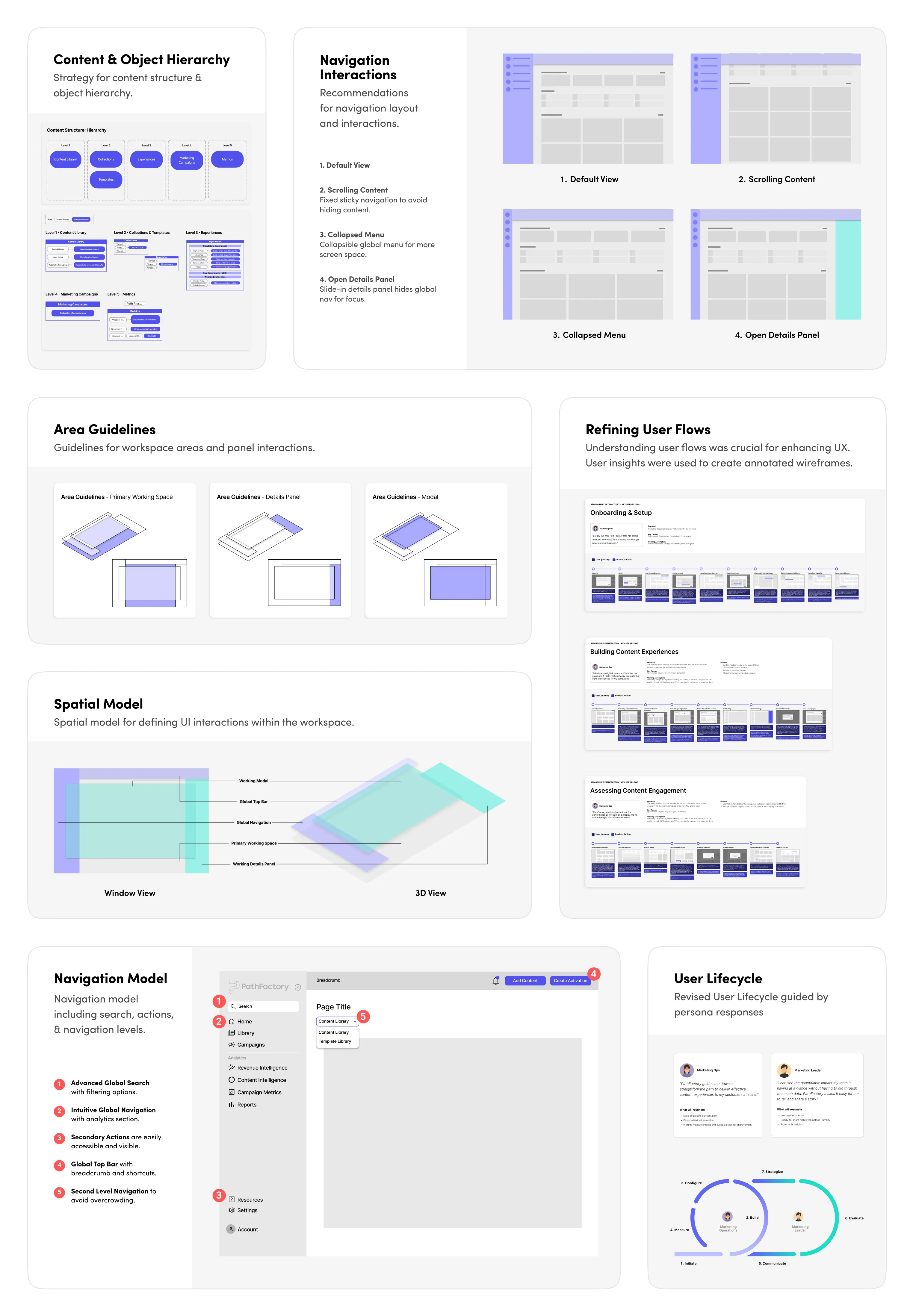
↑ Design System long-term opportunities
↑ Project Strategy long-term opportunities
Opportunity Brief Deck
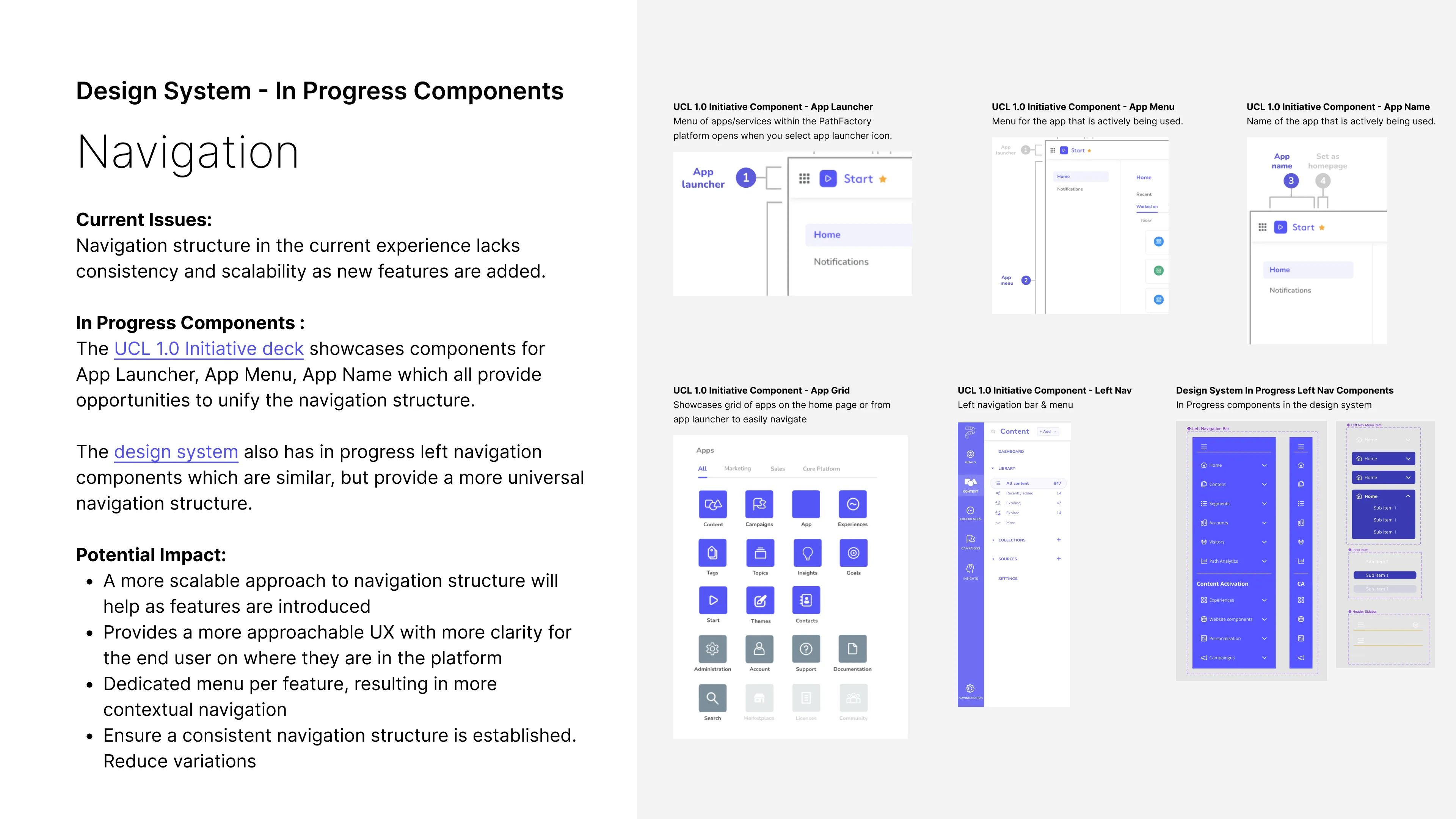
Slides from the Opportunity Brief Deck which summarized short and long-term opportunities. These select slides highlight some of my key focus areas in the brief.
Reimagining PathFactory
Based on audit insights and opportunities, we reimagined PathFactory’s core UX and UI to be a top-tier, user-centric experience for marketers, offering proof-of-concept guidance for the platform's evolution.
REIMAGINE FOCUS AREAS:
• IA & Navigation Updates
• User Flow Updates
• Lo-fi Wireframes & Hi-fi Screens
• Future Roadmap & Backlog
REIMAGINING
Evolving Navigation
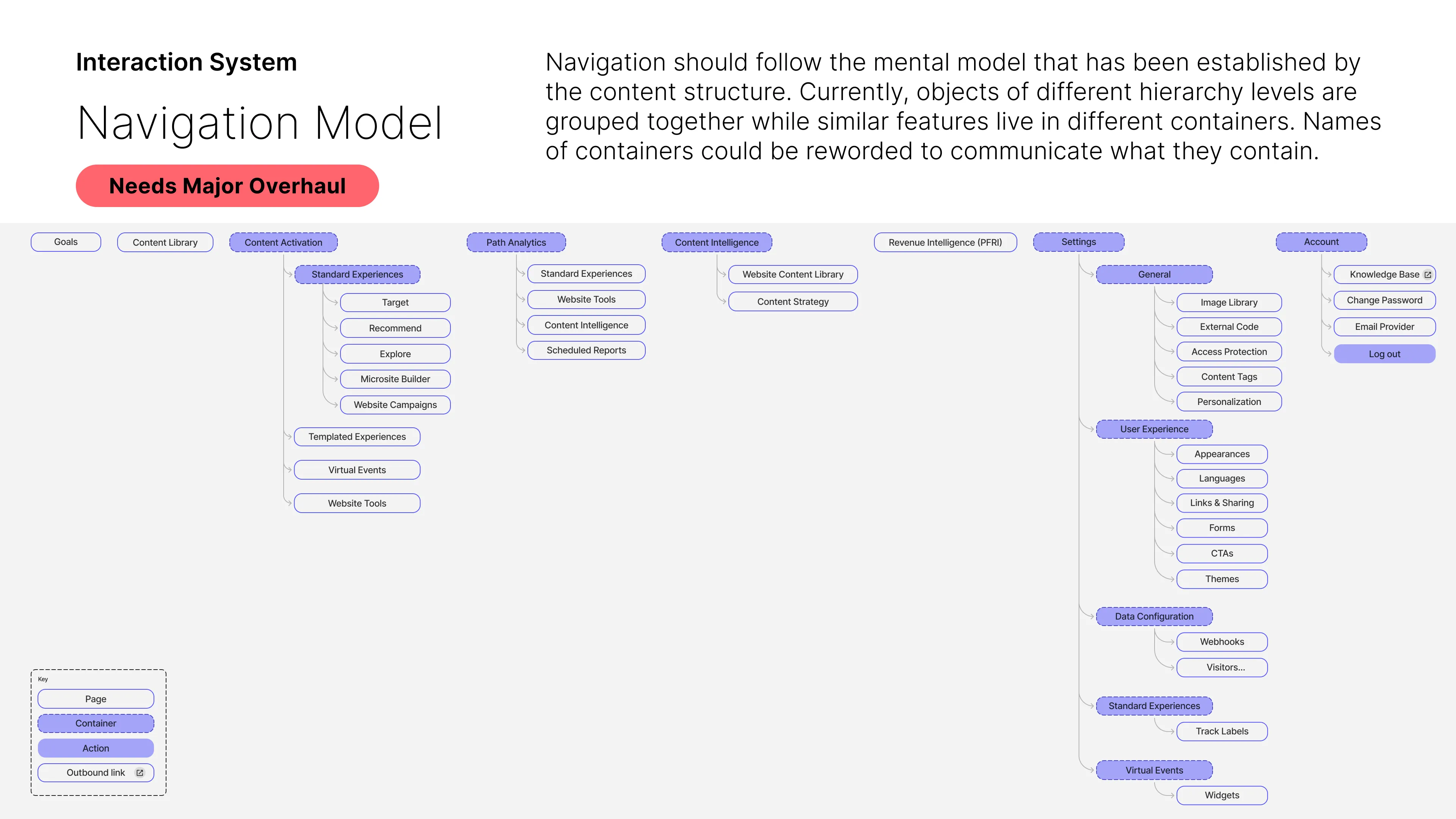
The navigation structure’s information architecture was enhanced using IA diagrams, which were then converted into low-fidelity wireframes to illustrate the approach clearly.
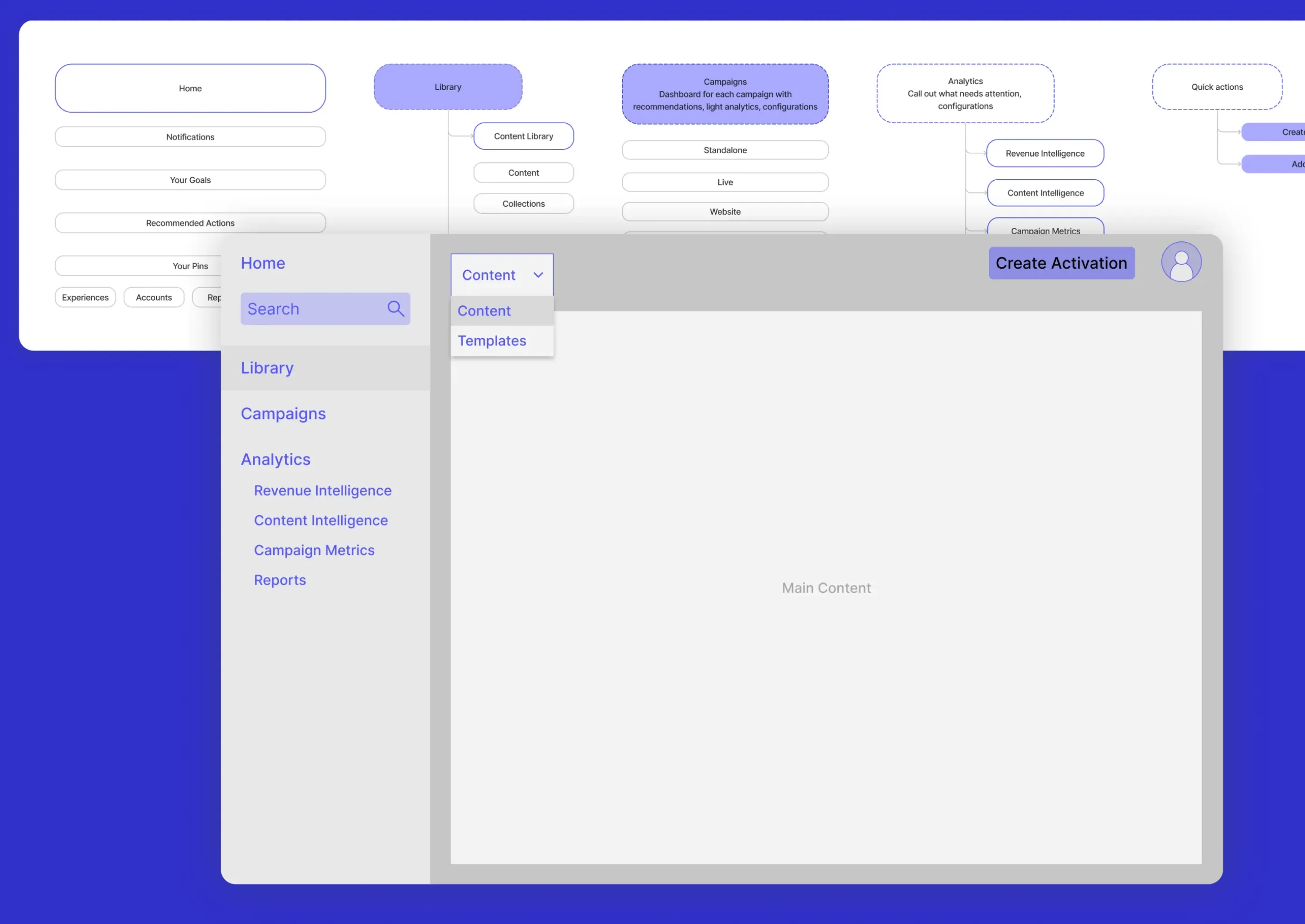
↑ Proposed navigation information architecture with supporting lofi wireframe.
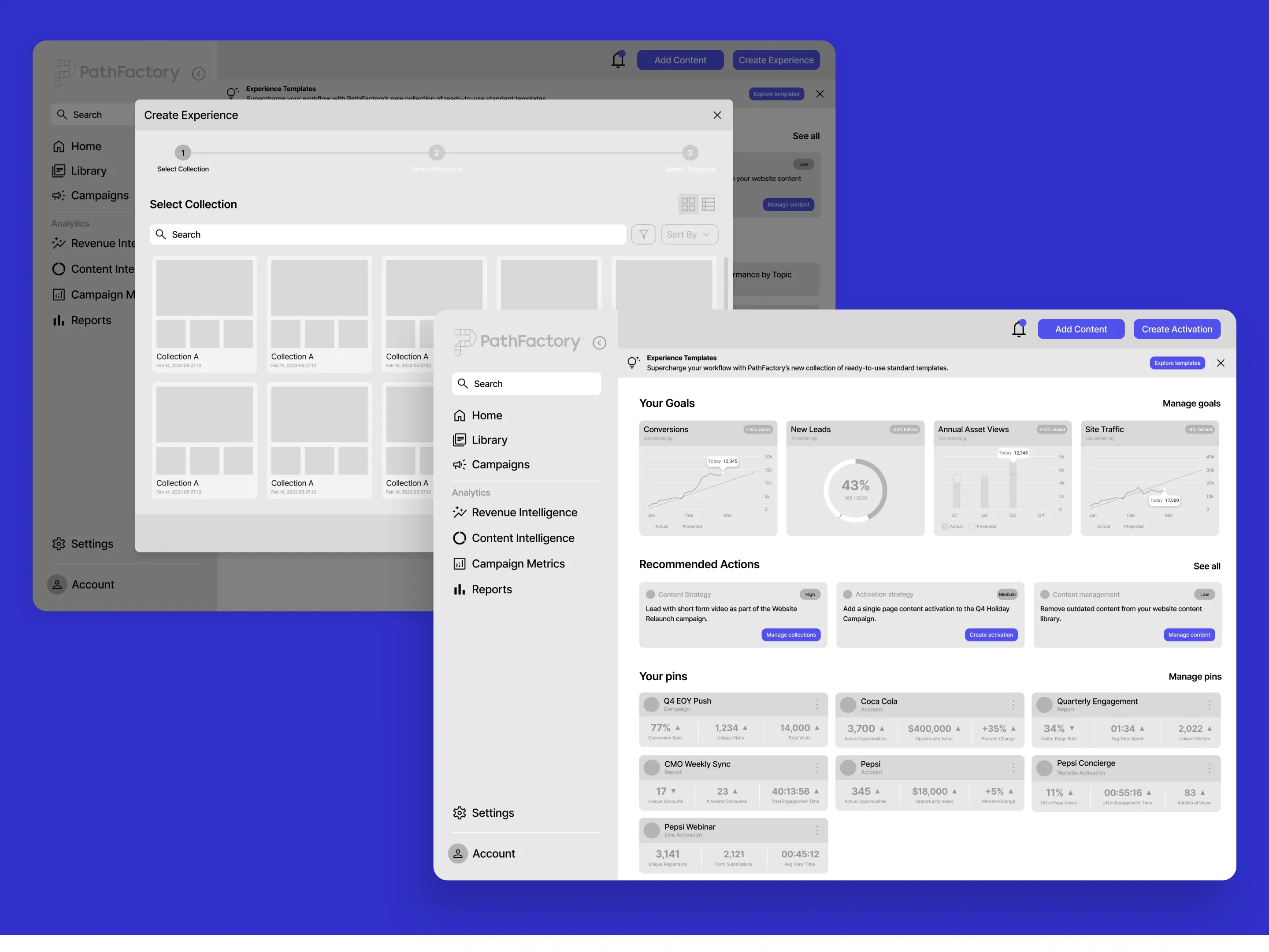
↑ Hero screen low fidelity wireframes with improved IA, layout, & UX.
REIMAGINING
Low-fidelity Wireframes
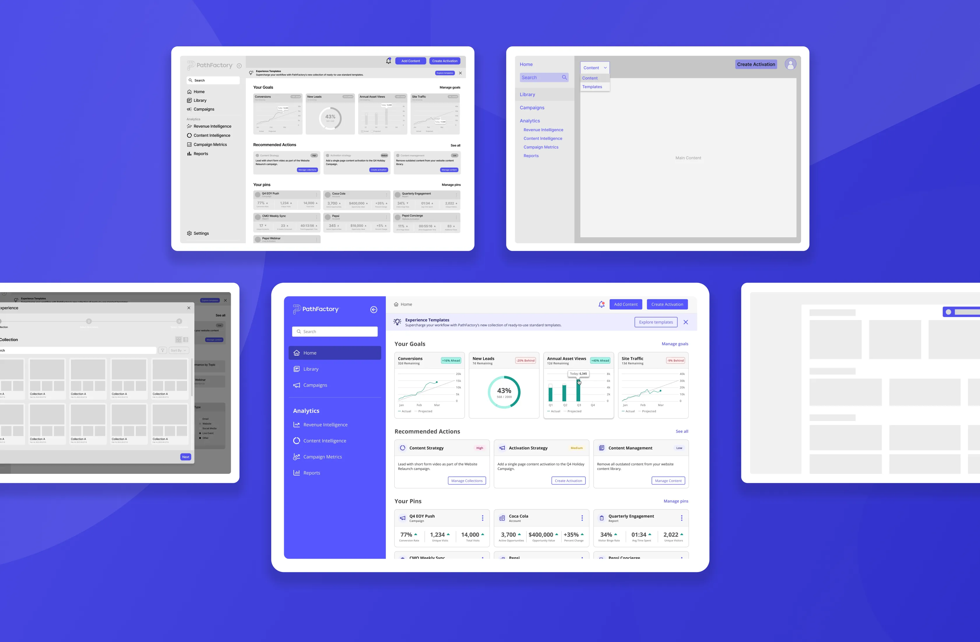
Creating low-fidelity wireframes for hero screens clarified the best architecture and layout, giving PathFactory a clear visual direction.
REIMAGINING
Home Screen Concept
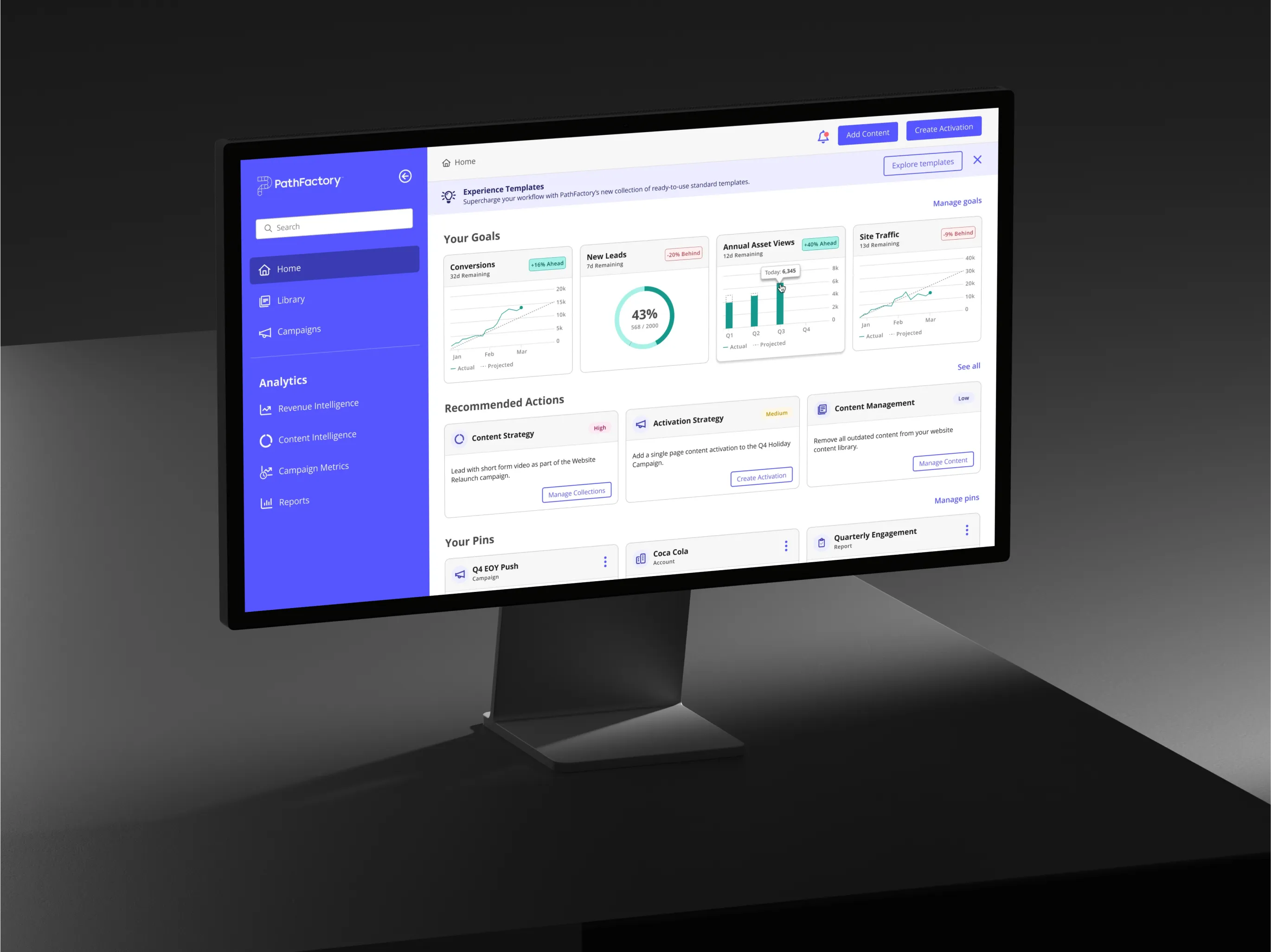
I transformed the home screen wireframe into a high-fidelity concept, improving navigation, components, styles, and layout. This concept serves as a proof of concept and a visual guide for PathFactory’s future platform improvements.

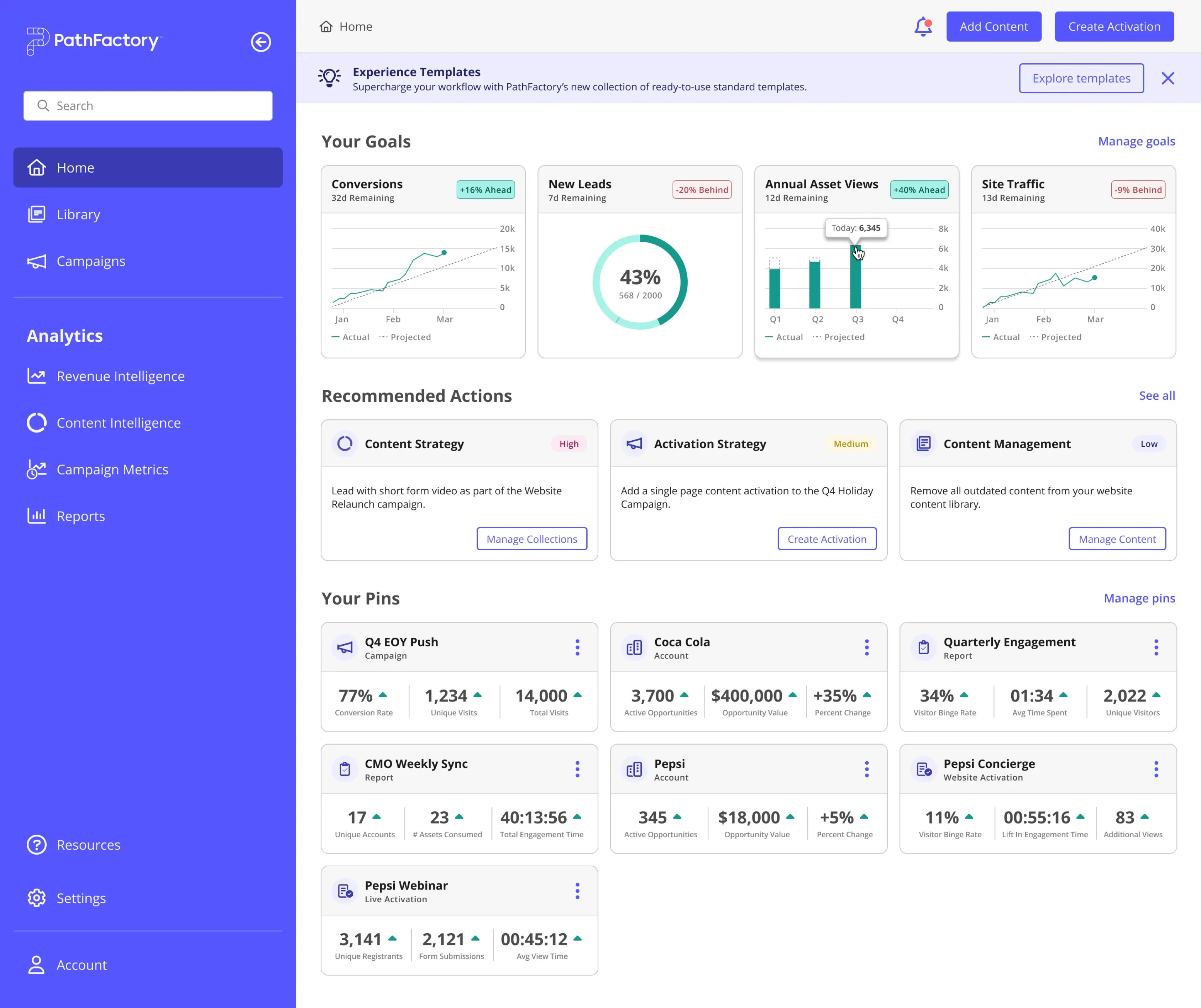
↑ High-fidelity Home concept with improved layout, navigation, & optimized components.

REIMAGINING
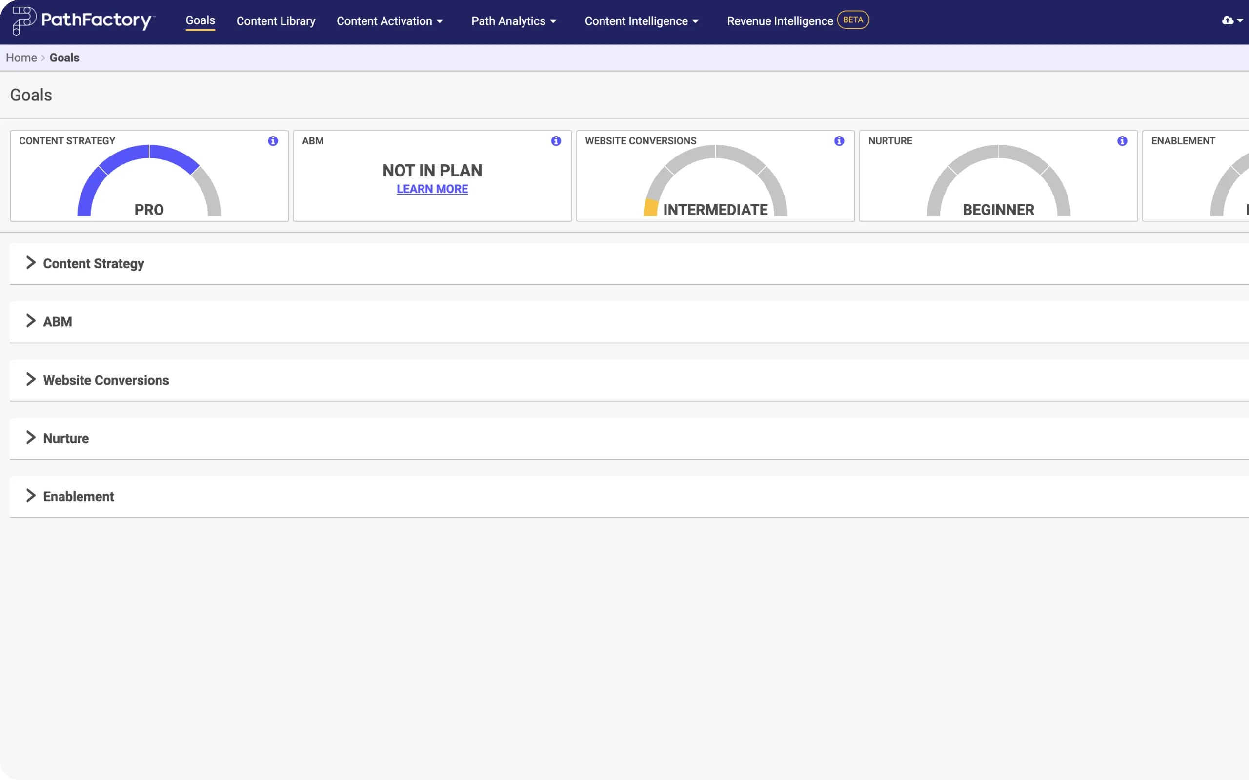
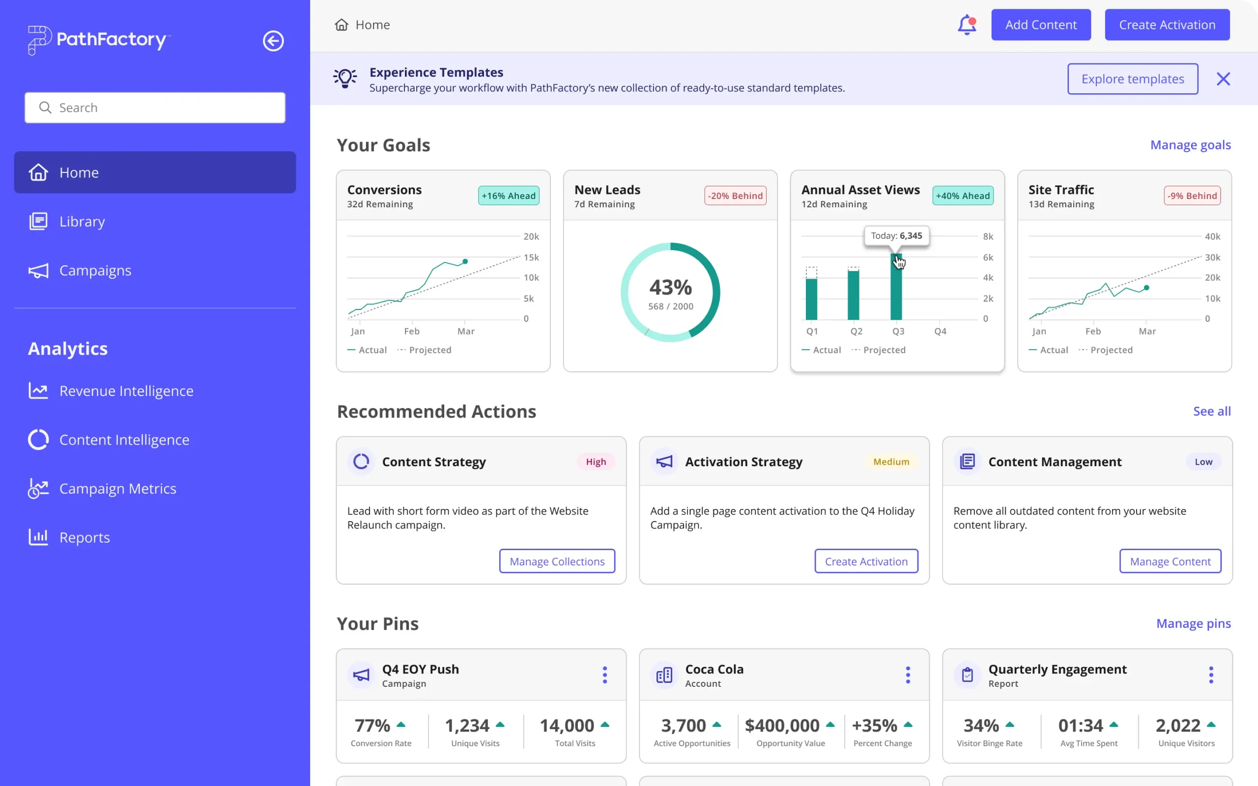
Before & After
PathFactory’s initial home page design was outdated with scattered metrics. The redesign features a cleaner layout, better navigation, and prominent metrics, strongly enhancing the user experience.

Impactful Results
The outcome significantly enhanced PathFactory’s overall usability and coherence by creating a scalable and efficient design system. This improved UX and navigation, adapting to evolving user needs and technological advancements.
KEY OUTCOMES
Harmonized UI/UX
Resolved inconsistencies between design system & platform, & established unified design & governance strategies.
Improved User Engagement
Identified opportunities to enhance platform usability & revamped core UX to drive user satisfaction & engagement.
Platform Improvements
Simplified design elements to enhance usability & created a roadmap for ongoing improvements & future success.
Enhanced Team Collaboration
Improved collaboration between design & dev teams, enhancing workflows & implementation for updates & launches.
KEY METRICS
485 +
Components, Styles, UI Elements Audited
54% ↑
Increase in Design System Accessibility
32% ↓
Decrease in Navigation Time
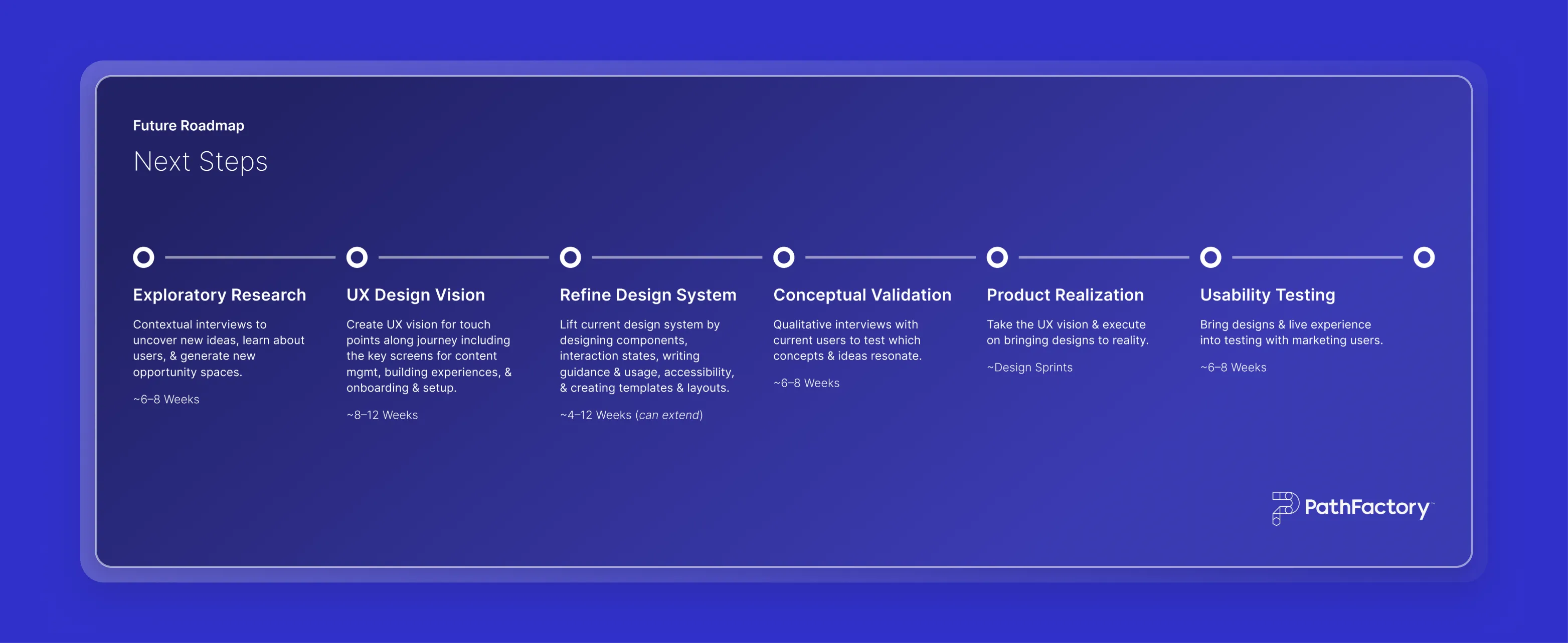
Next Steps
I helped define a design roadmap for PathFactory, setting short- and long-term goals with actionable steps. This phased approach aimed to incrementally enhance efficiency and user experience, ensuring strategic alignment and positioning PathFactory for future growth and success.
↑ Future roadmap with actionable short & long-term steps.
Reflection
Our collaborative and strategic approach successfully harmonized PathFactory’s UX, setting a strong foundation for future growth. This project demonstrated the value of comprehensive audits, strategic design, and effective teamwork in resolving UX issues and ensuring a seamless user experience. We will continue refining PathFactory’s UX to meet evolving user needs and industry standards.

LESSONS LEARNED
Importance of Unified Design Language
Uniform design is crucial for strong UX, as diverse styles cause confusion and reduce usability. This project highlighted the importance of consistency across all product offerings.
Strategic Prioritization Drives Change
Creating the opportunity brief emphasized prioritization, allowing PathFactory to focus on key user experience improvements and plan for the future.
Transformative Power of an Audit
Sometimes a comprehensive audit is the only way to identify key improvements, as in the initiative for PathFactory. Evaluating the design system and product suite led to a strategic design overhaul.
Cohesive Design System as a Necessity
This project highlights the importance of a unified design system and governance strategy to prevent inconsistencies and enhance UX through proper documentation of design changes.


Thank you
for viewing!
Want to discuss a project or collaboration?
I would love to hear from you! :)


Explore more case studies

Contact
Want to discuss a project or collaboration?
Navigation
Connect
© 2024 ~ Sam Small Design


